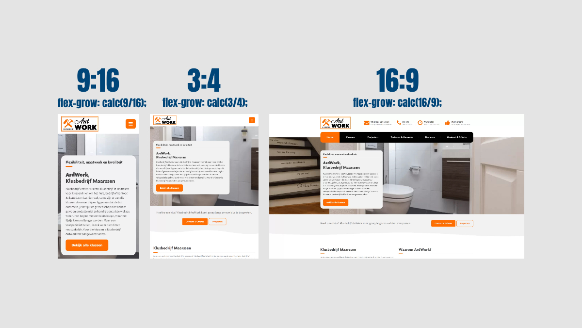
Placing images side by side, while keeping the same height, regardless of their aspect ratio, is easy ... just set the height to 500 pixels.. No, that's not a responsive approach to web design, because that way you won't know the total width of all images side by side.
What if you want to fill the space that is available (which you don't know to begin with)? CSS property flex-grow gives you the power to make the images fill up available space by growing. The images start at 0px wide, and grow as much as they can fill up space.
How much an image will grow as opposed to other images, depends on the value supplied for flex-grow. Such a value is a numeric value, without a unit.
Portrait images should not grow too much, because those would otherwise get too high. Landscape images should grow more, because otherwise those would not get high enough. How much an image will grow, depends on their aspect ratio as the formula.
Add HTML for flexbox with images
Add the following HTML (change it according to your images):
<div class="tw-equal-height-images">
  <img src="..." width="810" height="1440" style="flex-grow:calc(810/1440);">
  <img src="..." width="1152" height="1536" style="flex-grow:calc(1152/1536);">
  <img src="..." width="1600" height="900" style="flex-grow:calc(1600/900);">
</div>
Notice that I manually added the flex-grow property as inline CSS. You could also apply flex-grow automatically. Which I will explain after you've created the layout.
Add CSS to create the layout
Now, add the following CSS to create the layout:
  .tw-equal-height-images {
    display: flex;
  }
  .tw-equal-height-images img {
    display: block;
    flex-basis: 0px;
    width: 0px;
    height: auto;
  }
Make sure the layout is responsive
Depending on how many images, and what images, you might want to wrap them when it comes to a certain width. If you put two landscape images next to eachother on a small screen, such as a smartphone screen, then they are hard to see and read.
I suggest making landscape images and square images take up the full width on it's own. If you are lucky you can place two portrait images next to eachother on smaller screens.
The latter may require you to reorder those items, depending on the device being used.
You can add margin and padding, that's no problem
You can add margin and padding, the images will adapt and still have the same height as each other and will fill up available space, while taking margin and padding into account.
Applying flex-grow automatically
If you do not like to manually add flex-grow as inline CSS everytime, then I've got you covered. I suggest doing this with PHP (or using any other backend language) instead of JavaScript, because JavaScript causes reflows.
By using PHP's built-in HTML parser, which I like to use for a lot of things to cut down on JavaScript usage, you can query for images that have a width and height specified.
Then you can simply add the inline CSS style by using the width and height attributes.
However, you will need to collect all the HTML before outputting it, because PHP's HTML parser needs the HTML in order to create a document that you will perform queries on.
You can do this by calling ob_start() before you output any HTML, and at the end you collect the HTML from the buffer by calling ob_get_clean() and putting it into a variable.
// Start output buffering
ob_start();

/* ... (anything that happens in between, such as outputting HTML) */

// Stop output buffering and add to variable
$buffer = ob_get_clean();

// Create document object
$doc = new DOMDocument();

// Load HTML into the document
$doc -> loadHTML($buffer);

// Create an XPath object to use for querying
$xPath = new DOMXPath($doc);


$allFlexboxesWithEqualHeightImages = $xPath -> query (
  '//*[contains(@class, 'tw-equal-height-images')]'
  // Change the class name above if you've changed it in the HTML
);

foreach($allFlexboxesWithEqualHeightImages as $flexboxWithEqualHeightImages) {
  $images = $flexboxWithEqualHeightImages -> getElementsByTagName('img');
  foreach($images as $image) {
    if (
      $image -> hasAttribute('width')
      &&
      $image -> hasAttribute('height')
    ) {
      $imageWidth = $image -> getAttribute('width');
      $imageHeight = $image -> getAttribute('height');
      $styleToAdd = 'flex-grow:calc(' . $imageWidth . '/' . $imageHeight . ');';

      if($image -> hasAttribute('style')) {
        $image -> setAttribute (
          'style',
          $styleToAdd . $image -> getAttribute('style')
        );
      } else {
        $image -> setAttribute (
          'style',
          $styleToAdd
        );
      }
    }
  }
}

$html = '<!DOCTYPE html>' . $doc -> saveHTML($doc -> documentElement);
$html = preg_replace('/</wbr>/is', '', $html);
$html = preg_replace('/</source>/is', '', $html);
echo $html;
Now you do not have to apply flex-grow manually. What would have been great, is if CSS had a value like currentColor, but instead for the image's natural width and height.
Then you would have been able to use that in the formula via external CSS, instead of manually adding the width and height as inline CSS into a formula or by using PHP.
This code has been tested and is actually used to show designs on the portfolio of this website on a smartphone, tablet, and a desktop screen, side by side, filling up the space that is available while maintaining their aspect ratio and all having the same height.

