
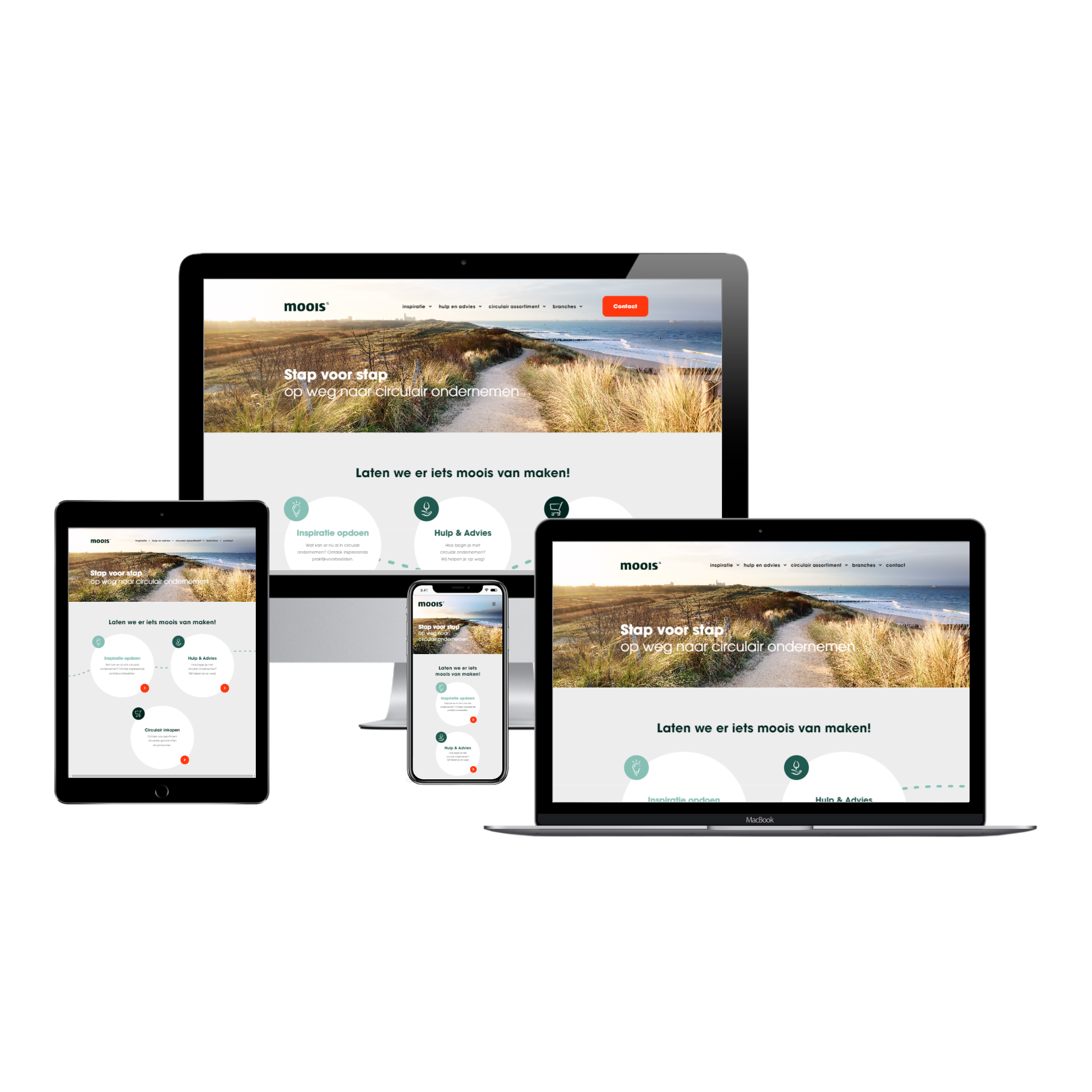
What is responsive web design?
Responsive web design means that a design for large screens, adapts to smaller screens. This way the website looks great at and is usable at large, medium, small, and extra small screens.
Our websites and webshops are responsive. We determine how desktop designs adapt to smaller viewports like laptops, tablets, and smartphones. Besides smaller viewports, we also make sure that the web design looks great at 4K-monitors.
By the way, we would like to inform you that a responsive web design is crucial for search engine optimization.
IntroductionHow we make your website responsive
There is a lot to consider when making responsive websites. We discuss the most important parts of responsive web design below, which we like to focus on to optimize your website for smaller screens. This way we create a responsive web design.

Legible text
Text has to be legible. This means that the text is not too small, but not too big either. The same goes for the space between the lines (line height), between the letters (letter spacing), between words (word spacing), and between paragraphs (paragraph spacing).
Thickness of text is also important - text that is too thin can be unpleasant for the eye. Too thick text can also be hard to read.
And last but not least, the contrast between the background and the text also has a great impact on legibility.
Step 1
Ease of use
Buttons have to be easely clickable and recognizable. We give important buttons a deviating color. Deviating colors get the attention. This way we can speed up the process of visitor to client. This leaves less time for visitors to be distracted.
We optimize the checkout page with that same thought in mind: create as less distraction as possible. We hide the header and footer at the checkout page. The checkout page only needs a subtle link to carry the visitor back to the cart page, and maybe even back to the home page. The checkout page has only one function: placing orders.
Step 2
Fold-out menu and product filters
At large screens all the links are generally placed next to one another. There is no space to do that on smaller screens. That's why it's a common practice to use a foldable menu. The visitor can tap the hamburger icon on the top left or right of their screen, which will open the menu to navigate the website.
It is called a hamburger icon, because it is usually presented as three lines on top of each other. Often such hamburger icons turn into a cross symbol when it has been opened. This will indicate to the visitor that the menu can be closed by tapping it again. Fold-out menus are a must-have for a responsive website.
Such a hamburger icon is located in the top bar of the website. That bar is sticked to the top of your screen while you swipe or scroll down a web page of the responsive website.
Just like is the case for menus, it is wise to make the filters in a webshop expandable and suspendable on smartphone screens. Those product filters take up way too much space, otherwise. Placing the product filters in the bottom of the webshop is useless, because the visitors would not be able to use them. That's why we use expandable and suspendable product filters, so visitors using a smartphone or any small screen can use product filters as well.
Step 3


Order and priority of content
Image a page with a row, on a desktop screen. The row contains text in the left column, and an image in the right column.
May that image be necessary to understand the text, then it's important to move the column with the image before the column with text, because it would show it the other way around when viewed on a smartphone (because the columns will then wrap).
That's why we change the order when they wrap.
Step 4

Visually stable layout
Maybe you have already experienced this: you are reading an article with lots of adverts in between paragraphs.
You scroll down, only to find an advert suddenly being loaded between the paragraph you were reading and the paragraph that you wanted to read next. That is very annoying, because you would have to scroll down again to continue reading.
Google notices this, when the layout is visually unstable. They even introduced a metric for this: Cumulative Layout Shift (CLS). The metric called CLS is part of the Core Web Vitals; a new ranking factor of Google that also focusses on page speed and interactivity.
Step 5
Avoid portrait images
Portrait images take up a lot of space when they are presented in full width, because their height is much greater than their width. This is not a problem for desktop screens, because on a desktop screen you can simply make them less wide (thus making it less tall).
However, to make images easy to see and understand on smartphones, it is necessary to present them in full width. That is not a problem for landscape images, but for portrait images this will make the image take up not only the full width of your smartphone, but also the full height of your smartphone. This will make your layout unstructured, because it's harder to associate tall images with text that's below them.
May a portrait image be purely decorative, it may be an idea to either use a landscape version (if possible) or hide the image completely at smartphone screens - to keep the layout structured.
You may notice that you will need a lot of text to be able to match the height when placed next to a portrait image. Portrait images are tall, and not wide, meaning it needs more lines next to them, and it takes up less horizontal space.. which means that you need more words per line.
This is something that we faced as well, while writing this section called Avoid portrait images. Luckily we were able to write enough text to fit next to the image on the left (if you are reading this on a desktop screen), by writing this last paragraph for filler content. We are truly sorry.
Step 6

Adjustments for touchscreens
When using a desktop screen, you use a mouse to click and move. Sometimes, webshops show the add-to-cart button only when you hover over (place your cursor at) a product. If you use a touch screen, you don't use a mouse. If you tap on the product, that will count as hovering while using a mouse, thus the add-to-cart button will only appear after you have tapped the product.
This is inconfenient, because if you tap on a product's image, you will be taken to the product's page. This is why we choose to show these kind of buttons beforehand at touch screens, to prevent this kind of confusion.
Step 7
Functions for ease of use
By using the functions below, we will make your website or webshop easier to use.
Back-to-top button
If a visitor wants to navigate to the top of your website, they will click this button. This button's position is fixed, so it will always stay on your screen when you scroll down and up. This button will only appear when the visitor has scrolled down enough, which would make it useful to be able to jump to the top of the page by tapping or clicking a simple back-to-top button.
Clickable phone numbers
This feature is not useful for desktops, but it is extremely useful when it comes to visitors using mobile phones! The visitor taps the phone number, the calling application opens up, and the visitor can call you immediately. This will make it easier for visitors to contact you, which will increase the trust they have in your company.
Clickable email addresses
The same story goes for email addresses. However, this is useful for both mobile phone users and desktop users. The visitor taps or click the email address, the email application opens up, and the visitor can email you immediately. Handy!

Step 8
Examples of responsiveness
In this section we will give you examples of situations where changes were needed to make a web design responsive.
Desktop → Laptop - Menu doesn't fit
On a desktop screen, you can fit many links in the menu, as you can see in the image below.

On a laptop screen, however, you can not place as many links in the menu if you keep the font size of the links the same.

After reducing the font size of the links in the menu, they now do fit in the menu.

The font size of the links gets gradually decreased within a certain range of screen width where they would otherwise not fit. This way, those links will fit at even smaller laptop screens. Besides the font size of the links, sometimes it is necessary to reduce the spacing between the links. If it does not fit after doing so, then the logo's size will decrease. If it does not fit anymore, even after that, then we will consider what links to remove on laptop screens. The latter is rarely the case, luckily.
Laptop → Tablet - Less columns
The example below, shows 3 columns next to eachother. The first column contains an image of a pigeon, the second column contains text, and the third column contains an image of another pigeon.
However, you can also see a tablet screen in the example below.
On the tablet screen we have placed two columns next to eachother, instead of three columns, because otherwise it would not fit next to eachother. On top of that, the column that contained the text, has been given a different position; we have switched that second column (containing text) with the third column (containing an image of a pigeon). This way the two pigeons are facing towards eachother, while the text is placed underneath them next to another column containing text.


Tablet → Mobile - Wrapping
Doubling down on the previous example, you can now see those two same pigeons in the image on the right or below (depending what device you are using right now).
These pigeons still fit next to eachother nicely on smartphone screens, but you can now see that the fourth column (containing text) does not appear next to the third column (containing text).
That is because it is wrapped (placed underneath) the third column.
This practice is the easiest, yet most important part of responsive web design.
Back in the days, websites were built up as real tables, just like Excel.

You might have noticed that we have talked about rows and columns, but those columns are actually blocks that fit next to eachother and which have a flexible width that can be changed independently from columns from other rows (as if it were inside of a table, which it's not).
This is not how the columns used to work back in the days; the width of the columns could not get changed at smaller screens. The width of the 1st column in the 2nd row, was equal to the 1st column of the 1st row, because that is how tables work.
Maybe you have once encountered such a website while browsing a smartphone. Maybe you have not, since search engines give priority to websites that use a responsive web design.