
A CSS design system is the core of your web design, so it's important that it brings flexibility and consistency throughout the design process. Making a CSS design system from scratch is, in my opinion, the second best thing in web design. The very best is using your own CSS design system to make beautiful layouts for your website.
You will be brought back to the very start – from adding a CSS browser reset to adding features and fixing issues. If this is your first time creating a CSS design system from scratch, I can assure you that this is an educational experience.
Let's start with the process of creating a CSS design system from scratch. There are a lot of steps, but don't worry, no design system is done in 1 day. In fact, I am still tweaking the CSS design system of this very website every now and then. I am even jealous of the CSS design system I will give away for free for you to enjoy.
Use the demo to compare your code throughout this article by clicking the button below.
View demoThese are the steps to making a CSS design system that I will guide you through:
- Setting up the files
- CSS browser reset
- Font size and line height
- Colors
- Containers
- Rows and columns
- Spacing between elements
- Styling for common elements
- Creating a simple layout
- Utility classes for simple styling
- Styling for less common elements
- Utility classes for advanced layouts
- Creating an advanced layout
- Breakpoint-specific utility classes for responsive layouts
- Making your layout responsive
- Creating a header
- Creating a top bar
- Creating a footer
Let's begin!
Setting up the files
The bare minimum that you need to make a CSS design system is a folder called css-design-system with an HTML file called index.html, and a CSS file called index.css within that folder.
The contents of the HTML file:
<!DOCTYPE html>
<html>
  <head>
    <link rel="stylesheet" href="index.css">
    <meta name="viewport" content="width=device-width">
    <meta charset="UTF-8">
  </head>
  <body class="color-scheme-dark">
    <main>
      <article>
      </article>
    </main>
  </body>
</html>
The CSS file contains nothing yet.
CSS browser reset
Your web browser adds default styling for all HTML elements, but not every browser adds the same styling. That's why it's best to reset all styling, in order to make the CSS design system work the same way in all modern web browsers.
This is the CSS browser reset that I use:
html, body, div, span, applet, object, iframe, h1, h2, h3, h4, h5, h6, p, blockquote, pre, a, abbr, acronym, address, big, cite, code, del, dfn, em, img, ins, kbd, q, s, samp, small, strike, strong, sub, sup, tt, var, b, u, i, center, dl, dt, dd, ol, ul, li, fieldset, form, label, legend, table, caption, tbody, tfoot, thead, tr, th, td, article, aside, canvas, details, embed, figure, figcaption, footer, header, hgroup, menu, nav, output, ruby, section, summary, time, mark, audio, video { margin:0; padding:0; border:0; font-size:100%; font:inherit; vertical-align:baseline; } article, aside, details, figcaption, figure, footer, header, hgroup, menu, nav, section { display: block; } * { box-sizing: border-box; -webkit-tap-highlight-color: transparent; }Add the CSS as shown above to the CSS file index.css. All CSS code you are about to write further into this article, is supposed to be added below the CSS browser reset, in order to be able to overwrite those if the specificity is equal.
There are multiple elements which's styling has not yet been reset, but since those styles are going to be defined anyways, there is no need to redefine those styles beforehand.
Font size and line height
The first thing you do when making a CSS design system, is setting the font sizes and line heights for the body and heading elements.
I suggest you add the following HTML inside the <article>-element:
<h2>Lorem ipsum dolor sit</h2>
<p>Lorem ipsum <a href="#">dolor sit</a>.</p>
<h2>Lorem ipsum dolor sit</h2>
<h3>Lorem ipsum dolor sit</h3>
<p>Lorem ipsum dolor sit.</p>
As you can see, we start by adding <h2> and <h3>-elements with paragraphs in between. These elements are very common, so it's good to use those elements as a starting point for defining font sizes. Less common elements, like <h1>, <h4>, <h5>, and <h6>, will use those font sizes as a point of reference.
This is the CSS that I ended up with:
body {
  font-family: Arial;
  font-size:   19px;
  line-height: 1.5em;
}
 h1,  h2,  h3,  h4,  h5,  h6,
.h1, .h2, .h3, .h4, .h5, .h6 {
  font-family: Arial;
  font-weight: 700;
  line-height: 1.2em;
}
h1, .h1 {
  font-size: 40px;
}
h2, .h2 {
  font-size: 33px;
}
h3, .h3 {
  font-size: 28px;
}
h4, .h4 {
  font-size: 24px;
}
h5, .h5 {
  font-size: 21px;
}
h6, .h6 {
  font-size: 19px;
}
As you can see in the example above, I did not target <p>-elements directly. I targeted the <body>-element instead, because paragraphs will inherit the font properties from its ancestor elements.
Using inheritance instead of directly targeting individual elements makes it easier for you to make utility classes that affect nested elements without having to target them directly.
For example, a class to overwrite the color scheme for a section. Imagine if I directly targeted paragraphs and <h1> through <h6>. That means I would have to create 7 selectors in order to overwrite the color of those elements if they were to be placed in a section with a different color scheme.
Instead of doing that, I rely on those elements inheriting the color from its ancestor elements. This will save you a lot of frustration and butchering in order to fix CSS problems whilst creating new ones in your design system.
Colors
Colors are used by multiple elements in your CSS design system. In order to manage those colors at one place, I suggest storing them as CSS variables to be able to refer to them from anywhere in the code of your CSS design system.
This is how you define CSS variables (I suggest placing this below the CSS browser reset):
:root {
  --black:        rgb(0, 0, 0);
  --darker-blue:  rgb(5, 5, 29);
  --dark-blue:    rgb(12, 12, 70);
  --light-blue:   rgb(13, 100, 176);
  --lighter-blue: rgb(180, 220, 255);
  --gray:         rgb(167, 167, 167);
  --light-gray:   rgb(210, 210, 210);
  --lighter-gray: rgb(243, 243, 243);
  --off-white:    rgb(252, 252, 252);
  --white:        rgb(255, 255, 255);

  --white-a90:    rgba(255, 255, 255, 0.9);
}
CSS variables are basically CSS properties, but they don't have any effect on their own. Instead, you make use of these variables using CSS' var-function to use them as a value for actual properties. For example, let's give hyperlinks a dark blue color:
a {
  color: var(--dark-blue);
}
Now, all hyperlinks are dark blue. What happens when those hyperlinks are placed in a section with a dark background color? They will become unreadable, so a hyperlink's color should be dynamic.
Let's define the color of hyperlinks on a light background (dark color scheme for the text) as a variable called --hyperlink-color with a value that refers to variable --dark-blue and then set the hyperlink color using variable --hyperlink-color.
a {
  color: var(--hyperlink-color);
}
.color-scheme-dark {
  --hyperlink-color: var(--dark-blue);
  color:             var(--black);
}
Now, look back at your HTML file and you might notice that class color-scheme-dark is added to the <body>-element. The color variables for elements are defined for elements with this class, to make it dark text on a light background, to ensure readability.
Let's add a class that gives a section a black background color and a class that indicates a light color scheme for its text. Add the the following CSS code below the rule set with selector .color-scheme-dark:
.color-scheme-light {
  --hyperlink-color: var(--lighter-blue);
  color:             var(--white-a90);
}
.bg-black {
  background-color: var(--black);
}
The code above allows sections to have a black background color using class bg-black and the hyperlink color to be lighter blue instead of dark blue by using class color-scheme-light, without directly targeting the hyperlinks within the section.
Let's add classes for the other colors as well:
.bg-darker-blue {
  background-color: var(--darker-blue);
}
.bg-dark-blue {
  background-color: var(--dark-blue);
}
.bg-light-blue {
  background-color: var(--light-blue);
}
.bg-lighter-blue {
  background-color: var(--lighter-blue);
}
.bg-gray {
  background-color: var(--gray);
}
.bg-light-gray {
  background-color: var(--light-gray);
}
.bg-lighter-gray {
  background-color: var(--lighter-gray);
}
.bg-off-white {
  background-color: var(--off-white);
}
.bg-white {
  background-color: var(--white);
}
Why inheritance is better than directly overriding values
Coming back to changing the color of hyperlinks within sections with dark background colors.. You might think, why not just directly overwrite the hyperlink color when placed in a dark background?
Imagine that you made a website with a white background and black text (dark color scheme). You add a section with a dark background and add the class to indicate a light color scheme for its text. Let's say you write the following CSS to do so:
.color-scheme-light a {
  color: var(--lighter-blue);
}
Then, inside of the same section you have a block that has a light background and needs dark text (dark color scheme), so you have to overwrite that value again. So there you go, you write the following CSS:
.color-scheme-dark a {
  color: var(--dark-blue);
}
Now, what happens next is a result of one selector overriding another selector. Selector .color-scheme-dark comes after selector .color-scheme-light, so it overwrites it, meaning you end up with the following: a website with a white background color and dark text, a section with a dark background color and dark text and within that section a block with a light background and dark text.

Inheritance, on the other hand, is like a waterfall, or a cascade. For example's sake, let's say the color value is the water of a waterfall. The water keeps falling down until it hits the ground. If you set a value, you will set a new ground to stop the waterfall, and you start a new waterfall of which its water has a new value (in this case the value for the color property).
Combine this with CSS variables, and you can start new waterfalls for the value of a CSS variable, while elements within the waterfall use that CSS variable for properties like the color of its text.
This way you avoid having two selectors overriding each other as is the case when directly overwriting values. That is why inheritance works so well in combination with CSS variables.
Containers
Containers are elements that determine the width of all content placed within it.
Let's say you have a viewport that is 1920 pixels wide. Inside that there is a container that is 1570 pixels wide and it's centered. This means that there will be empty space on the left and right of the container.
This is the CSS to create a container:
/* DT - Desktop */
.container {
  width:         1570px;
  margin-left:   auto;
  margin-right:  auto;
  padding-left:  25px;
  padding-right: 25px;
}
Responsive container width
If you have a screen that is 1200 pixels wide, then 1570 pixels is too wide. This means that the container has to change its width on smaller viewports.
When defining responsive widths for a container, you define the following: the minimum viewport width in which the container will fit, the maximum viewport width in which the container is wide enough, and the container width itself.
Let's say that you want to add a container width for viewports that are at least 1200 pixels wide and below 1600 pixels wide.
The container width should be a little bit narrower than the minimum viewport width, since the scrollbar can take up to 17 pixels of the viewport width by default. So let's subtract 30, because that is an even number, it's easy to remember and it has some room for whenever some browser decides to use a wider scrollbar.
Let's say the container is 1170 pixels wide. This is how I suggest you write this CSS:
/* LT - Laptop & Small desktop */
@media (min-width: 1200px) and (max-width: 1599.98px) {
  .container {
    width: 1170px;
  }
}
Did you notice I wrote max-width: 1599.98px? If you write 1599 pixels instead, there is a chance that while resizing your viewport that it can have fractional pixels. This will make it possible for your viewport not to match that media query, which is not good. It's rare, but it's easy to fix, so why not write 1599.98px instead?
Also.. If you write 1599.98px then any viewport below 1600 pixels wide will match the media query. However, if you wrote 1599.99px, then a viewport that is 1600 pixels wide would also match the media query. Why? I don't know, but I found out about this by looking at the CSS of the website of Bootstrap; they used that fix.
Now, let's go back to making responsive widths for the container. Let's say that, for viewports that are at least 992 pixels wide and below 1200 pixels wide, that the container width is 962 pixels wide.
/* TL - Tablet (landscape) */
@media (min-width: 992px) and (max-width: 1199.98px) {
  .container {
    width: 962px;
  }
}
For viewports with a width below 1025 pixels, you can assume they do not have a scrollbar that takes up content. Viewports with such a width are most certainly tablets, not desktop devices.
Although the example above targets viewports of atleast 992 pixels wide, it does reach viewport widths that are below 1200 pixels. This is why the possibility of a scrollbar is taken into consideration and that is why 30 pixels has been subtracted from the minimum viewport width to get the container width as a result.
Below I made 3 more breakpoints, one for tablets, one for mobile devices in landscape mode or small tablets, and one for mobile devices in portrait mode.
The container is now full width for all the breakpoints written below:
/* TP - Tablet (portrait) & Tall mobile (landscape) */
@media (min-width: 768px) and (max-width: 991.98px) {
  .container {
    width: 100%;
  }
}

/* ML - Mobile (landscape) & Small tablet */
@media (min-width: 576px) and (max-width: 767.98px) {
  .container {
    width: 100%;
  }
}

/* MP - Mobile (portrait) */
@media (max-width: 575.98px) {
  .container {
    width: 100%;
  }
}
Now wrap the content within <article> in a <div>-element with class container.
Rows and columns
Now we have some essentials, we need one more thing to make actual layouts. We need rows and columns. I suggest using flexbox for rows, because it will give you a lot of flexibility; hence the name flexbox. This is how:
.row {
  display:        flex;
  flex-wrap:      wrap;
  flex-direction: row;
  align-items:    flex-start;
}
Let's break it down.
Value flex for property display turns the element into a flexbox.
Value wrap for property flex-wrap enables the flex items (columns) within the flexbox (row) to wrap to a new line, if there is no more space available.
Value row for property flex-direction makes sure that the columns go from left to right. With flexbox you can use value column to make flex items go from top to bottom, and you can append -reverse to create values row-reverse and column-reverse - those will reverse the order in which the columns are presented.
Value flex-start for property align-items makes sure the items are aligned at the top instead of stretching the columns height, which is the default behavior of flexboxes and makes columns have the same height if on the same line.
Stretching columns is not bad, but I have encountered issues where a flexbox still caused stretching on flex items if the flexbox was inside a parent flexbox that had the default stretching behavior.
I even tried applying and justify-content: flex-start on the vertical flexbox, but none seemed to work, so I applied align-items: flex-start to the parent flexbox (which is a horizontal flexbox) and then the stretching and unexplainable space was gone.
In the past I have also encountered cross browser bugs on Safari when it comes to the default stretch behavior, so I decided to disable the stretching behavior by default, while still allowing it using a class.
Now, let's add a column class. Columns need spacing between each other and they need an automatic width if not specified, which will depend on how many columns there are in the same row:
.col {
  flex-basis: 0px;
  flex-grow:  1;
}
What does flex-basis: 0px and flex-grow: 1 do? CSS property flex-grow enables the column to grow if there is space available, while setting property flex-basis to 0px will make all columns start at a width of 0 pixels and then grow by an amount equal to the amount all other columns do.
This makes it so that you don't have to specify a width for each column if you want all of them to be the same width. The available space is shared over all flex items, and the value for property flex-grow will determine how much of that available space is getting taken by that very flex item.
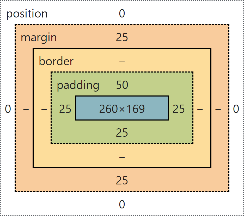
Spacing between elements
Spacing is one of the most important aspects of web design. It makes or breaks web designs. Consistent spacing is what takes the most time and effort when making a CSS design system. The goal is to make it as automatic as possible, while making it possible to fine tune them if necessary.
Spacings can be applied using both margins and paddings, but paddings should be used when an element has a background color, and margins are to be used to push the element away from other elements to create space.
Let's start by adding 50px of top margin for the <main>-element.
main {
  margin-top: 50px;
}
Now, let's add spacing for textual elements. Add the following below the rule set with selector h1, h2, h3, h4, h5, h6, .h1, .h2, .h3, .h4, .h5, .h6:
 h1:not(:first-child),  h2:not(:first-child),  h3:not(:first-child),  h4:not(:first-child),  h5:not(:first-child),  h6:not(:first-child),
.h1:not(:first-child), .h2:not(:first-child), .h3:not(:first-child), .h4:not(:first-child), .h5:not(:first-child), .h6:not(:first-child) {
  margin-top: 37.5px;
}
 h1:not(:last-child),  h2:not(:last-child),  h3:not(:last-child),  h4:not(:last-child),  h5:not(:last-child),  h6:not(:last-child),
.h1:not(:last-child), .h2:not(:last-child), .h3:not(:last-child), .h4:not(:last-child), .h5:not(:last-child), .h6:not(:last-child) {
  margin-bottom: 25px;
}
Add the following CSS between rule set with selector h6 and rule set with selector a:
p:not(:last-child) {
  margin-bottom: 12.5px;
}
Let's discuss the spacing between rows and columns. I did my very best to come up with a spacing system that makes spacing as automatic as possible. Let me try to explain how it works, because it is pretty advanced (if I may say so myself).
We start with adding margins between columns. I decided to give each column a left, right and bottom margin of 25px.
.col {
  flex-basis:    0px;
  flex-grow:     1;
  margin-left:   25px;
  margin-right:  25px;
  margin-bottom: 25px;
  max-width:     calc(100% - 50px);
}
Since there is now space on the left and right inside of the row, I decided to negate those by applying a negative margin on the left and right side of the row.
.row {
  display:        flex;
  flex-wrap:      wrap;
  flex-direction: row;
  align-items:    flex-start;
  margin-left:    -25px;
  margin-right:   -25px;
}
Instead of negating the bottom margin of the columns, I found it to be smarter to embrace it and use it as part of the spacing between rows. To do so, I applied only a top margin to the rows, equal to the bottom margin of the columns.
As a result, I have a row that has 25px of margin at the top, and 25 pixels of space that is created inside the bottom of the row by the bottom margin of the columns.
.row {
  display:        flex;
  flex-wrap:      wrap;
  flex-direction: row;
  align-items:    flex-start;
  margin-top:     25px;
  margin-left:    -25px;
  margin-right:   -25px;
}


The spacing system will get advanced once you realize that there are rows and columns that can have a background color. This means that you need to apply paddings when rows and columns have a background color.
I decided to make variables called --has-fill-top, --has-fill-right, --has-fill-bottom, and --has-fill-left, which indicates whether it has a background color. This variable can have two values: 0 and 1.
[class^='bg-'], [class*=' bg-'] {
  --has-fill-top:    1 !important;
  --has-fill-right:  1 !important;
  --has-fill-bottom: 1 !important;
  --has-fill-left:   1 !important;
}
The selector above will query for elements that have a class attribute that either starts with bg- or when it contains substring bg- (a space, then bg-) and sets variables --has-fill-top, --has-fill-right, --has-fill-bottom, and --has-fill-left to 1 with !important.
The reason for the use of !important is that each row and column will set the variables to 0 by default, to prevent the variables value from cascading to rows and columns with an ancestor element that has a background color, and thus has value 1 for those variables.
.row {
  --has-fill-top:    0;
  --has-fill-right:  0;
  --has-fill-bottom: 0;
  --has-fill-left:   0;
  display:           flex;
  flex-wrap:         wrap;
  flex-direction:    row;
  align-items:       flex-start;
  margin-top:        25px;
  margin-left:       -25px;
  margin-right:      -25px;
}
.col {
  --has-fill-top:    0;
  --has-fill-right:  0;
  --has-fill-bottom: 0;
  --has-fill-left:   0;
  flex-basis:        0px;
  flex-grow:         1;
  margin-left:       25px;
  margin-right:      25px;
  margin-bottom:     25px;
  max-width:         calc(100% - 50px);
}
Let's add paddings for rows that have a background color.
.row {
  --has-fill-top:    0;
  --has-fill-right:  0;
  --has-fill-bottom: 0;
  --has-fill-left:   0;
  display:           flex;
  flex-wrap:         wrap;
  flex-direction:    row;
  align-items:       flex-start;
  margin-top:        25px;
  margin-left:       -25px;
  margin-right:      -25px;
  padding-top:       calc(25px * 2 * var(--has-fill-top));
  padding-left:      calc(25px * var(--has-fill-left));
  padding-right:     calc(25px * var(--has-fill-right));
  padding-bottom:    calc(25px * var(--has-fill-bottom));
}
The padding values in the rule set above multiply 25px by variables --has-fill-top, --has-fill-right, --has-fill-bottom, and --has-fill-left. These variables act like a boolean value (true or false, 1 or 0).
The top padding is twice the bottom padding, because the columns inside the row do not have a top margin, just a bottom margin of 25px.


Rows with a background color need a bottom margin, because rows without a background color are 50 pixels apart; 25px of bottom margin by the columns inside the first row plus a top margin of 25px by the second row.
Adding a background color to a row will cover the area created by its column's bottom margin with its background color, bringing the row closer (visually) to the second row.

To fix this, you add a bottom margin of 25px to the row if it has a background color.
.row {
  --has-fill-top:    0;
  --has-fill-right:  0;
  --has-fill-bottom: 0;
  --has-fill-left:   0;
  display:           flex;
  flex-wrap:         wrap;
  flex-direction:    row;
  align-items:       flex-start;
  margin-top:        25px;
  margin-bottom:     calc(25px * var(--has-fill-bottom));
  margin-left:       -25px;
  margin-right:      -25px;
  padding-top:       calc(25px * 2 * var(--has-fill-top));
  padding-left:      calc(25px * var(--has-fill-left));
  padding-right:     calc(25px * var(--has-fill-right));
  padding-bottom:    calc(25px * var(--has-fill-bottom));
}
Now the column's 25 pixels of bottom margin has been reclaimed by adding 25 pixels of bottom margin to the row that has the background color, yet still ending up with 25 pixels of space between the first and second row.
Why is that? Well.. Two vertical margins do not add up to a value to be the sum of the two margins. Instead, they pick the highest value of the two margins, which would be 25px in this case.
Before fixing these vertical spacing issues whilst making a distinction between the spacing between a row with a background color and the row below, and spacing between a row with a background color and anything but a row or column (paragraphs for instance), I would like to fix other spacing issues; since I want to present to you a visualization of spacing between rows with a background color and anything but rows or columns while those horizontal spacing fixes are in place.
So let's do something about horizontal spacing for rows with a background color. Since the left and right space within rows, which are created by the left and right margins by the columns within those rows, are now covered with a background color, I decided to undo the row's negative left and right margin that were applied in order to negate the column's left and right margin.
If I were to negate those margins for rows that have a background color, then the row would stick out on the left and right because of the left and right spacing that is visible due to the row's background color. See the visualizations below, of which the first shows a row with a background color with left and right margin negation, and the second shows a row with a background color without left and right margin negation (which is the desired outcome).


So, in order to disable the negative left and right margin of rows with a background color, I had to change the logics of working with CSS variables --has-fill-left and --has-fill-right by starting with a negative value of -25px and creating value 0 by adding 25px multiplied by variable --has-fill-left or --has-fill-right to the negative value of -25px.
.row {
  --has-fill-top:    0;
  --has-fill-right:  0;
  --has-fill-bottom: 0;
  --has-fill-left:   0;
  display:           flex;
  flex-wrap:         wrap;
  flex-direction:    row;
  align-items:       flex-start;
  margin-top:        25px;
  margin-bottom:     calc(25px * var(--has-fill-bottom));
  margin-left:       calc(-25px + 25px * var(--has-fill-left));
  margin-right:      calc(-25px + 25px * var(--has-fill-right));
  padding-top:       calc(25px * 2 * var(--has-fill-top));
  padding-left:      calc(25px * var(--has-fill-left));
  padding-right:     calc(25px * var(--has-fill-right));
  padding-bottom:    calc(25px * var(--has-fill-bottom));
}
Let's add spacing for columns that have a background color. This is pretty straightforward:
.col {
  --has-fill-top:    0;
  --has-fill-right:  0;
  --has-fill-bottom: 0;
  --has-fill-left:   0;
  flex-basis:        0px;
  flex-grow:         1;
  margin-left:       25px;
  margin-right:      25px;
  margin-bottom:     25px;
  max-width:         calc(100% - 50px);
  padding:           calc(25px * 2 * var(--has-fill-top))
                     calc(25px * 2 * var(--has-fill-right))
                     calc(25px * 2 * var(--has-fill-bottom))
                     calc(25px * 2 * var(--has-fill-left));
}

When creating advanced layouts, there is no escaping the fact that you will be using rows within rows. This creates a new layer of complexity to the CSS design system, because rows within rows need smaller spacing, and will be placed inside of columns, which can be transparent but they can also have a background color.
The first thing I decided to do was to make use of a spacing multiplier CSS variable that decreases as the row depth increases. I suggest adding the following CSS rule sets below the rule set with selector .row:
.row .row {
  --col-spacing-multiplier: 0.5;
}
.row .row .row {
  --col-spacing-multiplier: 0.25;
}
Then, I used this variable in calculations for row and column spacing and set a default value of 1 for variable --col-spacing-multiplier.
.row {
  --has-fill-top:    0;
  --has-fill-right:  0;
  --has-fill-bottom: 0;
  --has-fill-left:   0;
  display:           flex;
  flex-wrap:         wrap;
  flex-direction:    row;
  align-items:       flex-start;
  margin-top:        calc(25px * var(--col-spacing-multiplier));
  margin-bottom:     calc(25px * var(--has-fill-bottom) * var(--col-spacing-multiplier));
  margin-left:       calc((-25px + 25px * var(--has-fill-left)) * var(--col-spacing-multiplier));
  margin-right:      calc((-25px + 25px * var(--has-fill-right)) * var(--col-spacing-multiplier));
  padding-top:       calc(25px * 2 * var(--has-fill-top) * var(--col-spacing-multiplier));
  padding-left:      calc(25px * var(--has-fill-left) * var(--col-spacing-multiplier));
  padding-right:     calc(25px * var(--has-fill-right) * var(--col-spacing-multiplier));
  padding-bottom:    calc(25px * var(--has-fill-bottom) * var(--col-spacing-multiplier));
  --col-spacing-multiplier: 1;
}
.col {
  --has-fill-top:    0;
  --has-fill-right:  0;
  --has-fill-bottom: 0;
  --has-fill-left:   0;
  flex-basis:        0px;
  flex-grow:         1;
  margin-left:       calc(25px * var(--col-spacing-multiplier));
  margin-right:      calc(25px * var(--col-spacing-multiplier));
  margin-bottom:     calc(25px * var(--col-spacing-multiplier));
  max-width:         calc(100% - 50px * var(--col-spacing-multiplier));
  padding:           calc(25px * 2 * var(--has-fill-top) * var(--col-spacing-multiplier))
                     calc(25px * 2 * var(--has-fill-right) * var(--col-spacing-multiplier))
                     calc(25px * 2 * var(--has-fill-bottom) * var(--col-spacing-multiplier))
                     calc(25px * 2 * var(--has-fill-left) * var(--col-spacing-multiplier));
}
Before showing you a visualization of rows within columns of other rows, there is one more thing to do – removing the top margin of rows that are the first child in its parent element (a column) and removing the bottom margin of rows that are the last child in its parent element.
Let's start with removing the top margin of rows within another row's column, since that is the easiest part. Add the following below the rule set with selector .row .row .row:
.row:first-child {
  margin-top: 0px;
}
Now, when placing a row within a column of another row, the inner row has a bottom margin of 12.5px. For transparent inner rows you have to set the bottom margin to a negative value of -12.5px, because not not only does the inner row otherwise add a bottom margin of 12.5px, its columns inside would also add 12.5px of bottom margin.


What about inner rows with a background color within another row's column? Well, if you apply a negative bottom margin of -12.5px, then that inner row would stick out of the column.
This is because the bottom margin of the inner row's columns are covered with the inner row's background color. This means that there is no need to negate those bottom margins anymore.
Add the following CSS rule set below the rule set with selector .row:first-child:
.row:last-child {
  margin-bottom: calc((-25px + 25px * var(--has-fill-bottom)) * var(--col-spacing-multiplier));
}


Finally, since those spacing fixes are now in place, let's make seperate, distinct, CSS rule sets to add spacing between a row with a background color and a row below, the spacing between a paragraph and a row below (which could contain paragraphs within its columns), and the spacing between a row and a paragraph below. Instead of targeting paragraphs, I target anything but a row or column, since paragraphs were just for example's sake; it could be anything from a paragraph to an unordered list, a button, an image, etc.
Visualization of the spacing between a row with a background color and a row below:


Visualization of the spacing between a paragraph and a row below:


Visualization of the spacing between a row and a paragraph below:


Add the following CSS rule sets below the rule set with selector [class^='bg-'], [class*=' bg-']:
.row[class^='bg-'] + .row,
.row[class*=' bg-'] + .row {
  margin-top: calc(25px * 2 * var(--col-spacing-multiplier));
}
:not(.row):not(.col) + .row[class^='bg-'],
:not(.row):not(.col) + .row[class*=' bg-'] {
  margin-top: max(12.5px, calc(25px * 2 * var(--col-spacing-multiplier)));
}
.row[class^='bg-'] + :not(.row):not(.col),
.row[class*=' bg-'] + :not(.row):not(.col) {
  margin-top: max(12.5px, calc(25px * var(--col-spacing-multiplier)));
}
The first rule set will query for rows that are below a row with a background color. A top margin of two times 25px will be applied to that row, to push it further away from the row that has a background color.
The second rule set will query for a row with a background color that is below anything but a row or column. A top margin of two times 25px will be applied to the row with the background color that is below anything but a row or column.
The reason for it to be two times 25px, is because the value for variable --col-spacing-multiplier gets halved if a row is within a column of another row. This would cause the top margin I would apply to be halved because of the lower value for variable --col-spacing-multiplier as opposed to a paragraph for example.
The third rule set will query for anything but a row or column that is below a row with a background color. A top margin of (once) 25px will be applied to anything but a row or column that is below a row that has a background color.
The last two rule sets are not necessary; it's personal preference. The reason why I added these is because I thought it would look too crowded if there is 12.5px of vertical space between a row with a background color and paragraphs above and below that row.
Visualization of 12.5px of space between a row with a background color and paragraphs:

Visualization of 25px of space between a row with a background color and paragraphs:

CSS function max was used in order to keep at least 12.5px of vertical space, because otherwise the spacing between a paragraph and a row within a row within a row within a row would be 6.25px, which is smaller than the spacing between paragraphs.
Styling for common elements
Let's distance ourselves from the previous chapter, and style the following elements:
- Rows and columns
- Images
- Buttons
- Form elements
Border radius for rows and columns
I decided to apply a border radius for rows and columns that have a background color. In order to make this look good, I made use of variable --col-spacing-multiplier to make radius smaller the deeper a row is nested within a column of another row.
:is([class^='bg-'], [class*=' bg-'], img) :is([class^='bg-'], [class*=' bg-'], img) {
  --border-radius-depth: 1;
}
:is([class^='bg-'], [class*=' bg-'], img) :is([class^='bg-'], [class*=' bg-'], img) :is([class^='bg-'], [class*=' bg-'], img) {
  --border-radius-depth: 2;
}
:is([class^='bg-'], [class*=' bg-'], img) :is([class^='bg-'], [class*=' bg-'], img) :is([class^='bg-'], [class*=' bg-'], img) :is([class^='bg-'], [class*=' bg-'], img) {
  --border-radius-depth: 3;
}
:is([class^='bg-'], [class*=' bg-'], img) :is([class^='bg-'], [class*=' bg-'], img) :is([class^='bg-'], [class*=' bg-'], img) :is([class^='bg-'], [class*=' bg-'], img) :is([class^='bg-'], [class*=' bg-'], img) {
  --border-radius-depth: 4;
}
:is([class^='bg-'], [class*=' bg-'], img) :is([class^='bg-'], [class*=' bg-'], img) :is([class^='bg-'], [class*=' bg-'], img) :is([class^='bg-'], [class*=' bg-'], img) :is([class^='bg-'], [class*=' bg-'], img) :is([class^='bg-'], [class*=' bg-'], img) {
  --border-radius-depth: 5;
}
.row[class^='bg-'],
.row[class*=' bg-'],
.col[class^='bg-'],
.col[class*=' bg-']{
  border-radius: calc(25px / var(--border-radius-depth));
}
Images
By default, images' display value is inline. This causes space to appear underneath the image as if it had a line height like text does. To prevent this, we turn images into blocks.
Add the following below rule set with selector a:
img {
  display: block;
  max-width: 100%;
  border-radius: calc(25px / var(--border-radius-depth));
}
img:not(:last-child) {
  margin-bottom: 12.5px;
}
As you can see the image also has a border radius, because an image is basically an element with a background, so it also gets a border radius, just like rows and columns.
It is necessary to use max-width: 100%, because otherwise if the intrinsic size is larger than the desired rendered size, then the rendered size will be larger than what you want. Basically we make sure that the image adapts its width to its parent, instead of letting it affect the width of its parent.
Form elements
Labels
Labels are elements that are placed above (and sometimes beside) form fields that require input from the user. These are often smaller than regular text, because otherwise the form would look too crowded. Add the following below the rule set with selector img:
label {
  font-size: 17px;
}
In HTML you can connect a label and a form field in two ways, to be able to focus the form field when clicking the label. The first method is to place the form field after the label, and add attribute for to the label to refer to the value of the form field's id-attribute.
<label for="form-field-1">Label text</label>
<input type="text" id="form-field-1" name="form-field-1">
The second method is to wrap the form field in a <label>-element, this requires no for-attribute and no id-attribute either (but I prefer using an id-attribute anyways).
<label>
  Label text
  <input type="text" id="form-field-1" name="form-field-1">
</label>
You might wonder why doesn't attribute for just refer to the name-attribute. The reason for this is that radio input fields can share the same value for the name-attribute, whilst having a unique value for the id-attribute. Each radio option has its own label that has to be connected to it.
So, why is this important? Well, there are also two ways to display a label and a form field. The first way being next to each other, and the second way below each other.


I decided to make the two ways of connecting a label change how they will be displayed. The first method places the label and form field next to each other, while the second method places the label and form field below each other. The code below also includes some exclusions for specific types of form fields.
label[for] {
  display:      inline-block;
  margin-right: 18.75px;
}
label:not([for]) {
  display: block;
}
label:not([for]) > input:not([type="checkbox"]):not([type="radio"]),
label:not([for]) > select,
label:not([for]) > textarea {
  display:    block;
  margin-top: 6.25px;
}
label:not([for]) > input:not([type="checkbox"]):not([type="radio"]):not([type="image"]),
label:not([for]) > select,
label:not([for]) > textarea {
  width: 100%;
}
Simple input fields
Simple input fields are fields that are the same except for their formatting. Simple input field types are text, email, tel, date, datetime-local, month, week, password, search, <time>, url, number, and color. Some properties of these input fields overlap with select boxes and text areas.
Let's start by setting the accent color for input fields, select boxes, and text areas.
input, select, textarea {
  accent-color: var(--accent-color);
}
In the CSS shown above I refer to a CSS variable that you should define in rule set with selector .color-scheme-dark and in rule set with selector .color-scheme-light.
.color-scheme-dark {
  --accent-color:    var(--light-blue);
  --hyperlink-color: var(--dark-blue);
  color:             var(--black);
}
.color-scheme-light {
  --accent-color:    var(--lighter-blue);
  --hyperlink-color: var(--lighter-blue);
  color:             var(--white-a90);
}
The reason for the accent color to be defined as a variable --accent-color and to be used by property accent-color, is that this color will be used by checkboxes and radios which's appearance-property will be set to none. As the appearance-property is set to none, property accent-color no longer affects the color, and so I have to apply the colors myself - using the CSS variable --accent-color.
When you focus an input field (when you click it to be able to type text, for instance), it has an outline by default. Let's get rid of that outline.
input:focus, select:focus, textarea:focus {
  outline: none;
}
Input fields also have a placeholder, which is a pseudo element that has a color and opacity that differs per browser, so let's set our own values for those properties:
input::placeholder {
  color:   inherit;
  opacity: 0.6;
}
Using value inherit for property color for placeholders basically means using the color of the text field, instead of setting that color yourself. I have tried setting the color using variable --field-color, but variables do not cascade towards pseudo elements, so that wasn't going to work.
Now, let's finally add the main styling for simple input fields, text areas, and select boxes.
input[type="text"],
input[type="email"],
input[type="tel"],
input[type="date"],
input[type="datetime-local"],
input[type="month"],
input[type="week"],
input[type="password"],
input[type="search"],
input[type="time"],
input[type="url"],
input[type="number"],
input[type="color"],
textarea,
select {
  -webkit-appearance: none;
  -moz-appearance:    none;
  appearance:         none;
  color:              var(--field-color);
  background-color:   var(--field-background-color);
  border:             1.5px solid var(--field-border-color);
  padding:            12.5px;
  font-family:        inherit;
  font-weight:        inherit;
  font-size:          15px;
  line-height:        1.5;
  vertical-align:     top;
  border-radius:      6.25px;
}
As discussed earlier, we set the appearance-property to value none, along with the prefixed versions, of which I'm not sure whether they are necessary or not.
As you can see I defined variables for the text color, background color and border color for fields. Please define those in the rule set with selector .color-scheme-dark and the rule set with selector .color-scheme-light.
.color-scheme-dark {
  --accent-color:           var(--light-blue);
  --hyperlink-color:        var(--dark-blue);
  --field-color:            var(--black);
  --field-background-color: transparent;
  --field-border-color:     var(--gray);
  color:                    var(--black);
}
.color-scheme-light {
  --accent-color:           var(--lighter-blue);
  --hyperlink-color:        var(--lighter-blue);
  --field-color:            var(--white);
  --field-background-color: transparent;
  --field-border-color:     var(--light-gray);
  color:                    var(--white-a90);
}
Checkboxes and radio buttons
If you have worked with checkboxes and radio options before, I can feel your pain when it comes to vertically aligning those elements. Especially when working on WordPress websites or WooCommerce webshops that have checkbox styles applied by Bootstrap, a WordPress theme, and WooCommerce all at once; you fix one checkbox, but the other checkboxes are ruined.
But let's not think about that. Let's make checkboxes and radio buttons ourselves.
input[type="checkbox"],
input[type="radio"] {
  -webkit-appearance: none;
  -moz-appearance:    none;
  appearance:         none;
  width:              17px;
  height:             17px;
  background-color:   var(--field-background-color);
  border:             1.5px solid var(--field-border-color);
  margin:             0px 3px -2px 0px;
  position:           relative;
}
input[type="checkbox"] + label[for],
input[type="radio"] + label[for] {
  display: inline;
}
input[type="checkbox"] {
  border-radius: 3.125px;
}
I applied position: relative, because radio buttons have a circle in the center when they are chosen that has to be positioned with position: absolute. Checkboxes get a background image instead, because I can store the background image as a CSS variable that has a different image depending on the color scheme (dark or light).
input[type="checkbox"]:checked {
  background-color:    var(--accent-color);
  border-color:        var(--accent-color);
  background-image:    var(--checkbox-check-url);
  background-size:     7px;
  background-repeat:   no-repeat;
  background-position: 3.5px 2.5px;
}
As discussed earlier, since the checkbox no longer has its default browser appearance, I have to color it myself using the CSS variable --accent-color. Please define CSS variable --checkbox-check-url in the rule set with selector .color-scheme-dark and the rule set with selector .color-scheme-light as shown below.
.color-scheme-dark {
  --accent-color:           var(--light-blue);
  --hyperlink-color:        var(--dark-blue);
  --field-color:            var(--black);
  --field-background-color: transparent;
  --field-border-color:     var(--gray);
  --checkbox-check-url:     url("data:image/svg+xml,%3Csvg width='167' height='218' xmlns='http://www.w3.org/2000/svg'%3E%3Cg%3E%3Cpath stroke='%23000' id='svg_16' d='m0.000002,112.697894c0,0 73.64307,105.03828 73.64307,105.03828c0,0 42.63547,0 42.63547,0l50.46119,-217.73617c0.31377,0.38759 -43.87208,0.38759 -43.87208,0.38759c0,0 -36.82153,160.07678 -36.82153,160.07678c0,0 -45.73623,-63.95319 -46.05,-64.34078l-39.99612,16.5743z' stroke-opacity='null' stroke-width='0' fill='%23ffffff'/%3E%3C/g%3E%3C/svg%3E");
  color:                    var(--black);
}
.color-scheme-light {
  --accent-color:           var(--lighter-blue);
  --hyperlink-color:        var(--lighter-blue);
  --field-color:            var(--white);
  --field-background-color: transparent;
  --field-border-color:     var(--light-gray);
  --checkbox-check-url:     url("data:image/svg+xml,%3Csvg width='167' height='218' xmlns='http://www.w3.org/2000/svg'%3E%3Cg%3E%3Cpath stroke='%23000' id='svg_16' d='m0.000002,112.697894c0,0 73.64307,105.03828 73.64307,105.03828c0,0 42.63547,0 42.63547,0l50.46119,-217.73617c0.31377,0.38759 -43.87208,0.38759 -43.87208,0.38759c0,0 -36.82153,160.07678 -36.82153,160.07678c0,0 -45.73623,-63.95319 -46.05,-64.34078l-39.99612,16.5743z' stroke-opacity='null' stroke-width='0' fill='%23000000'/%3E%3C/g%3E%3C/svg%3E");
  color:                    var(--white-a90);
}
The reason why the URL looks not so appealing, is because it is the URL encoded content of an SVG image. Why? Well, instead of creating another HTTP request to the server after downloading the CSS file, I decided to include the SVG image in the CSS to save time.
If you want to URL encode a different SVG image for the check inside a checkbox, I suggest using the URL-encoder for SVG.
The checkbox is done, so let's finish the styling of the radio button.
input[type="radio"] {
  border-radius: 50%;
}
input[type="radio"]:checked::after {
  content:          '';
  width:            9px;
  height:           9px;
  border-radius:    50%;
  background-color: var(--accent-color);
  position:         absolute;
  top:              2.5px;
  left:             2.5px;
}
The checkboxes and radio buttons are now complete.

Range input fields
As the main styling for simple input fields does not apply to range input fields, we still need to add a background color, and undo a border around the slider thumb of the range input field by applying -webkit-appearance: none, but that's about it.
input[type="range"] {
  background: var(--field-background-color);
}
input[type="range"]::-webkit-slider-thumb {
  -webkit-appearance: none;
}
Color input fields
The main styling for simple input fields apply to color input fields, but since browsers set some default styling for color input fields in particular, I decided to do something about it.
input[type="color"] {
  height: auto;
}
input[type="color"]::-webkit-color-swatch-wrapper {
  height: 1.5em;
}
input[type="color"]::-webkit-color-swatch {
  border: none;
}
Textareas
Text areas are just like regular text input fields, but they are often taller and can contain multiple lines of text instead of one line. Text areas can also be resized by the user, but I decided to limit resizing of text areas to just the height. I also set a minimum height.
textarea {
  resize:     vertical;
  min-height: 127px;
}
Select boxes
Now, select boxes are special. They are so special, that, in order to make them look good, you have to get rid of all default browser styles and add a background image to function as a downwards caret. This is nothing new, as we did the same thing to checkboxes.
select {
  padding-right:       calc(12.5px + 1em * 85 / 141 + 25px);
  background-image:    var(--selectbox-caret-url);
  background-size:     auto 0.5em;
  background-repeat:   no-repeat;
  background-position: calc(100% - 12.5px) center;
}
Yes, I added more URL encoded SVG images into CSS variables and you can't stop me.
In fact, I suggest you define the variable --selectbox-caret-url in the rule set with selector .color-scheme-dark and in the rule set with selector .color-scheme-light.
.color-scheme-dark {
  --accent-color:           var(--light-blue);
  --hyperlink-color:        var(--dark-blue);
  --field-color:            var(--black);
  --field-background-color: transparent;
  --field-border-color:     var(--gray);
  --checkbox-check-url:     url("data:image/svg+xml,%3Csvg width='167' height='218' xmlns='http://www.w3.org/2000/svg'%3E%3Cg%3E%3Cpath stroke='%23000' id='svg_16' d='m0.000002,112.697894c0,0 73.64307,105.03828 73.64307,105.03828c0,0 42.63547,0 42.63547,0l50.46119,-217.73617c0.31377,0.38759 -43.87208,0.38759 -43.87208,0.38759c0,0 -36.82153,160.07678 -36.82153,160.07678c0,0 -45.73623,-63.95319 -46.05,-64.34078l-39.99612,16.5743z' stroke-opacity='null' stroke-width='0' fill='%23ffffff'/%3E%3C/g%3E%3C/svg%3E");
  --selectbox-caret-url:    url("data:image/svg+xml,%3Csvg xmlns='http://www.w3.org/2000/svg' width='141.36422' height='84.93994' viewBox='0 0 141.36422 84.93994'%3E%3Cpolygon points='0 13.542 70.625 84.94 141.364 13.542 127.293 0 70.625 59.946 14.071 0 0 13.542' fill='%23000000'/%3E%3C/svg%3E");
  color:                    var(--black);
}
.color-scheme-light {
  --accent-color:           var(--lighter-blue);
  --hyperlink-color:        var(--lighter-blue);
  --field-color:            var(--white);
  --field-background-color: transparent;
  --field-border-color:     var(--light-gray);
  --checkbox-check-url:     url("data:image/svg+xml,%3Csvg width='167' height='218' xmlns='http://www.w3.org/2000/svg'%3E%3Cg%3E%3Cpath stroke='%23000' id='svg_16' d='m0.000002,112.697894c0,0 73.64307,105.03828 73.64307,105.03828c0,0 42.63547,0 42.63547,0l50.46119,-217.73617c0.31377,0.38759 -43.87208,0.38759 -43.87208,0.38759c0,0 -36.82153,160.07678 -36.82153,160.07678c0,0 -45.73623,-63.95319 -46.05,-64.34078l-39.99612,16.5743z' stroke-opacity='null' stroke-width='0' fill='%23000000'/%3E%3C/g%3E%3C/svg%3E");
  --selectbox-caret-url:    url("data:image/svg+xml,%3Csvg xmlns='http://www.w3.org/2000/svg' width='141.36422' height='84.93994' viewBox='0 0 141.36422 84.93994'%3E%3Cpolygon points='0 13.542 70.625 84.94 141.364 13.542 127.293 0 70.625 59.946 14.071 0 0 13.542' fill='%23ffffff'/%3E%3C/svg%3E");
  color:                    var(--white-a90);
}
Unlike select boxes, you don't have any other option than just styling the options within select boxes by using variables --txt-color and --bg-color.
option {
  color:            var(--txt-color);
  background-color: var(--bg-color);
}
I tried setting the background color to transparent, but that doesn't work - it would just be white. So instead I used the text color of the first ancestor element that declared a color scheme, and the background color of the first ancestor element that declared a background color. It required me to rewrite some CSS, but it was all worth the effort.
The value for variable --txt-color gets set or updated whenever you set a new color scheme using classes color-scheme-dark and color-scheme-light. The value for variable --bg-color gets set or updated whenever you add a background color to any element using a class like bg-dark-blue.
.bg-black {
  --bg-color: var(--black);
}
.bg-darker-blue {
  --bg-color: var(--darker-blue);
}
.bg-dark-blue {
  --bg-color: var(--dark-blue);
}
.bg-light-blue {
  --bg-color: var(--light-blue);
}
.bg-lighter-blue {
  --bg-color: var(--lighter-blue);
}
.bg-gray {
  --bg-color: var(--gray);
}
.bg-light-gray {
  --bg-color: var(--light-gray);
}
.bg-lighter-gray {
  --bg-color: var(--lighter-gray);
}
.bg-off-white {
  --bg-color: var(--off-white);
}
.bg-white {
  --bg-color: var(--white);
}
Now, use variable --bg-color in the rule set with selector [class^='bg-'], [class*=' bg-']:
[class^='bg-'], [class*=' bg-'] {
  --has-fill-top:    1 !important;
  --has-fill-right:  1 !important;
  --has-fill-bottom: 1 !important;
  --has-fill-left:   1 !important;
  background-color:  var(--bg-color) !important;
}
Change declaration color: var(--black) to --txt-color: var(--black) in the rule set with selector .color-scheme-dark and change declaration color: var(--white-a90) to --txt-color: var(--white-a90) in the rule set with selector .color-scheme-light.
.color-scheme-dark {
  --accent-color:           var(--light-blue);
  --hyperlink-color:        var(--dark-blue);
  --field-color:            var(--black);
  --field-background-color: transparent;
  --field-border-color:     var(--gray);
  --checkbox-check-url:     url("data:image/svg+xml,%3Csvg width='167' height='218' xmlns='http://www.w3.org/2000/svg'%3E%3Cg%3E%3Cpath stroke='%23000' id='svg_16' d='m0.000002,112.697894c0,0 73.64307,105.03828 73.64307,105.03828c0,0 42.63547,0 42.63547,0l50.46119,-217.73617c0.31377,0.38759 -43.87208,0.38759 -43.87208,0.38759c0,0 -36.82153,160.07678 -36.82153,160.07678c0,0 -45.73623,-63.95319 -46.05,-64.34078l-39.99612,16.5743z' stroke-opacity='null' stroke-width='0' fill='%23ffffff'/%3E%3C/g%3E%3C/svg%3E");
  --selectbox-caret-url:    url("data:image/svg+xml,%3Csvg xmlns='http://www.w3.org/2000/svg' width='141.36422' height='84.93994' viewBox='0 0 141.36422 84.93994'%3E%3Cpolygon points='0 13.542 70.625 84.94 141.364 13.542 127.293 0 70.625 59.946 14.071 0 0 13.542' fill='%23000000'/%3E%3C/svg%3E");
  --txt-color:              var(--black);
}
.color-scheme-light {
  --accent-color:           var(--lighter-blue);
  --hyperlink-color:        var(--lighter-blue);
  --field-color:            var(--white);
  --field-background-color: transparent;
  --field-border-color:     var(--light-gray);
  --checkbox-check-url:     url("data:image/svg+xml,%3Csvg width='167' height='218' xmlns='http://www.w3.org/2000/svg'%3E%3Cg%3E%3Cpath stroke='%23000' id='svg_16' d='m0.000002,112.697894c0,0 73.64307,105.03828 73.64307,105.03828c0,0 42.63547,0 42.63547,0l50.46119,-217.73617c0.31377,0.38759 -43.87208,0.38759 -43.87208,0.38759c0,0 -36.82153,160.07678 -36.82153,160.07678c0,0 -45.73623,-63.95319 -46.05,-64.34078l-39.99612,16.5743z' stroke-opacity='null' stroke-width='0' fill='%23000000'/%3E%3C/g%3E%3C/svg%3E");
  --selectbox-caret-url:    url("data:image/svg+xml,%3Csvg xmlns='http://www.w3.org/2000/svg' width='141.36422' height='84.93994' viewBox='0 0 141.36422 84.93994'%3E%3Cpolygon points='0 13.542 70.625 84.94 141.364 13.542 127.293 0 70.625 59.946 14.071 0 0 13.542' fill='%23ffffff'/%3E%3C/svg%3E");
  --txt-color:              var(--white-a90);
}
Finally, use CSS variable --txt-color in a new CSS rule set which I suggest you place below the rule set with the selector .color-scheme-light.
[class^='txt-'], [class*=' txt-'], .color-scheme-dark, .color-scheme-light {
  color: var(--txt-color) !important;
}
Buttons
Finally, something that is a common element which only now gets some styling: the button.
button, input[type="submit"], .button {
  display:            inline-block;
  padding:            12.5px;
  -webkit-appearance: none;
  -moz-appearance:    none;
  appearance:         none;
  color:              var(--button-color);
  background-color:   var(--button-background-color);
  border:             1.5px solid var(--button-border-color);
  border-radius:      6.25px;
  font-size:          15px;
  cursor:             pointer;
  outline:            0px;
}
button:hover, input[type="submit"]:hover, .button:hover {
  color:            var(--button-background-color);
  background-color: transparent;
  border-color:     var(--button-background-color);
}
Finally, below is an overview of all form fields that we've just styled:

Creating a simple layout
I tried to keep you hooked by adding visualizations throughout this article, but I understand that at some point you have to test and make it your own CSS design system.
Just add some stuff, I don't know. Choose a better font than Arial (please), and choose the colors that you like. There are still a lot of classes to add to make your layout more advanced and create some advanced styling, like changing the width of columns, adding a box shadow, changing colors on element-level (if necessary), changing the text alignment, the horizontal and vertical alignment of columns within rows, … Heck, you need to make it work on smaller devices too!
Utility classes for simple styling
Utility classes are classes that have a single purpose. A class called bg-dark-blue, for instance, just sets the background color to dark blue. It's as simple as that. But do not use utility classes too much, because the main styling should be done by the design system.
Utility classes should be used to define a behavior or styling that is unlike the default; if you want 90% of your hyperlinks to be red instead of blue, you should change it in the CSS design system instead of manually adding a utility class to 90 percent of your hyperlinks.
Text color, background color, border color, text color on hover, etc
You already added the classes for background colors, so let's add the utility classes for text color, text color on hover, background color on hover, border color, and border color on hover. I suggest you add the following utility classes.
.txt-black {
  --txt-color: var(--black);
}
.txt-darker-blue {
  --txt-color: var(--darker-blue);
}
.txt-dark-blue {
  --txt-color: var(--dark-blue);
}
.txt-light-blue {
  --txt-color: var(--light-blue);
}
.txt-lighter-blue {
  --txt-color: var(--lighter-blue);
}
.txt-gray {
  --txt-color: var(--gray);
}
.txt-light-gray {
  --txt-color: var(--light-gray);
}
.txt-lighter-gray {
  --txt-color: var(--lighter-gray);
}
.txt-off-white {
  --txt-color: var(--off-white);
}
.txt-white {
  --txt-color: var(--white);
}
.bg-black {
  --bg-color: var(--black);
}
.bg-darker-blue {
  --bg-color: var(--darker-blue);
}
.bg-dark-blue {
  --bg-color: var(--dark-blue);
}
.bg-light-blue {
  --bg-color: var(--light-blue);
}
.bg-lighter-blue {
  --bg-color: var(--lighter-blue);
}
.bg-gray {
  --bg-color: var(--gray);
}
.bg-light-gray {
  --bg-color: var(--light-gray);
}
.bg-lighter-gray {
  --bg-color: var(--lighter-gray);
}
.bg-off-white {
  --bg-color: var(--white);
}
.bg-white {
  --bg-color: var(--white);
}
.bor-black {
  --bor-color: var(--black);
}
.bor-darker-blue {
  --bor-color: var(--darker-blue);
}
.bor-dark-blue {
  --bor-color: var(--dark-blue);
}
.bor-light-blue {
  --bor-color: var(--light-blue);
}
.bor-lighter-blue {
  --bor-color: var(--lighter-blue);
}
.bor-gray {
  --bor-color: var(--gray);
}
.bor-light-gray {
  --bor-color: var(--light-gray);
}
.bor-lighter-gray {
  --bor-color: var(--lighter-gray);
}
.bor-off-white {
  --bor-color: var(--off-white);
}
.bor-white {
  --bor-color: var(--white);
}
Now, add the following in order to use the variable --bor-color:
[class^='bor-'],
[class*=' bor-'] {
  border-color: var(--bor-color) !important;
}
Color utility classes are handy for making specific buttons stand out, but what happens when you hover on a button is also important to be able to change. Copy and paste all rule sets of which the selector starts with either .txt-, .bg-, or .bor-, and append -hover:hover to the selector.
.txt-black-hover:hover {
  --txt-color: var(--black);
}
.txt-darker-blue-hover:hover {
  --txt-color: var(--darker-blue);
}
.txt-dark-blue-hover:hover {
  --txt-color: var(--dark-blue);
}
.txt-light-blue-hover:hover {
  --txt-color: var(--light-blue);
}
.txt-lighter-blue-hover:hover {
  --txt-color: var(--lighter-blue);
}
.txt-gray-hover:hover {
  --txt-color: var(--gray);
}
.txt-light-gray-hover:hover {
  --txt-color: var(--light-gray);
}
.txt-lighter-gray-hover:hover {
  --txt-color: var(--lighter-gray);
}
.txt-off-white-hover:hover {
  --txt-color: var(--off-white);
}
.txt-white-hover:hover {
  --txt-color: var(--white);
}
.bg-black-hover:hover {
  --bg-color: var(--black);
}
.bg-darker-blue-hover:hover {
  --bg-color: var(--darker-blue);
}
.bg-dark-blue-hover:hover {
  --bg-color: var(--dark-blue);
}
.bg-light-blue-hover:hover {
  --bg-color: var(--light-blue);
}
.bg-lighter-blue-hover:hover {
  --bg-color: var(--lighter-blue);
}
.bg-gray-hover:hover {
  --bg-color: var(--gray);
}
.bg-light-gray-hover:hover {
  --bg-color: var(--light-gray);
}
.bg-lighter-gray-hover:hover {
  --bg-color: var(--lighter-gray);
}
.bg-off-white-hover:hover {
  --bg-color: var(--off-white);
}
.bg-white-hover:hover {
  --bg-color: var(--white);
}
.bor-black-hover:hover {
  --bor-color: var(--black);
}
.bor-darker-blue-hover:hover {
  --bor-color: var(--darker-blue);
}
.bor-dark-blue-hover:hover {
  --bor-color: var(--dark-blue);
}
.bor-light-blue-hover:hover {
  --bor-color: var(--light-blue);
}
.bor-lighter-blue-hover:hover {
  --bor-color: var(--lighter-blue);
}
.bor-gray-hover:hover {
  --bor-color: var(--gray);
}
.bor-light-gray-hover:hover {
  --bor-color: var(--light-gray);
}
.bor-lighter-gray-hover:hover {
  --bor-color: var(--lighter-gray);
}
.bor-off-white-hover:hover {
  --bor-color: var(--off-white);
}
.bor-white-hover:hover {
  --bor-color: var(--white);
}
You could also extend this CSS to be able to add colors for the top, right, bottom, and left border. You could also not want to add different colors for each side.
I will not completely expand every single possibility, because otherwise the CSS file will get large very quickly when we are going to make all utility classes device-specific as well, meaning you are going to copy, paste and edit all utility classes to multiple media queries.
The design system of the website you are looking at right now, removes unused CSS classes automatically, so I don't have to worry about how many classes I add to my CSS file.
Text decoration
In some situations you want to remove the underline from a hyperlink, because the hyperlink is to be styled as a block or inline block with padding, background color, etc. Add the following below the rule set with selector .row[class^='bg-'] + :not(.row):not(.col), .row[class*=' bg-'] + :not(.row):not(.col):
.no-txt-decor {
  text-decoration: none;
}
Text transform: uppercase, lowercase, capitalize
I find it useful to be able to write in all caps without having to use caps lock, so I prefer using CSS to transform the text into uppercase. Another advantage of this, is that when a piece of uppercase text is shown in search results of Google, that it appears normally instead of full caps. Add the following below the rule with selector .no-txt-decor:
.uppercase {
  text-transform: uppercase;
}
.lowercase {
  text-transform: lowercase;
}
.capitalize {
  text-transform: capitalize;
}
Text align
Add the following below the rule set with selector .capitalize:
.txt-left {
  text-align: left;
}
.txt-center {
  text-align: center;
}
.txt-right {
  text-align: right;
}
Borders
While adding border classes for the CSS design system, I realized that borders do also need some padding between the content of the box and the border of the box.
Originally I used only one variable called --has-bg instead of the four variables --has-fill-top, --has-fill-right, --has-fill-bottom, and has-fill-left. Now, because elements that have a border also need a padding, I realized that this would also mean that it would need some padding, just like rows and columns with a background color.
As I said, I used a single variable called --has-bg for elements with a background color, but I had to separate it into four variables --has-fill-top, --has-fill-right, --has-fill-bottom, and --has-fill-left. Which might not sound hard, but the rows require a new approach.
Columns are easy, just add a padding and a border - no further changes needed after doing so. Rows without a background color, on the other hand, use a negative left and right margin to negate the left and right margins of the columns within. What happens next is that if you add a border on the left, the border will be wider than the content of other rows.
I came up with a solution that sounds ridiculous, but it works - I added pseudo-element ::before to rows which uses variables --has-fill-top, --has-fill-right, --has-fill-bottom, and --has-fill-bottom to position and size itself within the row. This was harder than I thought.
Before showing you how that works, let's add the following CSS for the border classes below the rule set with selector .txt-right:
.border:not(.row), .border-top:not(.row) {
  --has-fill-top:   1 !important;
  border-top-width: 1.5px;
  border-top-style: solid;
}
.border:not(.row), .border-right:not(.row) {
  --has-fill-right:   1 !important;
  border-right-width: 1.5px;
  border-right-style: solid;
}
.border:not(.row), .border-bottom:not(.row) {
  --has-fill-bottom:   1 !important;
  border-bottom-width: 1.5px;
  border-bottom-style: solid;
}
.border:not(.row), .border-left:not(.row) {
  --has-fill-left:   1 !important;
  border-left-width: 1.5px;
  border-left-style: solid;
}
.row.border,
.row.border-top {
  --has-fill-top:    1 !important;
  padding-top:       calc(50px * var(--col-spacing-multiplier));
}
.row.border,
.row.border-right {
  --has-fill-right:  1 !important;
  padding-right:     calc(25px * var(--col-spacing-multiplier));
}
.row.border,
.row.border-bottom {
  --has-fill-bottom: 1 !important;
  padding-bottom:    calc(25px * var(--col-spacing-multiplier));
}
.row.border,
.row.border-left {
  --has-fill-left: 1 !important;
  padding-left:    calc(25px * var(--col-spacing-multiplier));
}
.row.border::before,
.row.border-top::before {
  --has-fill-top:     1;
  border-top-width:   1.5px;
  border-top-style:   solid;
}
.row.border::before,
.row.border-right::before {
  --has-fill-right:     1;
  border-right-width:   1.5px;
  border-right-style:   solid;
}
.row.border::before,
.row.border-bottom::before {
  --has-fill-bottom:     1;
  border-bottom-width:   1.5px;
  border-bottom-style:   solid;
}
.row.border::before,
.row.border-left::before {
  --has-fill-left:     1;
  border-left-width:   1.5px;
  border-left-style:   solid;
}
.border-solid:not(.row), .border-top-solid:not(.row) {
  border-top-style: solid;
}
.border-solid:not(.row), .border-right-solid:not(.row) {
  border-right-style: solid;
}
.border-solid:not(.row), .border-bottom-solid:not(.row) {
  border-bottom-style: solid;
}
.border-solid:not(.row), .border-left-solid:not(.row) {
  border-left-style: solid;
}
.row.border-solid::before, .row.border-top-solid::before {
  border-top-style: solid;
}
.row.border-solid::before, .row.border-right-solid::before {
  border-right-style: solid;
}
.row.border-solid::before, .row.border-bottom-solid::before {
  border-bottom-style: solid;
}
.row.border-solid::before, .row.border-left-solid::before {
  border-left-style: solid;
}
.border-dashed:not(.row), .border-top-dashed:not(.row) {
  border-top-style: dashed;
}
.border-dashed:not(.row), .border-right-dashed:not(.row) {
  border-right-style: dashed;
}
.border-dashed:not(.row), .border-bottom-dashed:not(.row) {
  border-bottom-style: dashed;
}
.border-dashed:not(.row), .border-left-dashed:not(.row) {
  border-left-style: dashed;
}
.row.border-dashed::before, .row.border-top-dashed::before {
  border-top-style: dashed;
}
.row.border-dashed::before, .row.border-right-dashed::before {
  border-right-style: dashed;
}
.row.border-dashed::before, .row.border-bottom-dashed::before {
  border-bottom-style: dashed;
}
.row.border-dashed::before, .row.border-left-dashed::before {
  border-left-style: dashed;
}
.border-dotted:not(.row), .border-top-dotted:not(.row) {
  border-top-style: dotted;
}
.border-dotted:not(.row), .border-right-dotted:not(.row) {
  border-right-style: dotted;
}
.border-dotted:not(.row), .border-bottom-dotted:not(.row) {
  border-bottom-style: dotted;
}
.border-dotted:not(.row), .border-left-dotted:not(.row) {
  border-left-style: dotted;
}
.row.border-dotted::before, .row.border-top-dotted::before {
  border-top-style: dotted;
}
.row.border-dotted::before, .row.border-right-dotted::before {
  border-right-style: dotted;
}
.row.border-dotted::before, .row.border-bottom-dotted::before {
  border-bottom-style: dotted;
}
.row.border-dotted::before, .row.border-left-dotted::before {
  border-left-style: dotted;
}
The CSS code above sets variables --has-fill-top, --has-fill-right, --has-fill-bottom, and --has-fill-left for each corresponding side of the border a class refers to, because the variable's value does not cascade towards pseudo-elements.
Earlier in this article I talked about spacing between nested rows that had a background color, but were surrounded by paragraphs or any other element that's not a row or column. Since rows with borders now have padding too, just like rows with a background color, these should also be taken into account for those spacing rules in your CSS design system.
So let's update the selector of the following rule sets:
.row[class^='bg-'] + .row,
.row[class*=' bg-'] + .row,
.row.border + .row,
.row.border-bottom + .row {
  margin-top: calc(25px * 2 * var(--col-spacing-multiplier));
}
:not(.row):not(.col) + .row[class^='bg-'],
:not(.row):not(.col) + .row[class*=' bg-'],
:not(.row):not(.col) + .row.border,
:not(.row):not(.col) + .row.border-top {
  margin-top: max(12.5px, calc(25px * 2 * var(--col-spacing-multiplier)));
}
.row[class^='bg-'] + :not(.row):not(.col),
.row[class*=' bg-'] + :not(.row):not(.col),
.row.border + :not(.row):not(.col),
.row.border-bottom + :not(.row):not(.col) {
  margin-top: max(12.5px, calc(25px * var(--col-spacing-multiplier)));
}
Borders should also be taken into account for automatic border radiuses, update the following 5 rule sets:
:is([class^='bg-'], [class*=' bg-'], img, .border, .border-top.border-left, .border-top.border-right, .border-bottom.border-left, .border-bottom.border-right) :is([class^='bg-'], [class*=' bg-'], img, .border, .border-top.border-left, .border-top.border-right, .border-bottom.border-left, .border-bottom.border-right) {
  --border-radius-depth: 1;
}
:is([class^='bg-'], [class*=' bg-'], img, .border, .border-top.border-left, .border-top.border-right, .border-bottom.border-left, .border-bottom.border-right) :is([class^='bg-'], [class*=' bg-'], img, .border, .border-top.border-left, .border-top.border-right, .border-bottom.border-left, .border-bottom.border-right) :is([class^='bg-'], [class*=' bg-'], img, .border, .border-top.border-left, .border-top.border-right, .border-bottom.border-left, .border-bottom.border-right) {
  --border-radius-depth: 2;
}
:is([class^='bg-'], [class*=' bg-'], img, .border, .border-top.border-left, .border-top.border-right, .border-bottom.border-left, .border-bottom.border-right) :is([class^='bg-'], [class*=' bg-'], img, .border, .border-top.border-left, .border-top.border-right, .border-bottom.border-left, .border-bottom.border-right) :is([class^='bg-'], [class*=' bg-'], img, .border, .border-top.border-left, .border-top.border-right, .border-bottom.border-left, .border-bottom.border-right) :is([class^='bg-'], [class*=' bg-'], img, .border, .border-top.border-left, .border-top.border-right, .border-bottom.border-left, .border-bottom.border-right) {
  --border-radius-depth: 3;
}
:is([class^='bg-'], [class*=' bg-'], img, .border, .border-top.border-left, .border-top.border-right, .border-bottom.border-left, .border-bottom.border-right) :is([class^='bg-'], [class*=' bg-'], img, .border, .border-top.border-left, .border-top.border-right, .border-bottom.border-left, .border-bottom.border-right) :is([class^='bg-'], [class*=' bg-'], img, .border, .border-top.border-left, .border-top.border-right, .border-bottom.border-left, .border-bottom.border-right) :is([class^='bg-'], [class*=' bg-'], img, .border, .border-top.border-left, .border-top.border-right, .border-bottom.border-left, .border-bottom.border-right) :is([class^='bg-'], [class*=' bg-'], img, .border, .border-top.border-left, .border-top.border-right, .border-bottom.border-left, .border-bottom.border-right) {
  --border-radius-depth: 4;
}
:is([class^='bg-'], [class*=' bg-'], img, .border, .border-top.border-left, .border-top.border-right, .border-bottom.border-left, .border-bottom.border-right) :is([class^='bg-'], [class*=' bg-'], img, .border, .border-top.border-left, .border-top.border-right, .border-bottom.border-left, .border-bottom.border-right) :is([class^='bg-'], [class*=' bg-'], img, .border, .border-top.border-left, .border-top.border-right, .border-bottom.border-left, .border-bottom.border-right) :is([class^='bg-'], [class*=' bg-'], img, .border, .border-top.border-left, .border-top.border-right, .border-bottom.border-left, .border-bottom.border-right) :is([class^='bg-'], [class*=' bg-'], img, .border, .border-top.border-left, .border-top.border-right, .border-bottom.border-left, .border-bottom.border-right) :is([class^='bg-'], [class*=' bg-'], img, .border, .border-top.border-left, .border-top.border-right, .border-bottom.border-left, .border-bottom.border-right) {
  --border-radius-depth: 5;
}
After that, add 4 new rule sets below them:
.border, .border-top.border-left {
  border-top-left-radius: calc(25px / var(--border-radius-depth));
}
.border, .border-top.border-right {
  border-top-right-radius: calc(25px / var(--border-radius-depth));
}
.border, .border-bottom.border-left {
  border-bottom-left-radius: calc(25px / var(--border-radius-depth));
}
.border, .border-bottom.border-right {
  border-bottom-right-radius: calc(25px / var(--border-radius-depth));
}
Now, let's start with the pseudo-element within rows. First, let's apply position: relative to the rule set with selector .row and the rule set with selector .col.
.row {
  --has-fill-top:    0;
  --has-fill-right:  0;
  --has-fill-bottom: 0;
  --has-fill-left:   0;
  display:           flex;
  flex-wrap:         wrap;
  flex-direction:    row;
  align-items:       flex-start;
  position:          relative;
  margin-top:        calc(25px * var(--col-spacing-multiplier));
  margin-bottom:     calc(25px * var(--has-fill-bottom) * var(--col-spacing-multiplier));
  margin-left:       calc((-25px + 25px * var(--has-fill-left)) * var(--col-spacing-multiplier));
  margin-right:      calc((-25px + 25px * var(--has-fill-right)) * var(--col-spacing-multiplier));
  padding-top:       calc(25px * 2 * var(--has-fill-top) * var(--col-spacing-multiplier));
  padding-left:      calc(25px * var(--has-fill-left) * var(--col-spacing-multiplier));
  padding-right:     calc(25px * var(--has-fill-right) * var(--col-spacing-multiplier));
  padding-bottom:    calc(25px * var(--has-fill-bottom) * var(--col-spacing-multiplier));
  --col-spacing-multiplier: 1;
}
.col {
  --has-fill-top:    0;
  --has-fill-right:  0;
  --has-fill-bottom: 0;
  --has-fill-left:   0;
  flex-basis:        0px;
  flex-grow:         1;
  position:          relative;
  margin-left:       calc(25px * var(--col-spacing-multiplier));
  margin-right:      calc(25px * var(--col-spacing-multiplier));
  margin-bottom:     calc(25px * var(--col-spacing-multiplier));
  max-width:         calc(100% - 50px * var(--col-spacing-multiplier));
  padding:           calc(25px * 2 * var(--has-fill-top) * var(--col-spacing-multiplier))
                     calc(25px * 2 * var(--has-fill-right) * var(--col-spacing-multiplier))
                     calc(25px * 2 * var(--has-fill-bottom) * var(--col-spacing-multiplier))
                     calc(25px * 2 * var(--has-fill-left) * var(--col-spacing-multiplier));
}
The value of variable --col-spacing-multiplier does not cascade to psuedo-elements, so let's do this manually. Add the following CSS in below the rule set with selector .row .row:
.row .row::before {
  --col-spacing-multiplier: 0.5;
}
After that, add the following CSS below the rule set with selector .row .row .row:
.row .row .row::before {
  --col-spacing-multiplier: 0.25;
}
Finally, add the following CSS below the rule set with selector .row:
.row::before {
  --col-spacing-multiplier: 1;
  --has-fill-top:           0;
  --has-fill-right:         0;
  --has-fill-bottom:        0;
  --has-fill-left:          0;
  border-top-width:         0px;
  border-right-width:       0px;
  border-bottom-width:      0px;
  border-left-width:        0px;
  border-color:             inherit;
  content:                  '';
  display:                  block;
  pointer-events:           none;
  position:                 absolute;
  top:                      0px;
  left:                     calc(
                              max(
                                25px
                                *
                                (
                                  max(
                                    var(--has-fill-top),
                                    var(--has-fill-bottom)
                                  )
                                  -
                                  var(--has-fill-left)
                                ),
                                0px
                              )
                              *
                              var(--col-spacing-multiplier)
                            );
  width:                    calc(
                              100%
                              -
                              (
                                (
                                  (
                                    max(
                                      25px
                                      *
                                      (
                                        max(
                                          var(--has-fill-top),
                                          var(--has-fill-bottom)
                                        )
                                        -
                                        var(--has-fill-left)
                                      ),
                                      0px
                                    )
                                  )
                                  *
                                  var(--col-spacing-multiplier)
                                )
                                +
                                (
                                  (
                                    max(
                                      25px
                                      *
                                      (
                                        max(
                                          var(--has-fill-top),
                                          var(--has-fill-bottom)
                                        )
                                        -
                                        var(--has-fill-right)
                                      ),
                                      0px
                                    )
                                  )
                                  *
                                  var(--col-spacing-multiplier)
                                )
                              )
                            );

  height:                   calc(
                              100%
                              +
                              (
                                -25px
                                +
                                25px
                                *
                                var(--has-fill-bottom)
                              )
                              *
                              var(--col-spacing-multiplier)
                            );
  box-sizing:               border-box;
}
Now, I know what you're thinking. What are these calculations for, and why are they so large? Well, the thing is, there are many possible variations of what sides of a row have borders. The pseudo-element within that row has to position and resize itself accordingly.
If a row has a border on the top or bottom, but not on the left and not on the right, then the width of the pseudo-element should be 50px smaller than the row itself and should move 25px to the right.
If a row has a border on the top or bottom and on the left side, but not on the right side, then the width of the pseudo-element should be 25px smaller than the row itself, and it should not move to the right at all.
If a row has a border on the top or bottom and on the right side, but not on the left side, then the width of the pseudo-element should also be 25px smaller than the row itself, and it should move 25px to the right, instead of not moving at all, unlike a row that has only a top or bottom and a left border.
If a row has a border on the left, but not anywhere else, then the pseudo-element should not move to the bottom, but the height should be 25px smaller than the height of the row, because otherwise the border would stick out of the bottom.
These were just examples for 4 out of all 16 border combinations. I won't discuss them all, because that is a waste of time. I think you understand the complexity.
When I tried to imagine how many possible border side combinations there were, I thought there would be a ton of combinations. Which was, as I discovered whilst writing this, not true.
After calculating this by pretending the zero's and one's in binary numbers are no and yes for each border side, I ended up with 16 possible border combinations:
0000= no borders0001= left0010= bottom0011= bottom, left0100= right0101= right, left0110= right, bottom0111= right, bottom, left1000= top1001= top, left1010= top, bottom1011= top, bottom, left1100= top, right1101= top, right, left1110= top, right, bottom1111= top, right, bottom, left
I did think about doing 4 to the power of 2 to end up with 16, but for some reason, in my head, that would not make sense. It was pretty late in the evening, in my defense.
Anyways, using binary numbers and ridiculous calculations just makes me think I look very smart, so I will just stick with that. If you want to write 16 rule sets instead, then go ahead!
Border radius
As shown in chapter 8.1 Border radius for rows and columns, the deeper a row or column with a background color is nested within other rows or columns with background colors, the smaller the border radius becomes. The naming for the border radius classes that you are going to add goes from border-radius-0 all the way to border-radius-5 where border-radius-1 is 25px and border-radius-5 is 5px (25px divided by 5).
Add the following below the rule set with selector .row.border-dotted::before, .row.border-left-dotted::before:
.border-radius-none, .border-radius-top-right-none {
  border-top-right-radius: 0px !important;
}
.border-radius-none, .border-radius-bottom-right-none {
  border-bottom-right-radius: 0px !important;
}
.border-radius-none, .border-radius-bottom-left-none {
  border-bottom-left-radius: 0px !important;
}
.border-radius-none, .border-radius-top-left-none {
  border-top-left-radius: 0px !important;
}
.border-rad-1, .border-rad-top-right-1 {
  border-top-right-radius: 25px !important;
}
.border-rad-1, .border-rad-bottom-right-1 {
  border-bottom-right-radius: 25px !important;
}
.border-rad-1, .border-rad-bottom-left-1 {
  border-bottom-left-radius: 25px !important;
}
.border-rad-1, .border-rad-top-left-1 {
  border-top-left-radius: 25px !important;
}
.border-rad-2, .border-rad-top-right-2 {
  border-top-right-radius: calc(25px / 2) !important;
}
.border-rad-2, .border-rad-bottom-right-2 {
  border-bottom-right-radius: calc(25px / 2) !important;
}
.border-rad-2, .border-rad-bottom-left-2 {
  border-bottom-left-radius: calc(25px / 2) !important;
}
.border-rad-2, .border-rad-top-left-2 {
  border-top-left-radius: calc(25px / 2) !important;
}
.border-rad-3, .border-rad-top-right-3 {
  border-top-right-radius: calc(25px / 3) !important;
}
.border-rad-3, .border-rad-bottom-right-3 {
  border-bottom-right-radius: calc(25px / 3) !important;
}
.border-rad-3, .border-rad-bottom-left-3 {
  border-bottom-left-radius: calc(25px / 3) !important;
}
.border-rad-3, .border-rad-top-left-3 {
  border-top-left-radius: calc(25px / 3) !important;
}
.border-rad-4, .border-rad-top-right-4 {
  border-top-right-radius: calc(25px / 4) !important;
}
.border-rad-4, .border-rad-bottom-right-4 {
  border-bottom-right-radius: calc(25px / 4) !important;
}
.border-rad-4, .border-rad-bottom-left-4 {
  border-bottom-left-radius: calc(25px / 4) !important;
}
.border-rad-4, .border-rad-top-left-4 {
  border-top-left-radius: calc(25px / 4) !important;
}
.border-rad-5, .border-rad-top-right-5 {
  border-top-right-radius: calc(25px / 5) !important;
}
.border-rad-5, .border-rad-bottom-right-5 {
  border-bottom-right-radius: calc(25px / 5) !important;
}
.border-rad-5, .border-rad-bottom-left-5 {
  border-bottom-left-radius: calc(25px / 5) !important;
}
.border-rad-5, .border-rad-top-left-5 {
  border-top-left-radius: calc(25px / 5) !important;
}
Margins and paddings
Add the following below the rule set with selector .border-rad-5, .border-rad-top-left-5:
.mar-auto, .mar-top-auto {
  margin-top: auto !important;
}
.mar-auto, .mar-right-auto {
  margin-right: auto !important;
}
.mar-auto, .mar-bottom-auto {
  margin-bottom: auto !important;
}
.mar-auto, .mar-left-auto {
  margin-left: auto !important;
}
.mar-0, .mar-top-0 {
  margin-top: 0px !important;
}
.mar-0, .mar-right-0 {
  margin-right: 0px !important;
}
.mar-0, .mar-bottom-0 {
  margin-bottom: 0px !important;
}
.mar-0, .mar-left-0 {
  margin-left: 0px !important;
}
.mar-1, .mar-top-1 {
  margin-top: 50px !important;
}
.mar-1, .mar-right-1 {
  margin-right: 50px !important;
}
.mar-1, .mar-bottom-1 {
  margin-bottom: 50px !important;
}
.mar-1, .mar-left-1 {
  margin-left: 50px !important;
}
.mar-2, .mar-top-2 {
  margin-top: 25px !important;
}
.mar-2, .mar-right-2 {
  margin-right: 25px !important;
}
.mar-2, .mar-bottom-2 {
  margin-bottom: 25px !important;
}
.mar-2, .mar-left-2 {
  margin-left: 25px !important;
}
.mar-3, .mar-top-3 {
  margin-top: 12.5px !important;
}
.mar-3, .mar-right-3 {
  margin-right: 12.5px !important;
}
.mar-3, .mar-bottom-3 {
  margin-bottom: 12.5px !important;
}
.mar-3, .mar-left-3 {
  margin-left: 12.5px !important;
}
.mar-4, .mar-top-4 {
  margin-top: 6.25px !important;
}
.mar-4, .mar-right-4 {
  margin-right: 6.25px !important;
}
.mar-4, .mar-bottom-4 {
  margin-bottom: 6.25px !important;
}
.mar-4, .mar-left-4 {
  margin-left: 6.25px !important;
}
.mar-n1,
.mar-top-n1 {
  margin-top: -50px !important;
}
.mar-n1,
.mar-right-n1 {
  margin-right: -50px !important;
}
.mar-n1,
.mar-bottom-n1 {
  margin-bottom: -50px !important;
}
.mar-n1,
.mar-left-n1 {
  margin-left: -50px !important;
}
.mar-n2,
.mar-top-n2 {
  margin-top: -25px !important;
}
.mar-n2,
.mar-right-n2 {
  margin-right: -25px !important;
}
.mar-n2,
.mar-bottom-n2 {
  margin-bottom: -25px !important;
}
.mar-n2,
.mar-left-n2 {
  margin-left: -25px !important;
}
.mar-n3,
.mar-top-n3 {
  margin-top: -12.5px !important;
}
.mar-n3,
.mar-right-n3 {
  margin-right: -12.5px !important;
}
.mar-n3,
.mar-bottom-n3 {
  margin-bottom: -12.5px !important;
}
.mar-n3,
.mar-left-n3 {
  margin-left: -12.5px !important;
}
.mar-n4,
.mar-top-n4 {
  margin-top: -6.25px !important;
}
.mar-n4,
.mar-right-n4 {
  margin-right: -6.25px !important;
}
.mar-n4,
.mar-bottom-n4 {
  margin-bottom: -6.25px !important;
}
.mar-n4,
.mar-left-n4 {
  margin-left: -6.25px !important;
}
.pad-0, .pad-top-0 {
  padding-top: 0px !important;
}
.pad-0, .pad-right-0 {
  padding-right: 0px !important;
}
.pad-0, .pad-bottom-0 {
  padding-bottom: 0px !important;
}
.pad-0, .pad-left-0 {
  padding-left: 0px !important;
}
.pad-1, .pad-top-1 {
  padding-top: 50px !important;
}
.pad-1, .pad-right-1 {
  padding-right: 50px !important;
}
.pad-1, .pad-bottom-1 {
  padding-bottom: 50px !important;
}
.pad-1, .pad-left-1 {
  padding-left: 50px !important;
}
.pad-2, .pad-top-2 {
  padding-top: 25px !important;
}
.pad-2, .pad-right-2 {
  padding-right: 25px !important;
}
.pad-2, .pad-bottom-2 {
  padding-bottom: 25px !important;
}
.pad-2, .pad-left-2 {
  padding-left: 25px !important;
}
.pad-3, .pad-top-3 {
  padding-top: 12.5px !important;
}
.pad-3, .pad-right-3 {
  padding-right: 12.5px !important;
}
.pad-3, .pad-bottom-3 {
  padding-bottom: 12.5px !important;
}
.pad-3, .pad-left-3 {
  padding-left: 12.5px !important;
}
.pad-4, .pad-top-4 {
  padding-top: 6.25px !important;
}
.pad-4, .pad-right-4 {
  padding-right: 6.25px !important;
}
.pad-4, .pad-bottom-4 {
  padding-bottom: 6.25px !important;
}
.pad-4, .pad-left-4 {
  padding-left: 6.25px !important;
}
Full-width rows
First, let's address a problem with full-width rows. Full-width rows require JavaScript to get the correct width when placed inside of a container. You can't just set the width of full-width rows to 100vw, because 100vw includes the width of the scrollbar.
That's why I decided to measure the width of the scrollbar and redefine the CSS unit vw as a CSS variable called --vw that takes the width of the scrollbar into account.
First, force a scrollbar to appear and define CSS variable --scrollbar-width by adding the following style-attribute to the <html>-element:
<html style="min-height: 101vh; --scrollbar-width: 0px;">Now, let's add a little bit of JavaScript all the way in the top of the <head>-element:
<script type="text/javascript">
var scrollbarWidth = 0;
function measureScrollbarWidth() {
  var newScrollbarWidth = window.innerWidth - document.documentElement.clientWidth;
  if(newScrollbarWidth !== scrollbarWidth) {
    document.documentElement.style.setProperty('--scrollbar-width', newScrollbarWidth + 'px');
    scrollbarWidth = newScrollbarWidth;
  }
}
measureScrollbarWidth();
window.addEventListener('resize', measureScrollbarWidth);
</script>
The script above measures the width of the scrollbar and updates CSS variable --scrollbar-width if the width of the scrollbar is different from its last width, which is 0px by default.
Now, define variable --vw in a new rule set below the rule set with selector :root:
:root {
  --vw: calc((100vw - var(--scrollbar-width)) / 100);
}
Now you can make use of the CSS variable --vw to set the width of full-width rows and make sure that they are positioned on the left of the screen instead of at the left of the container. Add the following below the rule set with selector .pad-4, .pad-left-4:
.row.full-width {
  margin-left:  calc(50% - 50 * var(--vw));
  margin-right: calc(50% - 50 * var(--vw));
}
Another important detail is that full-width rows do not need a border radius, because that would look strange, so extend the following selectors:
:is([class^='bg-'], [class*=' bg-'], img, .border, .border-top.border-left, .border-top.border-right, .border-bottom.border-left, .border-bottom.border-right):not(.full-width) :is([class^='bg-'], [class*=' bg-'], img, .border, .border-top.border-left, .border-top.border-right, .border-bottom.border-left, .border-bottom.border-right):not(.full-width) {
  --border-radius-depth: 1;
}
:is([class^='bg-'], [class*=' bg-'], img, .border, .border-top.border-left, .border-top.border-right, .border-bottom.border-left, .border-bottom.border-right):not(.full-width) :is([class^='bg-'], [class*=' bg-'], img, .border, .border-top.border-left, .border-top.border-right, .border-bottom.border-left, .border-bottom.border-right):not(.full-width) :is([class^='bg-'], [class*=' bg-'], img, .border, .border-top.border-left, .border-top.border-right, .border-bottom.border-left, .border-bottom.border-right):not(.full-width) {
  --border-radius-depth: 2;
}
:is([class^='bg-'], [class*=' bg-'], img, .border, .border-top.border-left, .border-top.border-right, .border-bottom.border-left, .border-bottom.border-right):not(.full-width) :is([class^='bg-'], [class*=' bg-'], img, .border, .border-top.border-left, .border-top.border-right, .border-bottom.border-left, .border-bottom.border-right):not(.full-width) :is([class^='bg-'], [class*=' bg-'], img, .border, .border-top.border-left, .border-top.border-right, .border-bottom.border-left, .border-bottom.border-right):not(.full-width) :is([class^='bg-'], [class*=' bg-'], img, .border, .border-top.border-left, .border-top.border-right, .border-bottom.border-left, .border-bottom.border-right):not(.full-width) {
  --border-radius-depth: 3;
}
:is([class^='bg-'], [class*=' bg-'], img, .border, .border-top.border-left, .border-top.border-right, .border-bottom.border-left, .border-bottom.border-right):not(.full-width) :is([class^='bg-'], [class*=' bg-'], img, .border, .border-top.border-left, .border-top.border-right, .border-bottom.border-left, .border-bottom.border-right):not(.full-width) :is([class^='bg-'], [class*=' bg-'], img, .border, .border-top.border-left, .border-top.border-right, .border-bottom.border-left, .border-bottom.border-right):not(.full-width) :is([class^='bg-'], [class*=' bg-'], img, .border, .border-top.border-left, .border-top.border-right, .border-bottom.border-left, .border-bottom.border-right):not(.full-width) :is([class^='bg-'], [class*=' bg-'], img, .border, .border-top.border-left, .border-top.border-right, .border-bottom.border-left, .border-bottom.border-right):not(.full-width) {
  --border-radius-depth: 4;
}
:is([class^='bg-'], [class*=' bg-'], img, .border, .border-top.border-left, .border-top.border-right, .border-bottom.border-left, .border-bottom.border-right):not(.full-width) :is([class^='bg-'], [class*=' bg-'], img, .border, .border-top.border-left, .border-top.border-right, .border-bottom.border-left, .border-bottom.border-right):not(.full-width) :is([class^='bg-'], [class*=' bg-'], img, .border, .border-top.border-left, .border-top.border-right, .border-bottom.border-left, .border-bottom.border-right):not(.full-width) :is([class^='bg-'], [class*=' bg-'], img, .border, .border-top.border-left, .border-top.border-right, .border-bottom.border-left, .border-bottom.border-right):not(.full-width) :is([class^='bg-'], [class*=' bg-'], img, .border, .border-top.border-left, .border-top.border-right, .border-bottom.border-left, .border-bottom.border-right):not(.full-width) :is([class^='bg-'], [class*=' bg-'], img, .border, .border-top.border-left, .border-top.border-right, .border-bottom.border-left, .border-bottom.border-right):not(.full-width) {
  --border-radius-depth: 5;
}
.border:not(.full-width), .border-top.border-left:not(.full-width) {
  border-top-left-radius: calc(25px / var(--border-radius-depth));
}
.border:not(.full-width), .border-top.border-right:not(.full-width) {
  border-top-right-radius: calc(25px / var(--border-radius-depth));
}
.border:not(.full-width), .border-bottom.border-left:not(.full-width) {
  border-bottom-left-radius: calc(25px / var(--border-radius-depth));
}
.border:not(.full-width), .border-bottom.border-right:not(.full-width) {
  border-bottom-right-radius: calc(25px / var(--border-radius-depth));
}
.row[class^='bg-']:not(.full-width),
.row[class*=' bg-']:not(.full-width),
.col[class^='bg-'],
.col[class*=' bg-'] {
  border-radius: calc(25px / var(--border-radius-depth));
}
You might also want rows of which the width of its contents are as wide as the container, so add the following below the rule set with selector .row.full-width:
.row.full-width.content-in-container {
  padding-left:  calc(50 * var(--vw) - 50% - 25px * var(--col-spacing-multiplier));
  padding-right: calc(50 * var(--vw) - 50% - 25px * var(--col-spacing-multiplier));
}
Also, if the first row is full width and has a background color, then make sure there is no space between the header and that row. Add the following below the rule set with selector .row.full-width.content-in-container:
main > article > .container > .row.full-width:first-child {
  margin-top: calc(-50px * var(--has-fill-top));
}
There is a scenario where a full width row with a background color is followed by another full width row by a background color. In this case, there should be no margin between them.
Add the following CSS rule set below the rule set with selector main > article > .container > .row.full-width:first-child:
.row.full-width[class^='bg-'] + .row.full-width[class^='bg-'],
.row.full-width[class^='bg-'] + .row.full-width[class*=' bg-'],
.row.full-width[class*=' bg-'] + .row.full-width[class^='bg-'],
.row.full-width[class*=' bg-'] + .row.full-width[class*=' bg-'] {
  margin-top: calc(-25px * var(--col-spacing-multiplier));
}
Full height for rows
Making a row full height is easy, just add the following below rule set with selector .row.full-width[class^='bg-'] + .row.full-width[class^='bg-'], .row.full-width[class^='bg-'] + .row.full-width[class*=' bg-'], .row.full-width[class*=' bg-'] + .row.full-width[class^='bg-'], .row.full-width[class*=' bg-'] + .row.full-width[class*=' bg-']:
.row.full-height {
  min-height: calc(100vh - var(--header-height) - var(--top-bar-height));
}
In chapter 16 Creating a header we define the height of the header as CSS variable --header-height for every breakpoint. For now, set variable --header-height and --top-bar-height to 0px in the rule set with selector :root:
:root {
  --vw:              calc((100vw - var(--scrollbar-width)) / 100);
  --header-height:   0px;
  --top-bar-height:  0px;
}
Box shadow
Add the following below the rule set:
.box-shadow {
  --has-fill-top:    1 !important;
  --has-fill-right:  1 !important;
  --has-fill-bottom: 1 !important;
  --has-fill-left:   1 !important;
  box-shadow:        0px 0px 6.25px 6.25px rgba(0, 0, 0, 0.03);
}
If you want to use this class, please extend the following selectors:
:is([class^='bg-'], [class*=' bg-'], img, .border, .border-top.border-left, .border-top.border-right, .border-bottom.border-left, .border-bottom.border-right, .box-shadow):not(.full-width) :is([class^='bg-'], [class*=' bg-'], img, .border, .border-top.border-left, .border-top.border-right, .border-bottom.border-left, .border-bottom.border-right, .box-shadow):not(.full-width) {
  --border-radius-depth: 1;
}
:is([class^='bg-'], [class*=' bg-'], img, .border, .border-top.border-left, .border-top.border-right, .border-bottom.border-left, .border-bottom.border-right, .box-shadow):not(.full-width) :is([class^='bg-'], [class*=' bg-'], img, .border, .border-top.border-left, .border-top.border-right, .border-bottom.border-left, .border-bottom.border-right, .box-shadow):not(.full-width) :is([class^='bg-'], [class*=' bg-'], img, .border, .border-top.border-left, .border-top.border-right, .border-bottom.border-left, .border-bottom.border-right, .box-shadow):not(.full-width) {
  --border-radius-depth: 2;
}
:is([class^='bg-'], [class*=' bg-'], img, .border, .border-top.border-left, .border-top.border-right, .border-bottom.border-left, .border-bottom.border-right, .box-shadow):not(.full-width) :is([class^='bg-'], [class*=' bg-'], img, .border, .border-top.border-left, .border-top.border-right, .border-bottom.border-left, .border-bottom.border-right, .box-shadow):not(.full-width) :is([class^='bg-'], [class*=' bg-'], img, .border, .border-top.border-left, .border-top.border-right, .border-bottom.border-left, .border-bottom.border-right, .box-shadow):not(.full-width) :is([class^='bg-'], [class*=' bg-'], img, .border, .border-top.border-left, .border-top.border-right, .border-bottom.border-left, .border-bottom.border-right, .box-shadow):not(.full-width) {
  --border-radius-depth: 3;
}
:is([class^='bg-'], [class*=' bg-'], img, .border, .border-top.border-left, .border-top.border-right, .border-bottom.border-left, .border-bottom.border-right, .box-shadow):not(.full-width) :is([class^='bg-'], [class*=' bg-'], img, .border, .border-top.border-left, .border-top.border-right, .border-bottom.border-left, .border-bottom.border-right, .box-shadow):not(.full-width) :is([class^='bg-'], [class*=' bg-'], img, .border, .border-top.border-left, .border-top.border-right, .border-bottom.border-left, .border-bottom.border-right, .box-shadow):not(.full-width) :is([class^='bg-'], [class*=' bg-'], img, .border, .border-top.border-left, .border-top.border-right, .border-bottom.border-left, .border-bottom.border-right, .box-shadow):not(.full-width) :is([class^='bg-'], [class*=' bg-'], img, .border, .border-top.border-left, .border-top.border-right, .border-bottom.border-left, .border-bottom.border-right, .box-shadow):not(.full-width) {
  --border-radius-depth: 4;
}
:is([class^='bg-'], [class*=' bg-'], img, .border, .border-top.border-left, .border-top.border-right, .border-bottom.border-left, .border-bottom.border-right, .box-shadow):not(.full-width) :is([class^='bg-'], [class*=' bg-'], img, .border, .border-top.border-left, .border-top.border-right, .border-bottom.border-left, .border-bottom.border-right, .box-shadow):not(.full-width) :is([class^='bg-'], [class*=' bg-'], img, .border, .border-top.border-left, .border-top.border-right, .border-bottom.border-left, .border-bottom.border-right, .box-shadow):not(.full-width) :is([class^='bg-'], [class*=' bg-'], img, .border, .border-top.border-left, .border-top.border-right, .border-bottom.border-left, .border-bottom.border-right, .box-shadow):not(.full-width) :is([class^='bg-'], [class*=' bg-'], img, .border, .border-top.border-left, .border-top.border-right, .border-bottom.border-left, .border-bottom.border-right, .box-shadow):not(.full-width) :is([class^='bg-'], [class*=' bg-'], img, .border, .border-top.border-left, .border-top.border-right, .border-bottom.border-left, .border-bottom.border-right, .box-shadow):not(.full-width) {
  --border-radius-depth: 5;
}
.row[class^='bg-']:not(.full-width),
.row[class*=' bg-']:not(.full-width),
.col[class^='bg-'],
.col[class*=' bg-'],
.row.box-shadow:not(.full-width),
.col.box-shadow {
  border-radius: calc(25px / var(--border-radius-depth));
}
.row[class^='bg-'] + .row,
.row[class*=' bg-'] + .row,
.row.border + .row,
.row.border-bottom + .row,
.row.box-shadow + .row {
  margin-top: calc(25px * 2 * var(--col-spacing-multiplier));
}
:not(.row):not(.col) + .row[class^='bg-'],
:not(.row):not(.col) + .row[class*=' bg-'],
:not(.row):not(.col) + .row.border,
:not(.row):not(.col) + .row.border-top,
:not(.row):not(.col) + .row.box-shadow {
  margin-top: max(12.5px, calc(25px * 2 * var(--col-spacing-multiplier)));
}
.row[class^='bg-'] + :not(.row):not(.col),
.row[class*=' bg-'] + :not(.row):not(.col),
.row.border + :not(.row):not(.col),
.row.border-bottom + :not(.row):not(.col),
.row.box-shadow + :not(.row):not(.col) {
  margin-top: max(12.5px, calc(25px * var(--col-spacing-multiplier)));
}
Positioning
CSS has 5 types of positioning:
absolutefixedrelativestatic(default)sticky
Add the following below the rule set with selector .row.full-width.content-in-container:
.absolute {
  position: absolute !important;
}
.fixed {
  position: fixed !important;
}
.relative {
  position: relative !important;
}
.static {
  position: static !important;
}
.sticky {
  position: sticky !important;
}
.top {
  top:    0px;
  bottom: auto;
}
.right {
  right: 0px;
  left:  auto;
}
.bottom {
  bottom: 0px;
  top:    auto;
}
.left {
  left:  0px;
  right: auto;
}
.top-out {
  bottom: 100%;
  top:    auto;
}
.right-out {
  left:  100%;
  right: auto;
}
.bottom-out {
  top:    100%;
  bottom: auto;
}
.left-out {
  right: 100%;
  left:  auto;
}
Move element out of the container on the left or right
A nice effect can be to have an image fill the entire available width on the right side, while the left column contains text that is aligned with the container. Before we can do this, however, we need to know the width of the container.
We can't just use 100% to refer to the width of the container, because the elements that you want to move out of the container on the left or right side, can be placed within columns.
First, let's set the default container width as a CSS variable called --container-width in the rule set with selector :root.
:root {
  --vw:              calc((100vw - var(--scrollbar-width)) / 100);
  --container-width: 1570px;
  --header-height:   0px;
  --top-bar-height:  0px;
}
Change value 1570px to var(--container-width) in the first rule set with selector .container:
/* DT - Desktop */
.container {
  width:         var(--container-width);
  margin-left:   auto;
  margin-right:  auto;
  padding-left:  25px;
  padding-right: 25px;
}
Now, override variable --container-width in the remainder of the rule sets with selector .container by simply adding --container- in front of property width:
.container {
  --container-width: 1170px;
}
.container {
  --container-width: 962px;
}
.container {
  --container-width: calc(100 * var(--vw));
}
.container {
  --container-width: calc(100 * var(--vw));
}
.container {
  --container-width: calc(100 * var(--vw));
}
Notice that the last three rule sets use value calc(100 * var(--vw)) instead of 100% for variable --container-width, because we can't just refer to 100% for the container width, because the element is most likely not a direct parent of the container.
Finally, we can use the variable --container-width to move elements out of the container on the left or on the right. Add the following below the rule set with selector .left-out:
.out-container-left {
  margin-left: calc((var(--container-width) - var(--vw) * 100) / 2 - 25px);
  max-width:   calc(100% + (var(--vw) * 100 - var(--container-width)) / 2 + 25px);
}
.out-container-right {
  margin-right: calc((var(--container-width) - var(--vw) * 100) / 2 - 25px);
  max-width:    calc(100% + (var(--vw) * 100 - var(--container-width)) / 2 + 25px);
}
Styling for less common elements
abbr
abbr is an inline HTML-element that defines an abbreviation. Each <abbr>-element has a title-attribute that shows when you hover on the element. Since mobile devices do not have a hover-function to be able to show the contents of the title-attribute, we can make use of CSS function attr to refer to attribute title and use its value for the value of the content-property of pseudo-element ::after:
@media (hover: none) {
  abbr[title] {
    text-decoration: none;
  }
  abbr[title]::after {
    content: ' (' attr(title) ')';
  }
}
address
<address> is a block-level HTML-element that defines an address. The styling is not that exciting, it's just italic:
address {
  font-style: italic;
}
address:not(:last-child) {
  margin-bottom: 12.5px;
}
b, strong
<b> is an inline HTML-element that defines bold text without adding any importance to it. <strong> is an inline HTML-element that defines important text. Both elements have the same styling, but semantically they have different use cases.
Use element <b> to draw attention to something:
By using the b-element you draw attention to a certain element.
Use element <strong> to mark something important:
Heat the oatmeal in the microwave on 600W for 4 minutes.
Remove the spoon before microwaving the oatmeal.
blockquote
<blockquote> is a block-level HTML-element that defines a text that is quoted from another source. You can refer to the source by using attribute <cite> and the URL as the value.
The <blockquote> element represents a quoted section.
blockquote {
  display:      block;
  font-style:   italic;
  padding-left: calc(3em + 25px);
  position:     relative;
  quotes:       none;
}
blockquote:not(:last-child) {
  margin-bottom: 12.5px;
}
blockquote::before {
  content:     '“';
  display:     block;
  font-size:   10em;
  margin-top:  0.32em;
  color:       var(--blockquote-decoration-color);
  font-style:  normal;
  position:    absolute;
  left:        0px;
  top:         0px;
}
blockquote::after {
  content: '';
  content: none;
}
Please define CSS variable --blockquote-decoration-color in the rule set with selector .color-scheme-dark and in the rule set with selector .color-scheme-light:
.color-scheme-dark {
  --accent-color:                var(--light-blue);
  --hyperlink-color:             var(--dark-blue);
  --field-color:                 var(--black);
  --field-background-color:      transparent;
  --field-border-color:          var(--gray);
  --checkbox-check-url:          url("data:image/svg+xml,%3Csvg width='167' height='218' xmlns='http://www.w3.org/2000/svg'%3E%3Cg%3E%3Cpath stroke='%23000' id='svg_16' d='m0.000002,112.697894c0,0 73.64307,105.03828 73.64307,105.03828c0,0 42.63547,0 42.63547,0l50.46119,-217.73617c0.31377,0.38759 -43.87208,0.38759 -43.87208,0.38759c0,0 -36.82153,160.07678 -36.82153,160.07678c0,0 -45.73623,-63.95319 -46.05,-64.34078l-39.99612,16.5743z' stroke-opacity='null' stroke-width='0' fill='%23ffffff'/%3E%3C/g%3E%3C/svg%3E");
  --selectbox-caret-url:         url("data:image/svg+xml,%3Csvg xmlns='http://www.w3.org/2000/svg' width='141.36422' height='84.93994' viewBox='0 0 141.36422 84.93994'%3E%3Cpolygon points='0 13.542 70.625 84.94 141.364 13.542 127.293 0 70.625 59.946 14.071 0 0 13.542' fill='%23000000'/%3E%3C/svg%3E");
  --blockquote-decoration-color: var(--light-blue);
  --txt-color:                   var(--black);
}
.color-scheme-light {
  --accent-color:                var(--lighter-blue);
  --hyperlink-color:             var(--lighter-blue);
  --field-color:                 var(--white);
  --field-background-color:      transparent;
  --field-border-color:          var(--light-gray);
  --checkbox-check-url:          url("data:image/svg+xml,%3Csvg width='167' height='218' xmlns='http://www.w3.org/2000/svg'%3E%3Cg%3E%3Cpath stroke='%23000' id='svg_16' d='m0.000002,112.697894c0,0 73.64307,105.03828 73.64307,105.03828c0,0 42.63547,0 42.63547,0l50.46119,-217.73617c0.31377,0.38759 -43.87208,0.38759 -43.87208,0.38759c0,0 -36.82153,160.07678 -36.82153,160.07678c0,0 -45.73623,-63.95319 -46.05,-64.34078l-39.99612,16.5743z' stroke-opacity='null' stroke-width='0' fill='%23000000'/%3E%3C/g%3E%3C/svg%3E");
  --selectbox-caret-url:         url("data:image/svg+xml,%3Csvg xmlns='http://www.w3.org/2000/svg' width='141.36422' height='84.93994' viewBox='0 0 141.36422 84.93994'%3E%3Cpolygon points='0 13.542 70.625 84.94 141.364 13.542 127.293 0 70.625 59.946 14.071 0 0 13.542' fill='%23ffffff'/%3E%3C/svg%3E");
  --blockquote-decoration-color: var(--light-blue);
  --txt-color:                   var(--white-a90);
}
cite
<cite> is an inline HTML-element that defines the title of a work.
cite {
  font-style: italic;
}
Comb Hommes by Terluin Webdesign.
code, pre
<code> is an inline HTML-element that defines computer code. This element can also be used within a <pre>-element. <pre> is a block-level HTML-element that defines preformatted text. This means that every single line-break and space inside of that element is taken into account. Both elements use a monospace font.
Element <code> can be placed inside <pre> to define block-level computer code, as shown in the following CSS code example:
code {
  font-size:        0.8em;
  font-family:      monospace;
  padding:          0.125em;
  background-color: var(--code-background-color);
}
pre {
  display:    block;
  margin-top: 0px;
}
pre:not(:last-child) {
  margin-bottom: 12.5px;
}
pre > code {
  display:     block;
  padding:     1em;
  white-space: pre;
  overflow-x:  auto;
}
Please define CSS variable --code-background-color in the rule set with selector .color-scheme-dark and in the rule set with selector .color-scheme-light:
.color-scheme-dark {
  --accent-color:                var(--light-blue);
  --hyperlink-color:             var(--dark-blue);
  --field-color:                 var(--black);
  --field-background-color:      transparent;
  --field-border-color:          var(--gray);
  --checkbox-check-url:          url("data:image/svg+xml,%3Csvg width='167' height='218' xmlns='http://www.w3.org/2000/svg'%3E%3Cg%3E%3Cpath stroke='%23000' id='svg_16' d='m0.000002,112.697894c0,0 73.64307,105.03828 73.64307,105.03828c0,0 42.63547,0 42.63547,0l50.46119,-217.73617c0.31377,0.38759 -43.87208,0.38759 -43.87208,0.38759c0,0 -36.82153,160.07678 -36.82153,160.07678c0,0 -45.73623,-63.95319 -46.05,-64.34078l-39.99612,16.5743z' stroke-opacity='null' stroke-width='0' fill='%23ffffff'/%3E%3C/g%3E%3C/svg%3E");
  --selectbox-caret-url:         url("data:image/svg+xml,%3Csvg xmlns='http://www.w3.org/2000/svg' width='141.36422' height='84.93994' viewBox='0 0 141.36422 84.93994'%3E%3Cpolygon points='0 13.542 70.625 84.94 141.364 13.542 127.293 0 70.625 59.946 14.071 0 0 13.542' fill='%23000000'/%3E%3C/svg%3E");
  --blockquote-decoration-color: var(--light-blue);
  --code-background-color:       var(--lighter-gray);
  --txt-color:                   var(--black);
}
.color-scheme-light {
  --accent-color:                var(--lighter-blue);
  --hyperlink-color:             var(--lighter-blue);
  --field-color:                 var(--white);
  --field-background-color:      transparent;
  --field-border-color:          var(--light-gray);
  --checkbox-check-url:          url("data:image/svg+xml,%3Csvg width='167' height='218' xmlns='http://www.w3.org/2000/svg'%3E%3Cg%3E%3Cpath stroke='%23000' id='svg_16' d='m0.000002,112.697894c0,0 73.64307,105.03828 73.64307,105.03828c0,0 42.63547,0 42.63547,0l50.46119,-217.73617c0.31377,0.38759 -43.87208,0.38759 -43.87208,0.38759c0,0 -36.82153,160.07678 -36.82153,160.07678c0,0 -45.73623,-63.95319 -46.05,-64.34078l-39.99612,16.5743z' stroke-opacity='null' stroke-width='0' fill='%23000000'/%3E%3C/g%3E%3C/svg%3E");
  --selectbox-caret-url:         url("data:image/svg+xml,%3Csvg xmlns='http://www.w3.org/2000/svg' width='141.36422' height='84.93994' viewBox='0 0 141.36422 84.93994'%3E%3Cpolygon points='0 13.542 70.625 84.94 141.364 13.542 127.293 0 70.625 59.946 14.071 0 0 13.542' fill='%23ffffff'/%3E%3C/svg%3E");
  --blockquote-decoration-color: var(--light-blue);
  --code-background-color:       var(--dark-blue);
  --txt-color:                   var(--white-a90);
}
dd, dl, dt
The definitions of the following three terms are displayed using <dd>, <dl>, and <dt>:
- dd
- Element
<dd>defines a definition description. - dl
- Element
<dl>defines a definition list. - dt
- Element
<dt>defines a definition term.
dd {
  margin-left: 0.75em;
}
dd:not(:last-child) {
  margin-bottom: 6.25px;
}
dl:not(:last-child) {
  margin-bottom: 12.5px;
}
dt {
  font-weight: bold;
}
del, s, ins
<del> is an inline HTML-element that represents text that is deleted. This is often used to strike through the original price. <s> is an inline-element that defines text that is no longer correct. <ins> is an inline HTML-element that represents text that is inserted into the document, for instance the sale price that follows the original price.
€100 €75
del, s {
  text-decoration: line-through;
}
ins {
  text-decoration: underline;
}
details, summary
<details> is a block-level HTML-element that allows the user to open and close additional text or details on click. <summary> is a block-level HTML-element that displays text inside of the <details>-element by default, regardless of whether the <details>-element is opened or closed.
Show CSS
details:not(:last-child) {
  margin-bottom: 12.5px;
}
details summary {
  cursor: help;
  background-image: var(--selectbox-caret-url);
  background-size: 0px;
}
details summary::marker {
  content: '';
  display: none;
}
details:not(.read-more) summary::before {
  content: '';
  display: inline-block;
  width: 1em;
  height: 1em;
  background-image: inherit;
  background-size: auto 0.5em;
  background-repeat: no-repeat;
  background-position: center center;
  transform: rotate(-90deg);
  margin-bottom: -0.15em;
  margin-right: 6.25px;
}
details[open] summary::before {
  transform: rotate(0deg);
}
details[open] summary {
  margin-bottom: 6.25px;
}
details.read-more > summary {
  font-weight: 600;
}
details.read-more > summary::after {
  content: ' ...';
}
details.read-more[open] > summary {
  display: none;
}
dfn
<dfn> is an inline HTML-element that specifies a term that is going to be defined within the content. The sentence you just read started with a <dfn>-element that wrapped the word <dfn>. It is shown in italic font style.
dfn {
  font-style: italic;
}
dialog
<dialog> is a block-level HTML-element that defines a dialog box, but it can also be used to create a subwindow.
dialog {
  padding:          50px;
  color:            var(--txt-color);
  background-color: var(--bg-color);
  border:           1.5px solid currentColor;
  border-radius:    25px;
}
dialog::backdrop {
  background-color: rgba(0, 0, 0, .5);
}
dialog .row,
dialog .row::before {
  --col-spacing-multiplier: 1;
}
dialog .row .row,
dialog .row .row::before {
  --col-spacing-multiplier: 0.5;
}
dialog .row .row .row,
dialog .row .row .row::before {
  --col-spacing-multiplier: 0.25;
}
dialog:not(#_) :is([class^='bg-'], [class*=' bg-'], img, .border, .border-top.border-left, .border-top.border-right, .border-bottom.border-left, .border-bottom.border-right, .box-shadow):not(.full-width) {
  --border-radius-depth: 2;
}
dialog:not(#_) :is([class^='bg-'], [class*=' bg-'], img, .border, .border-top.border-left, .border-top.border-right, .border-bottom.border-left, .border-bottom.border-right, .box-shadow):not(.full-width) :is([class^='bg-'], [class*=' bg-'], img, .border, .border-top.border-left, .border-top.border-right, .border-bottom.border-left, .border-bottom.border-right, .box-shadow):not(.full-width) {
  --border-radius-depth: 3;
}
dialog:not(#_) :is([class^='bg-'], [class*=' bg-'], img, .border, .border-top.border-left, .border-top.border-right, .border-bottom.border-left, .border-bottom.border-right, .box-shadow):not(.full-width) :is([class^='bg-'], [class*=' bg-'], img, .border, .border-top.border-left, .border-top.border-right, .border-bottom.border-left, .border-bottom.border-right, .box-shadow):not(.full-width) :is([class^='bg-'], [class*=' bg-'], img, .border, .border-top.border-left, .border-top.border-right, .border-bottom.border-left, .border-bottom.border-right, .box-shadow):not(.full-width) {
  --border-radius-depth: 4;
}
dialog:not(#_) :is([class^='bg-'], [class*=' bg-'], img, .border, .border-top.border-left, .border-top.border-right, .border-bottom.border-left, .border-bottom.border-right, .box-shadow):not(.full-width) :is([class^='bg-'], [class*=' bg-'], img, .border, .border-top.border-left, .border-top.border-right, .border-bottom.border-left, .border-bottom.border-right, .box-shadow):not(.full-width) :is([class^='bg-'], [class*=' bg-'], img, .border, .border-top.border-left, .border-top.border-right, .border-bottom.border-left, .border-bottom.border-right, .box-shadow):not(.full-width) :is([class^='bg-'], [class*=' bg-'], img, .border, .border-top.border-left, .border-top.border-right, .border-bottom.border-left, .border-bottom.border-right, .box-shadow):not(.full-width) {
  --border-radius-depth: 5;
}
em, i
<em> is an inline HTML-element that is used to emphasize text. <i> is an inline HTML-element that defines a part of text in an alternate voice or mood. Both elements are displayed in italic.
The <em>-element can be used to give verbal stress to a word in a sentence like Is it necessary to style all HTML-elements that exist? No, not all of them, because some elements are hidden and some elements are not supported in HTML5.
.
The <i>-element can be used to markup a (technical) term, a phrase in a different language, the binomial name of a plant (Helianthus annuus, for instance), and so on.
em, i {
  font-style: italic;
}
fieldset, legend
<fieldset> is a block-level HTML-element that groups elements in a form that are related to each other and is shown as a bordered box around the elements.
fieldset {
  padding:       12.5px;
  border:        1.5px solid currentColor;
  border-radius: 8.33px;
}
fieldset > legend {
  padding-left:  6.25px;
  padding-right: 6.25px;
}
fieldset > legend + .row {
  margin-top: 0px;
}
The form below contains a fieldset and is a functioning form, so if you want to share your feedback on this article, please use the form below.
"*" indicates required fields
figure, figcaption
<figure> is a block-level HTML-element that defines content like images that have a caption, but removing the element itself should not affect the flow of the document. <figcaption> is a block-level HTML-element that is used within <figure>-elements to define a caption.
The CSS below styles <figure>-elements and <figcaption>-elements and also automatically numbers the figures using CSS' counter-function.
body {
  counter-reset: figcaption;
}
figure > figcaption::before {
  content:           "Figure " counter(figcaption) ". ";
  counter-increment: figcaption;
  font-style:        italic;
}
figure:not(:last-child) {
  margin-bottom: 12.5px;
}
figure > img ~ figcaption {
  margin-top: -6.25px;
}
hr
<hr> is a block-level HTML-element that defines a thematic change in the contents of a document (going off-topic, for instance). It is displayed as a horizontal rule to separate two pieces of content or to define a change in the HTML document.
hr {
  margin-top:          25px;
  margin-bottom:       25px;
  border-top-width:    0px;
  border-right-width:  0px;
  border-bottom-width: 1.5px;
  border-left-width:   0px;
  border-style:        solid;
  border-color:        currentColor;
  background:          currentColor;
  opacity:             0.2;
}iframe
<iframe> is a block-level HTML-element that defines an inline frame. It can contain another document, but without having access to the document itself (for security reasons).
iframe {
  display:      block;
  width:        100%;
  aspect-ratio: 16/9;
  border:       1.5px solid var(--light-gray);
}
kbd
<kbd> is an inline HTML-element that represents a key on your keyboard, for instance: Enter, Shift, Ctrl, Alt, and F4. This is how I decided to style these elements:
kbd {
  display:          inline-block;
  font-size:        0.8em;
  font-family:      monospace;
  padding:          0.125em 0.375em;
  margin-right:     0.25em;
  background-color: var(--kbd-background-color);
  line-height:      1.25em;
  border-radius:    0.5em;
  box-shadow:       .09375em .09375em currentColor;
}
Please define CSS variable --kbd-background-color in the rule set with selector .color-scheme-dark and in the rule set with selector .color-scheme-light:
.color-scheme-dark {
  --accent-color:                var(--light-blue);
  --hyperlink-color:             var(--dark-blue);
  --field-color:                 var(--black);
  --field-background-color:      transparent;
  --field-border-color:          var(--gray);
  --checkbox-check-url:          url("data:image/svg+xml,%3Csvg width='167' height='218' xmlns='http://www.w3.org/2000/svg'%3E%3Cg%3E%3Cpath stroke='%23000' id='svg_16' d='m0.000002,112.697894c0,0 73.64307,105.03828 73.64307,105.03828c0,0 42.63547,0 42.63547,0l50.46119,-217.73617c0.31377,0.38759 -43.87208,0.38759 -43.87208,0.38759c0,0 -36.82153,160.07678 -36.82153,160.07678c0,0 -45.73623,-63.95319 -46.05,-64.34078l-39.99612,16.5743z' stroke-opacity='null' stroke-width='0' fill='%23ffffff'/%3E%3C/g%3E%3C/svg%3E");
  --selectbox-caret-url:         url("data:image/svg+xml,%3Csvg xmlns='http://www.w3.org/2000/svg' width='141.36422' height='84.93994' viewBox='0 0 141.36422 84.93994'%3E%3Cpolygon points='0 13.542 70.625 84.94 141.364 13.542 127.293 0 70.625 59.946 14.071 0 0 13.542' fill='%23000000'/%3E%3C/svg%3E");
  --blockquote-decoration-color: var(--light-blue);
  --code-background-color:       var(--lighter-gray);
  --kbd-background-color:        var(--lighter-gray);
  --txt-color:                   var(--black);
}
.color-scheme-light {
  --accent-color:                var(--lighter-blue);
  --hyperlink-color:             var(--lighter-blue);
  --field-color:                 var(--white);
  --field-background-color:      transparent;
  --field-border-color:          var(--light-gray);
  --checkbox-check-url:          url("data:image/svg+xml,%3Csvg width='167' height='218' xmlns='http://www.w3.org/2000/svg'%3E%3Cg%3E%3Cpath stroke='%23000' id='svg_16' d='m0.000002,112.697894c0,0 73.64307,105.03828 73.64307,105.03828c0,0 42.63547,0 42.63547,0l50.46119,-217.73617c0.31377,0.38759 -43.87208,0.38759 -43.87208,0.38759c0,0 -36.82153,160.07678 -36.82153,160.07678c0,0 -45.73623,-63.95319 -46.05,-64.34078l-39.99612,16.5743z' stroke-opacity='null' stroke-width='0' fill='%23000000'/%3E%3C/g%3E%3C/svg%3E");
  --selectbox-caret-url:         url("data:image/svg+xml,%3Csvg xmlns='http://www.w3.org/2000/svg' width='141.36422' height='84.93994' viewBox='0 0 141.36422 84.93994'%3E%3Cpolygon points='0 13.542 70.625 84.94 141.364 13.542 127.293 0 70.625 59.946 14.071 0 0 13.542' fill='%23ffffff'/%3E%3C/svg%3E");
  --blockquote-decoration-color: var(--light-blue);
  --code-background-color:       var(--dark-blue);
  --kbd-background-color:        var(--dark-blue);
  --txt-color:                   var(--white-a90);
}
li, ol, ul, nav
<li> is a block-level HTML-element that defines list items. <ol> is a block-level HTML-element that defines an ordered list of list items. <ul> is a block-level HTML-element that defines an unordered list of list items. <nav> is a block-level HTML-element that defines a set of navigation links. <nav>-elements are often found inside of a <header>-element (the main header, for instance) and often contain <ul>-elements with <li>-elements inside of those unordered lists. Instead of targeting the <header>-tag, I decided to target the element with ID <header>, which I will discuss later in this article.
#header nav ul,
#top-bar nav ul,
#footer nav ul {
  list-style:    none;
  margin-bottom: 0px;
  display:       flex;
  flex-wrap:     wrap;
}
#header nav ul,
#top-bar nav ul {
  align-items:   center;
}
#footer nav ul {
  flex-direction: column;
  margin-left:    0px;
}
#copyright-bar nav ul {
  flex-direction: row;
}
#header nav ul {
  margin-left:  -12.5px;
  margin-right: -12.5px;
}
#top-bar nav ul,
#copyright-bar nav ul {
  margin-left:  -6.25px;
  margin-right: -6.25px;
}
#header nav ul li,
#top-bar nav ul li,
#copyright-bar nav ul li {
  margin: 0px;
}
#header nav ul li > a,
#top-bar nav ul li > a,
#footer nav ul li > a {
  text-decoration: none;
  display:         block;
  color:           var(--txt-color);
}
#header nav ul li > a {
  padding: 6.25px 12.5px;
}
#top-bar nav ul li > a,
#copyright-bar nav ul li > a {
  padding-left:  6.25px;
  padding-right: 6.25px;
}
mark
<mark> is an inline HTML-element that marks parts of text. I decided to leave the background color as is, but I added a little bit of padding to make it stand out.
mark {
  padding: 3.125px 6.25px;
}
meter, progress
<meter> is an inline HTML-element that is used to display a scalar value within a given range (a gauge). While this is not a form element, <label>-elements are used to label <meter>-elements the same way as labels refer to their related form element.
<progress> is an inline HTML-element that is used to display the progress of completing a task. This is also not a form element, but <label>-elements are also used to label these elements.
samp
<samp> is an inline HTML-element that defines that that is the output of a computer program, for instance: Boot Device Not Found. It is displayed in a monospace font.
samp {
  font-family: monospace;
}
small
<small> is an inline HTML-element that defines smaller text. This can be used for copyright text and side-comments that companies want you to accidentally not read, for instance:
Payment plans renew automatically. Change plans or cancel anytime.
small {
  font-size: 0.8em;
}
sub, sup
<sub> is an inline HTML-element that defines subscripted text, for instance the zero in H2O. <sup> is an inline HTML-element that defines superscripted text, for instance the two in x2.
sub {
  font-size: 0.8em;
  vertical-align: sub;
}
sup {
  font-size: 0.8em;
  vertical-align: super;
}
svg
<svg> is an HTML-element that serves as a container for SVG graphics:

svg {
  display:   block;
  max-width: 100%;
}
svg:not(:last-child) {
  margin-bottom: 12.5px;
}
table, tbody, td, tfoot, th, thead, tr
<table> is an HTML-element that defines a table, hence the name table. <tbody> is an HTML-element that defines the body of the <table>-element.
<td> is an HTML-element that defines a table data cell, for instance 114.2, to be placed inside a table row.
<tfoot> is an HTML-element that defines the footer of a <table>-element. For example, a table footer could contain the sum of the values inside the <tbody>-element.
<th> is an HTML-element that behaves the same as the <td>-element, but is used as a table heading, for instance Process, to be placed inside a table row.
<thead> is an HTML-element that serves as the header of a <table>-element. This element contains a table row that contains <th>-elements like Process and Time (ms).
<tr> is an HTML-element that defines a table row. This element can contain both <td>-elements and <th>-elements and can be placed in both <thead>, <tbody>, and in <tfoot>-elements.
| Process | Time (ms) |
|---|---|
| Loading | 19 |
| Scripting | 92.4 |
| Rendering | 114.2 |
| Painting | 14.6 |
| System | 51.8 |
| Total (ms) | 292 |
table {
  border-collapse: collapse;
  border-spacing:  0px;
  border:          1.5px solid var(--table-border-color);
  box-sizing:      border-box;
}
td, th {
  padding:    6.25px 12.5px;
  text-align: left;
}
td {
  background-color: var(--table-data-cell-background-color);
  color:            var(--table-data-cell-text-color);
}
th {
  background-color: var(--table-header-cell-background-color);
  color:            var(--table-header-cell-text-color);
}
th:not(:first-child),
td:not(:first-child) {
  border-left: 1.5px solid var(--table-border-color);
}
thead:not(:last-child) > tr > td,
thead:not(:last-child) > tr > th,
tbody:not(:last-child) > tr > td,
tbody:not(:last-child) > tr > th,
tfoot:not(:last-child) > tr > td,
tfoot:not(:last-child) > tr > th,
thead:last-child > tr:not(:last-child) > td,
thead:last-child > tr:not(:last-child) > th,
tbody:last-child > tr:not(:last-child) > td,
tbody:last-child > tr:not(:last-child) > th,
tfoot:last-child > tr:not(:last-child) > td,
tfoot:last-child > tr:not(:last-child) > th {
  border-bottom: 1.5px solid var(--table-border-color);
}
tfoot > tr > :not(th) {
  background-color: var(--table-footer-cell-background-color);
  color:            var(--table-footer-cell-text-color);
}
Please define the following CSS variables in the rule set with selector .color-scheme-dark and the rule set with selector .color-scheme-light:
.color-scheme-dark {
  --accent-color:                       var(--light-blue);
  --hyperlink-color:                    var(--dark-blue);
  --field-color:                        var(--black);
  --field-background-color:             transparent;
  --field-border-color:                 var(--gray);
  --checkbox-check-url:                 url("data:image/svg+xml,%3Csvg width='167' height='218' xmlns='http://www.w3.org/2000/svg'%3E%3Cg%3E%3Cpath stroke='%23000' id='svg_16' d='m0.000002,112.697894c0,0 73.64307,105.03828 73.64307,105.03828c0,0 42.63547,0 42.63547,0l50.46119,-217.73617c0.31377,0.38759 -43.87208,0.38759 -43.87208,0.38759c0,0 -36.82153,160.07678 -36.82153,160.07678c0,0 -45.73623,-63.95319 -46.05,-64.34078l-39.99612,16.5743z' stroke-opacity='null' stroke-width='0' fill='%23ffffff'/%3E%3C/g%3E%3C/svg%3E");
  --selectbox-caret-url:                url("data:image/svg+xml,%3Csvg xmlns='http://www.w3.org/2000/svg' width='141.36422' height='84.93994' viewBox='0 0 141.36422 84.93994'%3E%3Cpolygon points='0 13.542 70.625 84.94 141.364 13.542 127.293 0 70.625 59.946 14.071 0 0 13.542' fill='%23000000'/%3E%3C/svg%3E");
  --blockquote-decoration-color:        var(--light-blue);
  --code-background-color:              var(--lighter-gray);
  --kbd-background-color:               var(--lighter-gray);
  --table-border-color:                 var(--lighter-gray);
  --table-header-cell-background-color: var(--lighter-gray);
  --table-header-cell-text-color:       var(--black);
  --table-data-cell-background-color:   transparent;
  --table-data-cell-text-color:         var(--black);
  --table-footer-cell-background-color: var(--off-white);
  --table-footer-cell-text-color:       var(--black);
  --txt-color:                          var(--black);
}
.color-scheme-light {
  --accent-color:                       var(--lighter-blue);
  --hyperlink-color:                    var(--lighter-blue);
  --field-color:                        var(--white);
  --field-background-color:             transparent;
  --field-border-color:                 var(--light-gray);
  --checkbox-check-url:                 url("data:image/svg+xml,%3Csvg width='167' height='218' xmlns='http://www.w3.org/2000/svg'%3E%3Cg%3E%3Cpath stroke='%23000' id='svg_16' d='m0.000002,112.697894c0,0 73.64307,105.03828 73.64307,105.03828c0,0 42.63547,0 42.63547,0l50.46119,-217.73617c0.31377,0.38759 -43.87208,0.38759 -43.87208,0.38759c0,0 -36.82153,160.07678 -36.82153,160.07678c0,0 -45.73623,-63.95319 -46.05,-64.34078l-39.99612,16.5743z' stroke-opacity='null' stroke-width='0' fill='%23000000'/%3E%3C/g%3E%3C/svg%3E");
  --selectbox-caret-url:                url("data:image/svg+xml,%3Csvg xmlns='http://www.w3.org/2000/svg' width='141.36422' height='84.93994' viewBox='0 0 141.36422 84.93994'%3E%3Cpolygon points='0 13.542 70.625 84.94 141.364 13.542 127.293 0 70.625 59.946 14.071 0 0 13.542' fill='%23ffffff'/%3E%3C/svg%3E");
  --blockquote-decoration-color:        var(--light-blue);
  --code-background-color:              var(--dark-blue);
  --kbd-background-color:               var(--dark-blue);
  --table-border-color:                 var(--dark-blue);
  --table-header-cell-background-color: var(--dark-blue);
  --table-header-cell-text-color:       var(--white);
  --table-data-cell-background-color:   transparent;
  --table-data-cell-text-color:         var(--white);
  --table-footer-cell-background-color: var(--darker-blue);
  --table-footer-cell-text-color:       var(--white);
  --txt-color:                          var(--white-a90);
}
u
<u> is an inline HTML-element that is used to mark up mispeld text.
u {
  text-decoration-line:  underline;
  text-decoration-style: wavy;
  text-decoration-color: red;
}
var
<var> is an inline HTML-element that is used to mark up a variable. The hypotenuse of a triangle where side A and side B are both 1 centimeter, is. It is displayed in italic.
var {
  font-style: italic;
}
video
<video> is an HTML-element that is used to display a video. This element needs a <source>-element with a valid src-attribute. In order to automatically play a video, you can add the following attributes (with a blank value): autoplay, defaultmuted, muted.
video {
  display: block;
  width:   100%;
}
video:not(:last-child) {
  margin-bottom: 12.5px;
}
Utility classes for advanced layouts
Reversing, direction, alignment, and RTL layouts
Advanced layouts are layouts that can move columns to the left, to the right, in the center, to the top, to the bottom and vertically centered all while also being able to change the direction of the columns from horizontal to vertical (from flex-direction: row to flex-direction: column) and even reverse those directions. I calculated that there are 36 possibilities (2 * 2 * 3 * 3):
:not(.reverse):not(.vertical).content-left.items-top:not(.reverse):not(.vertical).content-left.items-center:not(.reverse):not(.vertical).content-left.items-bottom:not(.reverse):not(.vertical).content-center.items-top:not(.reverse):not(.vertical).content-center.items-center:not(.reverse):not(.vertical).content-center.items-bottom:not(.reverse):not(.vertical).content-right.items-top:not(.reverse):not(.vertical).content-right.items-center:not(.reverse):not(.vertical).content-right.items-bottom:not(.reverse).vertical.content-left.items-top:not(.reverse).vertical.content-left.items-center:not(.reverse).vertical.content-left.items-bottom:not(.reverse).vertical.content-center.items-top:not(.reverse).vertical.content-center.items-center:not(.reverse).vertical.content-center.items-bottom:not(.reverse).vertical.content-right.items-top:not(.reverse).vertical.content-right.items-center:not(.reverse).vertical.content-right.items-bottom.reverse:not(.vertical).content-left.items-top.reverse:not(.vertical).content-left.items-center.reverse:not(.vertical).content-left.items-bottom.reverse:not(.vertical).content-center.items-top.reverse:not(.vertical).content-center.items-center.reverse:not(.vertical).content-center.items-bottom.reverse:not(.vertical).content-right.items-top.reverse:not(.vertical).content-right.items-center.reverse:not(.vertical).content-right.items-bottom.reverse.vertical.content-left.items-top.reverse.vertical.content-left.items-center.reverse.vertical.content-left.items-bottom.reverse.vertical.content-center.items-top.reverse.vertical.content-center.items-center.reverse.vertical.content-center.items-bottom.reverse.vertical.content-right.items-top.reverse.vertical.content-right.items-center.reverse.vertical.content-right.items-bottom
In order to make all of these combinations possible, I wrote the CSS step by step.
I started by defining the row directions and reversing:
.row:not(.reverse):not(.vertical) {
  flex-direction:  row;
  justify-content: flex-start;
}
.row.reverse:not(.vertical) {
  flex-direction:  row-reverse;
  justify-content: flex-end;
}
.row:not(.reverse).vertical {
  flex-direction:  column;
  align-items:     flex-start;
}
.row.reverse.vertical {
  flex-direction:  column-reverse;
  align-items:     flex-start;
}
So the code above sets the flex-direction-property and the justify-content-property and align-items-property. Property justify-content determines the horizontal alignment, while property align-items determines the vertical alignment.
These properties swap roles when flex-direction: column is applied instead of flex-direction: row. For rows with flex-direction: column applied, the property justify-content determines the vertical alignment, while property align-items determines the horizontal alignment.
That's why I used property align-items in the last two rule sets instead of justify-content.
Using the value flex-start indicates the start of the axis, while value flex-end indicates the end of the axis. When flex-direction: row-reverse or flex-direction: column-reverse are applied, the roles of values flex-start and flex-end are also swapped.
This means that, for example, for horizontally reversed rows, I have to use value flex-end for property justify-content in order to align the columns within the rows to the left. Likewise, for horizontally reversed rows, I have to use value flex-start for property justify-content in order to align the columns with the rows to the right. That's why I used value flex-end to be the default value for property justify-content for horizontally reversed rows.
This is not the case when using property align-items, which means that properties flex-start and flex-end do not swap roles. I think the reason behind this is for RTL layouts. RTL layouts go from right to left, but not from bottom to top - they still go from top to bottom.
When translating your website to Arabic, not only should the (horizontal) order of the columns be reversed, the horizontal alignment should also be reversed, which is exactly what happens by the browser.
What does happen, but I'm not sure whether this is intentional or not, is that when you have a vertical row with property justify-content set to flex-start, that the columns are aligned at the bottom instead of at the top.
This is because values flex-start and flex-end for property justify-content swap regardless of the main axis of the row, be it horizontal or vertical.
The way these properties work is mind blowing, so I coded the utility classes in such a way that it works great for LTR layouts. If you apply direction: rtl to the body, then the browser will automatically apply the quirks of RTL layouts.
Rule sets for left alignment:
.row:not(.reverse):not(.vertical).content-left {
  justify-content: flex-start !important;
}
.row.reverse:not(.vertical).content-left {
  justify-content: flex-end !important;
}
.row:not(.reverse).vertical.content-left {
  align-items: flex-start !important;
}
.row.reverse.vertical.content-left {
  align-items: flex-start !important;
}
We could argue that I could remove the fourth rule set and remove :not(.reverse) from the selector of the third rule set, but I would like to keep these separate to avoid confusion as to why the third rule set does not take the existence of class reverse into account.
Rule sets for center alignment:
.row:not(.vertical).content-center {
  justify-content: center !important;
}
.row.vertical.content-center {
  align-items: center !important;
}
The center alignment has fewer rule sets, because, unlike values left and right, the value center does not have a polar opposite. This means that there are no values for value center to swap with.
Rule sets for right alignment:
.row:not(.reverse):not(.vertical).content-right {
  justify-content: flex-end !important;
}
.row.reverse:not(.vertical).content-right {
  justify-content: flex-start !important;
}
.row:not(.reverse).vertical.content-right {
  align-items: flex-end !important;
}
.row.reverse.vertical.content-right {
  align-items: flex-end !important;
}
Rule sets for top alignment:
.row:not(.reverse):not(.vertical).items-top {
  align-items: flex-start !important;
}
.row.reverse:not(.vertical).items-top {
  align-items: flex-start !important;
}
.row:not(.reverse).vertical.items-top {
  justify-content: flex-start !important;
}
.row.reverse.vertical.items-top {
  justify-content: flex-end !important;
}
Rule sets for vertically centered alignment:
.row:not(.vertical).items-center {
  align-items: center !important;
}
.row.vertical.items-center {
  justify-content: center !important;
}
Like as is the case for horizontally centered alignment, the value center does not have a polar opposite, which is the reason why vertically centered alignment has fewer rule sets.
Rule sets for bottom alignment:
.row:not(.reverse):not(.vertical).items-bottom {
  align-items: flex-end !important;
}
.row.reverse:not(.vertical).items-bottom {
  align-items: flex-end !important;
}
.row:not(.reverse).vertical.items-bottom {
  justify-content: flex-end !important;
}
.row.reverse.vertical.items-bottom {
  justify-content: flex-start !important;
}
Now, let's add a class that indicates an RTL layout:
.rtl {
  direction: rtl;
}
Let's also add a class that indicates a LTR layout, so you can switch between LTR and RTL layouts.
.ltr {
  direction: ltr;
}
You can add these classes to the body and it will be inherited by underlying elements until a different value is provided, which starts a new waterfall/cascade as explained in chapter 4.1 Why inheritance is better than directly overriding values.
Column width
A common method to define column widths in CSS is to simply hardcode all of them as a value from 1 to 12. This is not what you are going to do, but this is what I mean:
.col-12 {
  width: 100%;
}
.col-11 {
  width: 91.66666667%;
}
.col-10 {
  width: 83.33333333%;
}
.col-9 {
  width: 75%;
}
.col-8 {
  width: 66.66666667%;
}
.col-7 {
  width: 58.33333333%;
}
.col-6 {
  width: 50%;
}
.col-5 {
  width: 41.66666667%;
}
.col-4 {
  width: 33.33333333%;
}
.col-3 {
  width: 25%;
}
.col-2 {
  width: 16.66666667%;
}
.col-1 {
  width: 8.33333333%;
}
Instead, I give you the ability to perform a division to set the width of columns by writing a class in the following format: w-4//7. Why two slashes? Well, you can add lt between the two slashes to apply that column width only for breakpoint LT - Laptop & Small desktop.
For now, I will show you the classes to be used to set a column width for every device, but in chapter 14 Breakpoint-specific utility classes for responsive layouts, a lot of classes will be copied to the other containers, including the classes to set column widths.
In contrast to the example above of what we are not going to do, the approach of using a dividend and a divisor of maximum 24 to define a column width, will make it possible to set a column width that is way more accurate than 12 hardcoded widths.
You have 576 combinations of which 359 are fractions that result in a value of 1 or below of which 180 values are unique values. This is how I calculated this:
aList = [1,2,3,4,5,6,7,8,9,10,11,12,13,14,15,16,17,18,19,20,21,22,23,24];
bList = [1,2,3,4,5,6,7,8,9,10,11,12,13,14,15,16,17,18,19,20,21,22,23,24];
var possibilitiesString = '';
var possibilitiesCounter = 0;
var possibilityFractionList = [];
aList.forEach(function(aListItem) {
  bList.forEach(function(bListItem) {
    if (
      aListItem <= bListItem
      &&
      !possibilityFractionList.includes(aListItem / bListItem)
    ) {
      possibilitiesString += 'w-' + aListItem + '//' + bListItem + "rn";
      possibilitiesCounter++;
      possibilityFractionList.push(aListItem / bListItem);
    }
  });
});
console.log(possibilitiesString);
console.log(possibilitiesCounter);
Finally, let me show you the CSS:
[class*='w-1//']{--a:1}
[class*='w-2//']{--a:2}
[class*='w-3//']{--a:3}
[class*='w-4//']{--a:4}
[class*='w-5//']{--a:5}
[class*='w-6//']{--a:6}
[class*='w-7//']{--a:7}
[class*='w-8//']{--a:8}
[class*='w-9//']{--a:9}
[class*='w-10//']{--a:10}
[class*='w-11//']{--a:11}
[class*='w-12//']{--a:12}
[class*='w-13//']{--a:13}
[class*='w-14//']{--a:14}
[class*='w-15//']{--a:15}
[class*='w-16//']{--a:16}
[class*='w-17//']{--a:17}
[class*='w-18//']{--a:18}
[class*='w-19//']{--a:19}
[class*='w-20//']{--a:20}
[class*='w-21//']{--a:21}
[class*='w-22//']{--a:22}
[class*='w-23//']{--a:23}
[class*='w-24//']{--a:24}
[class*='//1']{--b:1}
[class*='//2']{--b:2}
[class*='//3']{--b:3}
[class*='//4']{--b:4}
[class*='//5']{--b:5}
[class*='//6']{--b:6}
[class*='//7']{--b:7}
[class*='//8']{--b:8}
[class*='//9']{--b:9}
[class*='//10']{--b:10}
[class*='//11']{--b:11}
[class*='//12']{--b:12}
[class*='//13']{--b:13}
[class*='//14']{--b:14}
[class*='//15']{--b:15}
[class*='//16']{--b:16}
[class*='//17']{--b:17}
[class*='//18']{--b:18}
[class*='//19']{--b:19}
[class*='//20']{--b:20}
[class*='//21']{--b:21}
[class*='//22']{--b:22}
[class*='//23']{--b:23}
[class*='//24']{--b:24}
.col[class*='//'] {
  flex-grow:  0;
  flex-basis: calc(var(--a) / var(--b) * 100% - 25px * 2 * var(--col-spacing-multiplier));
  width:      calc(var(--a) / var(--b) * 100% - 25px * 2 * var(--col-spacing-multiplier));
}
Not too bad for 180 possible widths.
I also find it handy to set the width of specific columns to be automatic.
.col.w-auto {
  flex-basis: auto;
  flex-grow:  0;
}
This way you can emulate the behavior of multiple elements that have display: inline-block applied, while instead being flex items that can take full advantage of the power of flexbox.
100% width or height
Being able to set the height-property to a value of 100% can be useful if, for instance, you want to place a row within a column that holds an image, and center an element within that row which has to fill the full width and height of the column. That's a little bit specific, but I couldn't make up a better example. There must be better examples.
.w100 {
  width: 100% !important;
}
.h100 {
  height: 100% !important;
}
Please don't use class w100 to set the width of rows or columns. These classes are intended for other elements.
Z-Index
When you try to overlap an element that is placed before an element in the DOM tree, you need to set a (higher) value for property z-index to prevent that other element from overlapping it. In order for property z-index to work, the element needs to have a value other than static. The values for elements with class absolute were set with !important, so setting the value to relative without using !important won't overwrite it.
Since I want to have multiple values for the z-index property, I kept the class names short:
.z-1  {--z:1}  .z-2  {--z:2}  .z-3  {--z:3}
.z-4  {--z:4}  .z-5  {--z:5}  .z-6  {--z:6}
.z-7  {--z:7}  .z-8  {--z:8}  .z-9  {--z:9}
.z-10 {--z:10} .z-11 {--z:11} .z-12 {--z:12}
.z-13 {--z:13} .z-14 {--z:14} .z-15 {--z:15}
.z-16 {--z:16} .z-17 {--z:17} .z-18 {--z:18}
.z-19 {--z:19} .z-20 {--z:20} .z-21 {--z:21}
.z-22 {--z:22} .z-23 {--z:23} .z-24 {--z:24}
.z-25 {--z:25} .z-26 {--z:26} .z-27 {--z:27}
.z-28 {--z:28} .z-29 {--z:29} .z-30 {--z:30}
.z-31 {--z:31} .z-32 {--z:32} .z-33 {--z:33}
.z-34 {--z:34} .z-35 {--z:35} .z-36 {--z:36}
.z-37 {--z:37} .z-38 {--z:38} .z-39 {--z:39}
.z-40 {--z:40} .z-41 {--z:41} .z-42 {--z:42}
.z-43 {--z:43} .z-44 {--z:44} .z-45 {--z:45}
.z-46 {--z:46} .z-47 {--z:47} .z-48 {--z:48}
[class^='z-'], [class*=' z-'] {
  z-index:  var(--z);
  position: relative;
}
The code above provides 48 values for property z-index and sets the position property to relative to ensure that property z-index works (any value but static for property position will allow property z-index to work). Again, this won't override the position-property for elements that have classes such as absolute.
You might think to yourself, why not just apply the property z-index in attribute style? Well, you could do that, but then you also need to set property position to anything but static.
It also doesn't look great, in my opinion. It becomes easier to make mistakes. If you decide to use huge numbers as a way of please just work
, then one day you feel like setting the value to 999999 and the other day you feel like setting the value to 1337 ... and before you know it, there is an element that overlaps the header when scrolling past it.
I've done something along the lines of that, I admit. In fact, when writing PHP code in WordPress child themes, I still set the priority-parameter to 9001 for some add_action function calls. Luckily, that is only to ensure it's called after all other actions that have been added, so it is not supposed to be surpassed by any reasonable number.
Hiding elements
Let's add a class to hide elements and a class to make elements invisible:
.hide {
  display: none !important;
}
.invisible {
  visibility: hidden !important;
}
The difference between display: none and visibility: hidden is that the latter renders the element, meaning the element is physically still there, and allowing user interaction, yet not visible, while the first completely disables the element.
Preventing user interaction
You can use visibility: hidden in conjunction with pointer-events: none to make sure that a cookie bar is rendered, but yet not visible and interactive until a piece of JavaScript decides to show the cookie notice after checking for a cookie in the browser that indicates that the cookie notice has not been closed yet. The advantage is that the browser has rendered the cookie notice already, allowing for a smoother process of displaying the cookie notice.
.no-pointer-events {
  pointer-events: none !important;
}
These classes get a lot more useful after we've created breakpoint-exclusive versions for in chapter 14 Breakpoint-specific utility classes for responsive layouts, since you might want to hide some elements on smaller devices if those elements aren't necessary.
Creating an advanced layout
I think it's safe to say that you have a good amount of utility classes to be able to create an advanced layout. Let's start with a full-width row of which its contents are aligned with the container, it has a lighter gray background color and the two columns that are inside are aligned at the bottom.
<div class="row full-width content-in-container bg-lighter-gray items-bottom">
  <div class="col">

  </div>
  <div class="col">

  </div>
</div>
Let's add a row within the first column that contains two columns that have an automatic width. The first column contains a paragraph that's styled like an <h6>-element and is uppercase with the following text content: Company Name.
The second column also contains a paragraph styled like an <h6>-element, but it's not uppercase and it has the following text content: Agency in some country.
<div class="row full-width content-in-container bg-lighter-gray items-bottom">
  <div class="col">
    <div class="row">
      <div class="col w-auto">
        <p class="h6 uppercase">Company Name</p>
      </div>
      <div class="col w-auto">
        <p class="h6">Agency in some country</p>
      </div>
    </div>
  </div>
  <div class="col">

  </div>
</div>
Below the row we just added, let's add an <h1>-element with the top margin removed with the following text content: Etiam rhoncus. Maecenas tempus, tellus eget condimentum rhoncus, sem quam semper libero, sit amet adipiscing sem neque sed ipsum..
<div class="row full-width content-in-container bg-lighter-gray items-bottom">
  <div class="col">
    <div class="row">
      <div class="col w-auto">
        <p class="h6 uppercase">Company Name</p>
      </div>
      <div class="col w-auto">
        <p class="h6">Agency in some country</p>
      </div>
    </div>
    <h1 class="mar-top-0">Etiam rhoncus. Maecenas tempus, tellus eget condimentum rhoncus, sem quam semper libero, sit amet adipiscing sem neque sed ipsum.</h1>
  </div>
  <div class="col">

  </div>
</div>
Now let's add a row with two columns below that <h1>-element and give it a white background and center the items vertically. The first column has a width of 1/7 and the second column has no width specified.
<div class="row full-width content-in-container bg-lighter-gray items-bottom">
  <div class="col">
    <div class="row">
      <div class="col w-auto">
        <p class="h6 uppercase">Company Name</p>
      </div>
      <div class="col w-auto">
        <p class="h6">Agency in some country</p>
      </div>
    </div>
    <h1 class="mar-top-0">Etiam rhoncus. Maecenas tempus, tellus eget condimentum rhoncus, sem quam semper libero, sit amet adipiscing sem neque sed ipsum.</h1>
    <div class="row bg-white items-center">
      <div class="col w-1//7">

      </div>
      <div class="col">

      </div>
    </div>
  </div>
  <div class="col">

  </div>
</div>
Add an image in the first column, I used this image: https://www.terluinwebdesign.nl/en/wp-content/uploads/2020/04/wordpress-square.svg.
Add an <h2>-element with the following text content to the second column: WordPress websites. Make sure that the <h2>-element looks like an <h3>-element and remove its bottom margin.
Add a row with two columns below the <h2>-element. Both columns have an automatic width. The first column contains a paragraph with the following text content: from 749,-. The second column also contains a paragraph, but it contains a hyperlink with the following text content: View portfolio. You can set the href-attribute to # for the time being.
<div class="row full-width content-in-container bg-lighter-gray items-bottom">
  <div class="col">
    <div class="row">
      <div class="col w-auto">
        <p class="h6 uppercase">Company Name</p>
      </div>
      <div class="col w-auto">
        <p class="h6">Agency in some country</p>
      </div>
    </div>
    <h1 class="mar-top-0">Etiam rhoncus. Maecenas tempus, tellus eget condimentum rhoncus, sem quam semper libero, sit amet adipiscing sem neque sed ipsum.</h1>
    <div class="row bg-white items-center">
      <div class="col w-1//7">
        <img src="https://www.terluinwebdesign.nl/en/wp-content/uploads/2020/04/wordpress-square.svg">
      </div>
      <div class="col">
        <h2 class="h3 mar-bottom-0">WordPress websites</h2>
        <div class="row">
          <div class="col w-auto">
            <p>from 749,-</p>
          </div>
          <div class="col w-auto">
            <p><a href="#">View portfolio</a></p>
          </div>
        </div>
      </div>
    </div>
  </div>
  <div class="col">

  </div>
</div>
Now, duplicate the row with the white background color and change the image to: https://www.terluinwebdesign.nl/en/wp-content/uploads/2021/05/woocommerce-square.svg.
Change the text content of the <h2>-element to WooCommerce webshops and change the price to 1247,- instead of 749,-.
<div class="row full-width content-in-container bg-lighter-gray items-bottom">
  <div class="col">
    <div class="row">
      <div class="col w-auto">
        <p class="h6 uppercase">Company Name</p>
      </div>
      <div class="col w-auto">
        <p class="h6">Agency in some country</p>
      </div>
    </div>
    <h1 class="mar-top-0">Etiam rhoncus. Maecenas tempus, tellus eget condimentum rhoncus, sem quam semper libero, sit amet adipiscing sem neque sed ipsum.</h1>
    <div class="row bg-white items-center">
      <div class="col w-1//7">
        <img src="https://www.terluinwebdesign.nl/en/wp-content/uploads/2020/04/wordpress-square.svg">
      </div>
      <div class="col">
        <h2 class="h3 mar-bottom-0">WordPress websites</h2>
        <div class="row">
          <div class="col w-auto">
            <p>from 749,-</p>
          </div>
          <div class="col w-auto">
            <p><a href="#">View portfolio</a></p>
          </div>
        </div>
      </div>
    </div>
    <div class="row bg-white items-center">
      <div class="col w-1//7">
        <img src="https://www.terluinwebdesign.nl/en/wp-content/uploads/2021/05/woocommerce-square.svg">
      </div>
      <div class="col">
        <h2 class="h3 mar-bottom-0">WordPress websites</h2>
        <div class="row">
          <div class="col w-auto">
            <p>from 749,-</p>
          </div>
          <div class="col w-auto">
            <p><a href="#">View portfolio</a></p>
          </div>
        </div>
      </div>
    </div>
  </div>
  <div class="col">

  </div>
</div>
Now, let's add an image to the second column in the main row that we've added, I've used this image: https://www.terluinwebdesign.nl/wp-content/uploads/2022/08/2I4A5520.jpg.
Make sure that the image has a negative bottom margin of -50px, no border radius at the bottom left, no border radius at the bottom right and no border radius on the top right, and make it move itself out of the container on the right side.
<div class="row full-width content-in-container bg-lighter-gray items-bottom">
  <div class="col">
    <div class="row">
      <div class="col w-auto">
        <p class="h6 uppercase">Company Name</p>
      </div>
      <div class="col w-auto">
        <p class="h6">Agency in some country</p>
      </div>
    </div>
    <h1 class="mar-top-0">Etiam rhoncus. Maecenas tempus, tellus eget condimentum rhoncus, sem quam semper libero, sit amet adipiscing sem neque sed ipsum.</h1>
    <div class="row bg-white items-center">
      <div class="col w-1//7">
        <img src="https://www.terluinwebdesign.nl/en/wp-content/uploads/2020/04/wordpress-square.svg">
      </div>
      <div class="col">
        <h2 class="h3 mar-bottom-0">WordPress websites</h2>
        <div class="row">
          <div class="col w-auto">
            <p>from 749,-</p>
          </div>
          <div class="col w-auto">
            <p><a href="#">View portfolio</a></p>
          </div>
        </div>
      </div>
    </div>
    <div class="row bg-white items-center">
      <div class="col w-1//7">
        <img src="https://www.terluinwebdesign.nl/en/wp-content/uploads/2021/05/woocommerce-square.svg">
      </div>
      <div class="col">
        <h2 class="h3 mar-bottom-0">WordPress websites</h2>
        <div class="row">
          <div class="col w-auto">
            <p>from 749,-</p>
          </div>
          <div class="col w-auto">
            <p><a href="#">View portfolio</a></p>
          </div>
        </div>
      </div>
    </div>
  </div>
  <div class="col">
    <img src="https://www.terluinwebdesign.nl/wp-content/uploads/2022/08/2I4A5520.jpg" class="mar-bottom-n1 border-rad-bottom-left-0 border-rad-bottom-right-0 border-rad-top-right-0 out-container-right">
  </div>
</div>
The result should look like this:

Let's add another row with two columns below this row. In the first column, add an image that has a negative top margin of -50px, is moved out of the container on the left side, has no border radius on the top right, no border radius on the bottom left, and no border radius on the top left. This is the image I used: https://www.terluinwebdesign.nl/en/wp-content/uploads/tw-img/2022/08/website-webshop-and-hosting-with-1-partner-w1691.jpg.webp.
<div class="row">
  <div class="col">
    <img src="https://www.terluinwebdesign.nl/en/wp-content/uploads/tw-img/2022/08/website-webshop-and-hosting-with-1-partner-w1691.jpg.webp" class="mar-top-n1 out-container-left border-rad-top-right-0 border-rad-bottom-left-0 border-rad-top-left-0">
  </div>
  <div class="col">
  </div>
</div>
Add an <h2>-element to the second column with the following text content: Lorem ipsum dolor sit amet, consectetuer.
Add a paragraph to the second column with the following text content: Lorem ipsum dolor sit amet, consectetuer adipiscing elit. Aenean commodo ligula eget dolor. Aenean massa. Cum sociis natoque penatibus et magnis dis parturient montes, nascetur ridiculus mus. Donec quam felis, ultricies nec, pellentesque eu, pretium quis, sem. Nulla consequat massa quis enim. Donec pede justo, fringilla vel, aliquet nec, vulputate eget, arcu. In enim justo, rhoncus ut, imperdiet a, venenatis vitae, justo. Nullam dictum felis eu pede mollis pretium. Integer tincidunt. Cras dapibus. Vivamus elementum semper nisi. Aenean vulputate eleifend tellus. Aenean leo ligula, porttitor eu, consequat vitae..
Add an <h2>-element to the second column with the following text content: Lorem ipsum dolor sit amet, consectetuer.
Add a paragraph to the second column with the following text content: Lorem ipsum dolor sit amet, consectetuer adipiscing elit. Aenean commodo ligula eget dolor. Aenean massa. Cum sociis natoque penatibus et magnis dis parturient montes, nascetur ridiculus mus. Donec quam felis, ultricies nec, pellentesque eu, pretium quis, sem. Nulla consequat massa quis enim..
Add a row with three columns to the second column. Give the row a top margin of 25px. Give the first column in the row a lighter gray background color, a top padding of 12.5px and a bottom padding of 12.5px.
Inside of that column, add a row with two columns that are vertically centered. Give the first column of that row a width of 3/13. In that first column, add an image without a border radius. This is the image I used: https://www.terluinwebdesign.nl/en/wp-content/themes/terluin-webdesign/access/img/tw-magnifying-glass.svg?c=%23004578
In the second column of that row, add an <h3>-element that looks like an <h6>-element with the following, centered, text content: SEO-ready. Now, copy the row that has the lighter gray background color and paste it twice to overwrite the other two columns within that row.
Change the image in the first duplicate column to: https://www.terluinwebdesign.nl/en/wp-content/themes/terluin-webdesign/access/img/tw-stopwatch.svg?c=%23004578. Change the text content of the first duplicate column to: Performance.
Change the image in the second duplicate column to: https://www.terluinwebdesign.nl/en/wp-content/themes/terluin-webdesign/access/img/tw-devices.svg?c=%23004578. Change the text content of the second duplicate column to: Responsive.
Remove the right margin of the column that wraps the large image of the servers. Remove the left margin of the column that wraps the <h2>-elements, the paragraphs and the row and also add a left padding of 50px and force the width to be 1/2 or 50 percent.
Add a <div>-element below the large image on the right side of the first main row. Set its position-property to absolute, position it on the left side, outside of the column that wraps the image as well, position it on the bottom, give it a padding of 25px on every side, give it a black background color, and a negative bottom margin of -50px.
Inside of that <div>-element, add another <div>-element. This one also has property position set to absolute, and is positioned on the left side within the parent <div>-element, positioned on the bottom, it has the same padding as the parent <div>-element, but it has a lighter gray background color and a border radius of 25px on the bottom right.
Copy the parent <div>-element and the other <div>-element inside and paste it below the large image on the left side of the second main row. Change class left-out to right-out, bottom to top, mar-bottom-n1 to mar-top-n1, bg-lighter-gray to bg-white, and border-rad-bottom-right-1 to border-rad-top-left-1.
At the end, the HTML of our two main rows should look like this:
<div class="row full-width content-in-container bg-lighter-gray items-bottom">
  <div class="col">
    <div class="row">
      <div class="col w-auto">
        <p class="h6 uppercase">Company Name</p>
      </div>
      <div class="col w-auto">
        <p class="h6">Agency in some country</p>
      </div>
    </div>
    <h1 class="mar-top-0">Etiam rhoncus. Maecenas tempus, tellus eget condimentum rhoncus, sem quam semper libero, sit amet adipiscing sem neque sed ipsum.</h1>
    <div class="row bg-white items-center">
      <div class="col w-1//7">
        <img src="https://www.terluinwebdesign.nl/en/wp-content/uploads/2020/04/wordpress-square.svg">
      </div>
      <div class="col">
        <h2 class="h3 mar-bottom-0">WordPress websites</h2>
        <div class="row">
          <div class="col w-auto">
            <p>from 749,-</p>
          </div>
          <div class="col w-auto">
            <p><a href="#">View portfolio</a></p>
          </div>
        </div>
      </div>
    </div>
    <div class="row bg-white items-center">
      <div class="col w-1//7">
        <img src="https://www.terluinwebdesign.nl/en/wp-content/uploads/2021/05/woocommerce-square.svg">
      </div>
      <div class="col">
        <h2 class="h3 mar-bottom-0">WooCommerce webshops</h2>
        <div class="row">
          <div class="col w-auto">
            <p>from 1247,-</p>
          </div>
          <div class="col w-auto">
            <p><a href="#">View portfolio</a></p>
          </div>
        </div>
      </div>
    </div>
  </div>
  <div class="col">
    <img src="https://www.terluinwebdesign.nl/wp-content/uploads/2022/08/2I4A5520.jpg" class="mar-bottom-n1 border-rad-bottom-left-0 border-rad-bottom-right-0 border-rad-top-right-0 out-container-right">
    <div class="absolute left-out bottom pad-2 bg-black mar-bottom-n1">
      <div class="absolute left bottom pad-2 bg-lighter-gray border-rad-bottom-right-1"></div>
    </div>
  </div>
</div>
<div class="row">
  <div class="col mar-right-0">
    <img src="https://www.terluinwebdesign.nl/en/wp-content/uploads/tw-img/2022/08/website-webshop-and-hosting-with-1-partner-w1691.jpg.webp" class="mar-top-n1 out-container-left border-rad-top-right-0 border-rad-bottom-left-0 border-rad-top-left-0">
    <div class="absolute right-out top pad-2 bg-black mar-top-n1">
      <div class="absolute left top pad-2 bg-white border-rad-top-left-1"></div>
    </div>
  </div>
  <div class="col mar-left-0 pad-left-1 w-1//2">
    <h2>Lorem ipsum dolor sit amet, consectetuer</h2>
    <p>Lorem ipsum dolor sit amet, consectetuer adipiscing elit. Aenean commodo ligula eget dolor. Aenean massa. Cum sociis natoque penatibus et magnis dis parturient montes, nascetur ridiculus mus. Donec quam felis, ultricies nec, pellentesque eu, pretium quis, sem. Nulla consequat massa quis enim. Donec pede justo, fringilla vel, aliquet nec, vulputate eget, arcu. In enim justo, rhoncus ut, imperdiet a, venenatis vitae, justo. Nullam dictum felis eu pede mollis pretium. Integer tincidunt. Cras dapibus. Vivamus elementum semper nisi. Aenean vulputate eleifend tellus. Aenean leo ligula, porttitor eu, consequat vitae.</p>
    <h2>Lorem ipsum dolor sit amet, consectetuer</h2>
    <p>Lorem ipsum dolor sit amet, consectetuer adipiscing elit. Aenean commodo ligula eget dolor. Aenean massa. Cum sociis natoque penatibus et magnis dis parturient montes, nascetur ridiculus mus. Donec quam felis, ultricies nec, pellentesque eu, pretium quis, sem. Nulla consequat massa quis enim.</p>
    <div class="row mar-top-2">
      <div class="col bg-lighter-gray pad-top-3 pad-bottom-3">
        <div class="row items-center">
          <div class="col w-3//13">
            <img src="https://www.terluinwebdesign.nl/en/wp-content/themes/terluin-webdesign/access/img/tw-magnifying-glass.svg?c=%23004578" class="border-rad-0">
          </div>
          <div class="col">
            <h3 class="h6 txt-center">SEO-ready</h3>
          </div>
        </div>
      </div>
      <div class="col bg-lighter-gray pad-top-3 pad-bottom-3">
        <div class="row items-center">
          <div class="col w-3//13">
            <img src="https://www.terluinwebdesign.nl/en/wp-content/themes/terluin-webdesign/access/img/tw-stopwatch.svg?c=%23004578" class="border-rad-0">
          </div>
          <div class="col">
            <h3 class="h6 txt-center">Performance</h3>
          </div>
        </div>
      </div>
      <div class="col bg-lighter-gray pad-top-3 pad-bottom-3">
        <div class="row items-center">
          <div class="col w-3//13">
            <img src="https://www.terluinwebdesign.nl/en/wp-content/themes/terluin-webdesign/access/img/tw-devices.svg?c=%23004578" class="border-rad-0">
          </div>
          <div class="col">
            <h3 class="h6 txt-center">Responsive</h3>
          </div>
        </div>
      </div>
    </div>
  </div>
</div>
The result of this HTML should look like this:

Breakpoint-specific utility classes for responsive layouts
Changing how color scheme variable management works
The first thing that has to change, is the way the colors are defined per color scheme (dark/light). I want you to be able to change the background color and text color of elements per device, so you also need to change the color scheme per device.
Since the colors are defined for elements with class color-scheme-dark or color-scheme-light, that means that I would have to copy these classes in my CSS to the other breakpoints. That's not what I want, because then you have to change the same color for 5 additional breakpoints.
Instead, copy all variables that are defined in the rule set with selector .color-scheme-dark and paste them in the rule set with selector :root. Add dark__ to the start of the variable names. Do the same thing for the variables that are defined in the rule set with selector .color-scheme-light and prepend its variable names with light__.
Now go back to the rule set with selector .color-scheme-dark and change the values of the variables to a reference of the dark__-version of the variable. Copy these variables to the rule set with selector .color-scheme-light and change dark__ to light__ in the variable references.
This is what the rule set with selector :root should look like:
:root {
  --vw:                                       calc((100vw - var(--scrollbar-width)) / 100);
  --container-width:                          1570px;
  --header-height:                            0px;
  --top-bar-height:                           0px;

  --dark__accent-color:                       var(--light-blue);
  --dark__hyperlink-color:                    var(--light-blue);
  --dark__field-color:                        var(--black);
  --dark__field-background-color:             transparent;
  --dark__field-border-color:                 var(--gray);
  --dark__checkbox-check-url:                 url("data:image/svg+xml,%3Csvg width='167' height='218' xmlns='http://www.w3.org/2000/svg'%3E%3Cg%3E%3Cpath stroke='%23000' id='svg_16' d='m0.000002,112.697894c0,0 73.64307,105.03828 73.64307,105.03828c0,0 42.63547,0 42.63547,0l50.46119,-217.73617c0.31377,0.38759 -43.87208,0.38759 -43.87208,0.38759c0,0 -36.82153,160.07678 -36.82153,160.07678c0,0 -45.73623,-63.95319 -46.05,-64.34078l-39.99612,16.5743z' stroke-opacity='null' stroke-width='0' fill='%23ffffff'/%3E%3C/g%3E%3C/svg%3E");
  --dark__selectbox-caret-url:                url("data:image/svg+xml,%3Csvg xmlns='http://www.w3.org/2000/svg' width='141.36422' height='84.93994' viewBox='0 0 141.36422 84.93994'%3E%3Cpolygon points='0 13.542 70.625 84.94 141.364 13.542 127.293 0 70.625 59.946 14.071 0 0 13.542' fill='%23000000'/%3E%3C/svg%3E");
  --dark__option-color:                       var(--black);
  --dark__option-background-color:            var(--white);
  --dark__button-color:                       var(--white);
  --dark__button-background-color:            var(--dark-blue);
  --dark__button-border-color:                var(--dark-blue);
  --dark__blockquote-decoration-color:        var(--light-blue);
  --dark__code-background-color:              var(--lighter-gray);
  --dark__kbd-background-color:               var(--lighter-gray);
  --dark__table-border-color:                 var(--lighter-gray);
  --dark__table-header-cell-background-color: var(--lighter-gray);
  --dark__table-header-cell-text-color:       var(--black);
  --dark__table-data-cell-background-color:   transparent;
  --dark__table-data-cell-text-color:         var(--black);
  --dark__table-footer-cell-background-color: var(--off-white);
  --dark__table-footer-cell-text-color:       var(--black);
  --dark__txt-color:                          var(--black);

  --light__accent-color:                       var(--lighter-blue);
  --light__hyperlink-color:                    var(--lighter-blue);
  --light__field-color:                        var(--white);
  --light__field-background-color:             transparent;
  --light__field-border-color:                 var(--light-gray);
  --light__checkbox-check-url:                 url("data:image/svg+xml,%3Csvg width='167' height='218' xmlns='http://www.w3.org/2000/svg'%3E%3Cg%3E%3Cpath stroke='%23000' id='svg_16' d='m0.000002,112.697894c0,0 73.64307,105.03828 73.64307,105.03828c0,0 42.63547,0 42.63547,0l50.46119,-217.73617c0.31377,0.38759 -43.87208,0.38759 -43.87208,0.38759c0,0 -36.82153,160.07678 -36.82153,160.07678c0,0 -45.73623,-63.95319 -46.05,-64.34078l-39.99612,16.5743z' stroke-opacity='null' stroke-width='0' fill='%23000000'/%3E%3C/g%3E%3C/svg%3E");
  --light__selectbox-caret-url:                url("data:image/svg+xml,%3Csvg xmlns='http://www.w3.org/2000/svg' width='141.36422' height='84.93994' viewBox='0 0 141.36422 84.93994'%3E%3Cpolygon points='0 13.542 70.625 84.94 141.364 13.542 127.293 0 70.625 59.946 14.071 0 0 13.542' fill='%23ffffff'/%3E%3C/svg%3E");
  --light__option-color:                       var(--white);
  --light__option-background-color:            var(--black);
  --light__button-color:                       var(--dark-blue);
  --light__button-background-color:            var(--lighter-blue);
  --light__button-border-color:                var(--lighter-blue);
  --light__blockquote-decoration-color:        var(--light-blue);
  --light__code-background-color:              var(--dark-blue);
  --light__kbd-background-color:               var(--dark-blue);
  --light__table-border-color:                 var(--dark-blue);
  --light__table-header-cell-background-color: var(--dark-blue);
  --light__table-header-cell-text-color:       var(--white);
  --light__table-data-cell-background-color:   transparent;
  --light__table-data-cell-text-color:         var(--white);
  --light__table-footer-cell-background-color: var(--darker-blue);
  --light__table-footer-cell-text-color:       var(--white);
  --light__txt-color:                          var(--white-a90);
}
This is what the rule set with selector .color-scheme-dark should look like:
.color-scheme-dark {
  --accent-color:                       var(--dark__accent-color);
  --hyperlink-color:                    var(--dark__hyperlink-color);
  --field-color:                        var(--dark__field-color);
  --field-background-color:             var(--dark__field-background-color);
  --field-border-color:                 var(--dark__field-border-color);
  --checkbox-check-url:                 var(--dark__checkbox-check-url);
  --selectbox-caret-url:                var(--dark__selectbox-caret-url);
  --option-color:                       var(--dark__option-color);
  --option-background-color:            var(--dark__option-background-color);
  --button-color:                       var(--dark__button-color);
  --button-background-color:            var(--dark__button-background-color);
  --button-border-color:                var(--dark__button-border-color);
  --blockquote-decoration-color:        var(--dark__blockquote-decoration-color);
  --code-background-color:              var(--dark__code-background-color);
  --kbd-background-color:               var(--dark__kbd-background-color);
  --table-border-color:                 var(--dark__table-border-color);
  --table-header-cell-background-color: var(--dark__table-header-cell-background-color);
  --table-header-cell-text-color:       var(--dark__table-header-cell-text-color);
  --table-data-cell-background-color:   var(--dark__table-data-cell-background-color);
  --table-data-cell-text-color:         var(--dark__table-data-cell-text-color);
  --table-footer-cell-background-color: var(--dark__table-footer-cell-background-color);
  --table-footer-cell-text-color:       var(--dark__table-footer-cell-text-color);
  --txt-color:                          var(--dark__txt-color);
}
This is what the rule set with selector .color-scheme-light should look like:
.color-scheme-light {
  --accent-color:                       var(--light__accent-color);
  --hyperlink-color:                    var(--light__hyperlink-color);
  --field-color:                        var(--light__field-color);
  --field-background-color:             var(--light__field-background-color);
  --field-border-color:                 var(--light__field-border-color);
  --checkbox-check-url:                 var(--light__checkbox-check-url);
  --selectbox-caret-url:                var(--light__selectbox-caret-url);
  --option-color:                       var(--light__option-color);
  --option-background-color:            var(--light__option-background-color);
  --button-color:                       var(--light__button-color);
  --button-background-color:            var(--light__button-background-color);
  --button-border-color:                var(--light__button-border-color);
  --blockquote-decoration-color:        var(--light__blockquote-decoration-color);
  --code-background-color:              var(--light__code-background-color);
  --kbd-background-color:               var(--light__kbd-background-color);
  --table-border-color:                 var(--light__table-border-color);
  --table-header-cell-background-color: var(--light__table-header-cell-background-color);
  --table-header-cell-text-color:       var(--light__table-header-cell-text-color);
  --table-data-cell-background-color:   var(--light__table-data-cell-background-color);
  --table-data-cell-text-color:         var(--light__table-data-cell-text-color);
  --table-footer-cell-background-color: var(--light__table-footer-cell-background-color);
  --table-footer-cell-text-color:       var(--light__table-footer-cell-text-color);
  --txt-color:                          var(--light__txt-color);
}
Copying and changing utility classes to other breakpoints
We start by copying groups of utility classes to the first breakpoint, changing them, and then copying those to the other breakpoints after performing a search/replace to replace the breakpoint-abbreviation, for instance: replacing dt__ with lt__.
Headings
Copy the group of rule sets of which the first rule set has selector h1, h2, h3, h4, h5, h6, .h1, .h2, .h3, .h4, .h5, .h6 and the last rule set has selector h6, .h6 and paste it below the rule set with selector .container in the following, new, media query above media query (min-width: 1200px) and (max-width: 1599.98px):
/* DT - Desktop */
@media (min-width: 1600px) {

}
In the first rule set, remove the queries that target tag names <h1> through <h6> and leave the utility class names as is. The selector of the first rule set should now be .h1, .h2, .h3, .h4, .h5, .h6. Prepend the utility class names with dt__, so the selector becomes .dt__h1, .dt__h2, .dt__h3, .dt__h4, .dt__h5, .dt__h6.
In the second rule set, remove query h1:not(:first-child) through h6:not(:first-child), again leaving only the utility class variants to form the following selector after prepending dt__ to the utility class names: .dt__h1:not(:first-child), .dt__h2:not(:first-child), .dt__h3:not(:first-child), .dt__h4:not(:first-child), .dt__h5:not(:first-child), .dt__h6:not(:first-child).
Follow the same process for the selector of the third rule set, so the selector of that rule set becomes: .dt__h1:not(:last-child), .dt__h2:not(:last-child), .dt__h3:not(:last-child), .dt__h4:not(:last-child), .dt__h5:not(:last-child), .dt__h6:not(:last-child).
For the remaining 6 rule sets, you can leave the queries that target tag names <h1> through <h6> as is, and add a new query to the selectors to target the dt__-version of utility class name h1, h2, h3, h4, h5, or h6. These will be the new selectors for the 6 rule sets:
h1, .h1, .dt__h1h2, .h2, .dt__h2h3, .h3, .dt__h3h4, .h4, .dt__h4h5, .h5, .dt__h5h6, .h6, .dt__h6
The reason that the tag name queries can stay for the last 6 rule sets, is that there is a chance that you might want to change the font size for elements <h1> through <h6> per breakpoint, but keep properties margin-bottom, margin-top, font-family, font-weight, and line-height the same for every breakpoint.
If you want to change those too, be sure to recover the tag name queries and utility classes that are not breakpoint-specific, for instance you would have selector h1, h2, h3, h4, h5, h6, .h1, .h2, .h3, .h4, .h5, .h6, .dt__h1, .dt__h2, .dt__h3, .dt__h4, .dt__h5, .dt__h6 instead of just .dt__h1, .dt__h2, .dt__h3, .dt__h4, .dt__h5, .dt__h6; which is way longer, but if you do want to change the properties I just listed per breakpoint, then that is the way go to. I decided to only change the font size and leave those other properties as is for every breakpoint.
Dialogs
Dialog may not be a utility class, but it does refer to utility classes box-shadow, full-width and background color utility classes in the rule sets that have the following selectors:
dialog:not(#_) :is([class^='bg-'], [class*=' bg-'], img, .border, .border-top.border-left, .border-top.border-right, .border-bottom.border-left, .border-bottom.border-right, .box-shadow):not(.full-width)dialog:not(#_) :is([class^='bg-'], [class*=' bg-'], img, .border, .border-top.border-left, .border-top.border-right, .border-bottom.border-left, .border-bottom.border-right, .box-shadow):not(.full-width) :is([class^='bg-'], [class*=' bg-'], img, .border, .border-top.border-left, .border-top.border-right, .border-bottom.border-left, .border-bottom.border-right, .box-shadow):not(.full-width)dialog:not(#_) :is([class^='bg-'], [class*=' bg-'], img, .border, .border-top.border-left, .border-top.border-right, .border-bottom.border-left, .border-bottom.border-right, .box-shadow):not(.full-width) :is([class^='bg-'], [class*=' bg-'], img, .border, .border-top.border-left, .border-top.border-right, .border-bottom.border-left, .border-bottom.border-right, .box-shadow):not(.full-width) :is([class^='bg-'], [class*=' bg-'], img, .border, .border-top.border-left, .border-top.border-right, .border-bottom.border-left, .border-bottom.border-right, .box-shadow):not(.full-width)dialog:not(#_) :is([class^='bg-'], [class*=' bg-'], img, .border, .border-top.border-left, .border-top.border-right, .border-bottom.border-left, .border-bottom.border-right, .box-shadow):not(.full-width) :is([class^='bg-'], [class*=' bg-'], img, .border, .border-top.border-left, .border-top.border-right, .border-bottom.border-left, .border-bottom.border-right, .box-shadow):not(.full-width) :is([class^='bg-'], [class*=' bg-'], img, .border, .border-top.border-left, .border-top.border-right, .border-bottom.border-left, .border-bottom.border-right, .box-shadow):not(.full-width) :is([class^='bg-'], [class*=' bg-'], img, .border, .border-top.border-left, .border-top.border-right, .border-bottom.border-left, .border-bottom.border-right, .box-shadow):not(.full-width)
Utility class full-width is used in CSS negation function :not, so this means that this does not negate elements that have the breakpoint-specific version of the utility class full-width. Since these rule sets aren't placed in any breakpoint, there is no way to determine what breakpoint-specific to negate.
In order to make these rule sets work, we have to move these rule sets into our new media query (min-width: 1600px). It should look like this:
@media (min-width: 1600px) {
  dialog:not(#_) :is([class^='bg-'], [class*=' bg-'], img, .border, .border-top.border-left, .border-top.border-right, .border-bottom.border-left, .border-bottom.border-right, .box-shadow):not(.full-width) {
    --border-radius-depth: 2;
  }
  dialog:not(#_) :is([class^='bg-'], [class*=' bg-'], img, .border, .border-top.border-left, .border-top.border-right, .border-bottom.border-left, .border-bottom.border-right, .box-shadow):not(.full-width) :is([class^='bg-'], [class*=' bg-'], img, .border, .border-top.border-left, .border-top.border-right, .border-bottom.border-left, .border-bottom.border-right, .box-shadow):not(.full-width) {
    --border-radius-depth: 3;
  }
  dialog:not(#_) :is([class^='bg-'], [class*=' bg-'], img, .border, .border-top.border-left, .border-top.border-right, .border-bottom.border-left, .border-bottom.border-right, .box-shadow):not(.full-width) :is([class^='bg-'], [class*=' bg-'], img, .border, .border-top.border-left, .border-top.border-right, .border-bottom.border-left, .border-bottom.border-right, .box-shadow):not(.full-width) :is([class^='bg-'], [class*=' bg-'], img, .border, .border-top.border-left, .border-top.border-right, .border-bottom.border-left, .border-bottom.border-right, .box-shadow):not(.full-width) {
    --border-radius-depth: 4;
  }
  dialog:not(#_) :is([class^='bg-'], [class*=' bg-'], img, .border, .border-top.border-left, .border-top.border-right, .border-bottom.border-left, .border-bottom.border-right, .box-shadow):not(.full-width) :is([class^='bg-'], [class*=' bg-'], img, .border, .border-top.border-left, .border-top.border-right, .border-bottom.border-left, .border-bottom.border-right, .box-shadow):not(.full-width) :is([class^='bg-'], [class*=' bg-'], img, .border, .border-top.border-left, .border-top.border-right, .border-bottom.border-left, .border-bottom.border-right, .box-shadow):not(.full-width) :is([class^='bg-'], [class*=' bg-'], img, .border, .border-top.border-left, .border-top.border-right, .border-bottom.border-left, .border-bottom.border-right, .box-shadow):not(.full-width) {
    --border-radius-depth: 5;
  }
}
You have now successfully made sure that the 6 rule sets only apply if the other 5 breakpoints do not apply. Now do the following:
- duplicate all occurrences of query
[class^='bg-']and change those duplicates to[class^='dt__bg-'] - duplicate all occurrences of query
[class*=' bg-']and change those duplicates to[class*=' dt__bg-'] - duplicate all occurrences of query
.box-shadowand change those duplicates to.dt__box-shadow - duplicate all occurrences of negation query
:not(.full-width)and change those duplicates to:not(.dt__full-width) - makes combinations for the borders
You will end up with the following selectors:
dialog:not(#_) :is([class^='bg-'], [class^='dt__bg-'], [class*=' bg-'], [class*=' dt__bg-'], img, .border, .dt__border, .border-top.border-left, .border-top.dt__border-left, .dt__border-top.border-left, .dt__border-top.dt__border-left, .border-top.border-right, .border-top.dt__border-right, .dt__border-top.border-right, .dt__border-top.dt__border-right, .border-bottom.border-left, .border-bottom.dt__border-left, .dt__border-bottom.border-left, .dt__border-bottom.dt__border-left, .border-bottom.border-right, .border-bottom.dt__border-right, .dt__border-bottom.border-right, .dt__border-bottom.dt__border-right, .box-shadow, .dt__box-shadow):not(.full-width):not(.dt__full-width)dialog:not(#_) :is([class^='bg-'], [class^='dt__bg-'], [class*=' bg-'], [class*=' dt__bg-'], img, .border, .dt__border, .border-top.border-left, .border-top.dt__border-left, .dt__border-top.border-left, .dt__border-top.dt__border-left, .border-top.border-right, .border-top.dt__border-right, .dt__border-top.border-right, .dt__border-top.dt__border-right, .border-bottom.border-left, .border-bottom.dt__border-left, .dt__border-bottom.border-left, .dt__border-bottom.dt__border-left, .border-bottom.border-right, .border-bottom.dt__border-right, .dt__border-bottom.border-right, .dt__border-bottom.dt__border-right, .box-shadow, .dt__box-shadow):not(.full-width):not(.dt__full-width) :is([class^='bg-'], [class^='dt__bg-'], [class*=' bg-'], [class*=' dt__bg-'], img, .border, .dt__border, .border-top.border-left, .border-top.dt__border-left, .dt__border-top.border-left, .dt__border-top.dt__border-left, .border-top.border-right, .border-top.dt__border-right, .dt__border-top.border-right, .dt__border-top.dt__border-right, .border-bottom.border-left, .border-bottom.dt__border-left, .dt__border-bottom.border-left, .dt__border-bottom.dt__border-left, .border-bottom.border-right, .border-bottom.dt__border-right, .dt__border-bottom.border-right, .dt__border-bottom.dt__border-right, .box-shadow, .dt__box-shadow):not(.full-width):not(.dt__full-width)
dialog:not(#_) :is([class^='bg-'], [class^='dt__bg-'], [class*=' bg-'], [class*=' dt__bg-'], img, .border, .dt__border, .border-top.border-left, .border-top.dt__border-left, .dt__border-top.border-left, .dt__border-top.dt__border-left, .border-top.border-right, .border-top.dt__border-right, .dt__border-top.border-right, .dt__border-top.dt__border-right, .border-bottom.border-left, .border-bottom.dt__border-left, .dt__border-bottom.border-left, .dt__border-bottom.dt__border-left, .border-bottom.border-right, .border-bottom.dt__border-right, .dt__border-bottom.border-right, .dt__border-bottom.dt__border-right, .box-shadow, .dt__box-shadow):not(.full-width):not(.dt__full-width) :is([class^='bg-'], [class^='dt__bg-'], [class*=' bg-'], [class*=' dt__bg-'], img, .border, .dt__border, .border-top.border-left, .border-top.dt__border-left, .dt__border-top.border-left, .dt__border-top.dt__border-left, .border-top.border-right, .border-top.dt__border-right, .dt__border-top.border-right, .dt__border-top.dt__border-right, .border-bottom.border-left, .border-bottom.dt__border-left, .dt__border-bottom.border-left, .dt__border-bottom.dt__border-left, .border-bottom.border-right, .border-bottom.dt__border-right, .dt__border-bottom.border-right, .dt__border-bottom.dt__border-right, .box-shadow, .dt__box-shadow):not(.full-width):not(.dt__full-width) :is([class^='bg-'], [class^='dt__bg-'], [class*=' bg-'], [class*=' dt__bg-'], img, .border, .dt__border, .border-top.border-left, .border-top.dt__border-left, .dt__border-top.border-left, .dt__border-top.dt__border-left, .border-top.border-right, .border-top.dt__border-right, .dt__border-top.border-right, .dt__border-top.dt__border-right, .border-bottom.border-left, .border-bottom.dt__border-left, .dt__border-bottom.border-left, .dt__border-bottom.dt__border-left, .border-bottom.border-right, .border-bottom.dt__border-right, .dt__border-bottom.border-right, .dt__border-bottom.dt__border-right, .box-shadow, .dt__box-shadow):not(.full-width):not(.dt__full-width)dialog:not(#_) :is([class^='bg-'], [class^='dt__bg-'], [class*=' bg-'], [class*=' dt__bg-'], img, .border, .dt__border, .border-top.border-left, .border-top.dt__border-left, .dt__border-top.border-left, .dt__border-top.dt__border-left, .border-top.border-right, .border-top.dt__border-right, .dt__border-top.border-right, .dt__border-top.dt__border-right, .border-bottom.border-left, .border-bottom.dt__border-left, .dt__border-bottom.border-left, .dt__border-bottom.dt__border-left, .border-bottom.border-right, .border-bottom.dt__border-right, .dt__border-bottom.border-right, .dt__border-bottom.dt__border-right, .box-shadow, .dt__box-shadow):not(.full-width):not(.dt__full-width) :is([class^='bg-'], [class^='dt__bg-'], [class*=' bg-'], [class*=' dt__bg-'], img, .border, .dt__border, .border-top.border-left, .border-top.dt__border-left, .dt__border-top.border-left, .dt__border-top.dt__border-left, .border-top.border-right, .border-top.dt__border-right, .dt__border-top.border-right, .dt__border-top.dt__border-right, .border-bottom.border-left, .border-bottom.dt__border-left, .dt__border-bottom.border-left, .dt__border-bottom.dt__border-left, .border-bottom.border-right, .border-bottom.dt__border-right, .dt__border-bottom.border-right, .dt__border-bottom.dt__border-right, .box-shadow, .dt__box-shadow):not(.full-width):not(.dt__full-width) :is([class^='bg-'], [class^='dt__bg-'], [class*=' bg-'], [class*=' dt__bg-'], img, .border, .dt__border, .border-top.border-left, .border-top.dt__border-left, .dt__border-top.border-left, .dt__border-top.dt__border-left, .border-top.border-right, .border-top.dt__border-right, .dt__border-top.border-right, .dt__border-top.dt__border-right, .border-bottom.border-left, .border-bottom.dt__border-left, .dt__border-bottom.border-left, .dt__border-bottom.dt__border-left, .border-bottom.border-right, .border-bottom.dt__border-right, .dt__border-bottom.border-right, .dt__border-bottom.dt__border-right, .box-shadow, .dt__box-shadow):not(.full-width):not(.dt__full-width) :is([class^='bg-'], [class^='dt__bg-'], [class*=' bg-'], [class*=' dt__bg-'], img, .border, .dt__border, .border-top.border-left, .border-top.dt__border-left, .dt__border-top.border-left, .dt__border-top.dt__border-left, .border-top.border-right, .border-top.dt__border-right, .dt__border-top.border-right, .dt__border-top.dt__border-right, .border-bottom.border-left, .border-bottom.dt__border-left, .dt__border-bottom.border-left, .dt__border-bottom.dt__border-left, .border-bottom.border-right, .border-bottom.dt__border-right, .dt__border-bottom.border-right, .dt__border-bottom.dt__border-right, .box-shadow, .dt__box-shadow):not(.full-width):not(.dt__full-width)
Yikes.
Color schemes
Copy the rule sets with selector .color-scheme-dark and .color-scheme-light to media query (min-width: 1600px) and prepend dt__ to the utility class names that are targeted to get the selectors .dt__color-scheme-dark and .dt__color-scheme-light.
Copy the rule set with selector [class^='txt-'], [class*=' txt-'], .color-scheme-dark, .color-scheme-light as well, duplicate query [class^='txt-'] and change it to [class^='dt__txt-'], duplicate query [class*=' txt-'] and change it to [class*=' dt__txt-'] and prepend class names color-scheme-dark and color-scheme-light with dt__ to get the following selector: [class^='dt__txt-'], [class*=' dt__txt-'], .dt__color-scheme-dark, .dt__color-scheme-light.
Text colors, background colors, and border colors
Copy rule set with selector .txt-black through rule set with selector .bor-white-hover:hover, paste them into media query (min-width: 1600px), and prepend the utility class names with dt__.
Do also copy the two rule sets with selector [class^='bor-'], [class*=' bor-'] and selector [class^='bg-'], [class*=' bg-'], paste them into the media query, and prepend the utility classes with dt__ to end up with the following selectors:
[class^='dt__bor-'], [class*=' dt__bor-'][class^='dt__bg-'], [class*=' dt__bg-']
Border radius depth
Just like what was the case for the border radius depth within dialogs as described in chapter 14.2.2 Dialogs, the rule sets that have the following selectors also need to be moved to (now existing) media query (min-width: 1600px):
:is([class^='bg-'], [class*=' bg-'], img, .border, .border-top.border-left, .border-top.border-right, .border-bottom.border-left, .border-bottom.border-right, .box-shadow):not(.full-width) :is([class^='bg-'], [class*=' bg-'], img, .border, .border-top.border-left, .border-top.border-right, .border-bottom.border-left, .border-bottom.border-right, .box-shadow):not(.full-width):is([class^='bg-'], [class*=' bg-'], img, .border, .border-top.border-left, .border-top.border-right, .border-bottom.border-left, .border-bottom.border-right, .box-shadow):not(.full-width) :is([class^='bg-'], [class*=' bg-'], img, .border, .border-top.border-left, .border-top.border-right, .border-bottom.border-left, .border-bottom.border-right, .box-shadow):not(.full-width) :is([class^='bg-'], [class*=' bg-'], img, .border, .border-top.border-left, .border-top.border-right, .border-bottom.border-left, .border-bottom.border-right, .box-shadow):not(.full-width):is([class^='bg-'], [class*=' bg-'], img, .border, .border-top.border-left, .border-top.border-right, .border-bottom.border-left, .border-bottom.border-right, .box-shadow):not(.full-width) :is([class^='bg-'], [class*=' bg-'], img, .border, .border-top.border-left, .border-top.border-right, .border-bottom.border-left, .border-bottom.border-right, .box-shadow):not(.full-width) :is([class^='bg-'], [class*=' bg-'], img, .border, .border-top.border-left, .border-top.border-right, .border-bottom.border-left, .border-bottom.border-right, .box-shadow):not(.full-width) :is([class^='bg-'], [class*=' bg-'], img, .border, .border-top.border-left, .border-top.border-right, .border-bottom.border-left, .border-bottom.border-right, .box-shadow):not(.full-width):is([class^='bg-'], [class*=' bg-'], img, .border, .border-top.border-left, .border-top.border-right, .border-bottom.border-left, .border-bottom.border-right, .box-shadow):not(.full-width) :is([class^='bg-'], [class*=' bg-'], img, .border, .border-top.border-left, .border-top.border-right, .border-bottom.border-left, .border-bottom.border-right, .box-shadow):not(.full-width) :is([class^='bg-'], [class*=' bg-'], img, .border, .border-top.border-left, .border-top.border-right, .border-bottom.border-left, .border-bottom.border-right, .box-shadow):not(.full-width) :is([class^='bg-'], [class*=' bg-'], img, .border, .border-top.border-left, .border-top.border-right, .border-bottom.border-left, .border-bottom.border-right, .box-shadow):not(.full-width) :is([class^='bg-'], [class*=' bg-'], img, .border, .border-top.border-left, .border-top.border-right, .border-bottom.border-left, .border-bottom.border-right, .box-shadow):not(.full-width)
:is([class^='bg-'], [class*=' bg-'], img, .border, .border-top.border-left, .border-top.border-right, .border-bottom.border-left, .border-bottom.border-right, .box-shadow):not(.full-width) :is([class^='bg-'], [class*=' bg-'], img, .border, .border-top.border-left, .border-top.border-right, .border-bottom.border-left, .border-bottom.border-right, .box-shadow):not(.full-width) :is([class^='bg-'], [class*=' bg-'], img, .border, .border-top.border-left, .border-top.border-right, .border-bottom.border-left, .border-bottom.border-right, .box-shadow):not(.full-width) :is([class^='bg-'], [class*=' bg-'], img, .border, .border-top.border-left, .border-top.border-right, .border-bottom.border-left, .border-bottom.border-right, .box-shadow):not(.full-width) :is([class^='bg-'], [class*=' bg-'], img, .border, .border-top.border-left, .border-top.border-right, .border-bottom.border-left, .border-bottom.border-right, .box-shadow):not(.full-width) :is([class^='bg-'], [class*=' bg-'], img, .border, .border-top.border-left, .border-top.border-right, .border-bottom.border-left, .border-bottom.border-right, .box-shadow):not(.full-width).border:not(.full-width), .border-top.border-left:not(.full-width).border:not(.full-width), .border-top.border-right:not(.full-width).border:not(.full-width), .border-bottom.border-left:not(.full-width).border:not(.full-width), .border-bottom.border-right:not(.full-width)
After that, move the rule set with selector .row[class^='bg-']:not(.full-width), .row[class*=' bg-']:not(.full-width), .col[class^='bg-'], .col[class*=' bg-'], .row.box-shadow:not(.full-width), .col.box-shadow into media query (min-width: 1600px) and do the following:
duplicate all occurrences of query[class^='bg-']and change those duplicates to[class^='dt__bg-']duplicate all occurrences of query[class*=' bg-']and change those duplicates to[class*=' dt__bg-']duplicate all occurrences of query.box-shadowand change those duplicates to.dt__box-shadowduplicate all occurrences of negation query:not(.full-width)and change those duplicates to:not(.dt__full-width).
You would end up with 10 rule sets with the following selectors Use these new selectors:
:is([class^='bg-'], [class^='dt__bg-'], [class*=' bg-'], [class*=' dt__bg-'], img, .border, .dt__border, .border-top.border-left, .border-top.dt__border-left, .dt__border-top.border-left, .dt__border-top.dt__border-left, .border-top.border-right, .border-top.dt__border-right, .dt__border-top.border-right, .dt__border-top.dt__border-right, .border-bottom.border-left, .border-bottom.dt__border-left, .dt__border-bottom.border-left, .dt__border-bottom.dt__border-left, .border-bottom.border-right, .border-bottom.dt__border-right, .dt__border-bottom.border-right, .dt__border-bottom.dt__border-right, .box-shadow, .dt__box-shadow):not(.full-width):not(.dt__full-width) :is([class^='bg-'], [class^='dt__bg-'], [class*=' bg-'], [class*=' dt__bg-'], img, .border, .dt__border, .border-top.border-left, .border-top.dt__border-left, .dt__border-top.border-left, .dt__border-top.dt__border-left, .border-top.border-right, .border-top.dt__border-right, .dt__border-top.border-right, .dt__border-top.dt__border-right, .border-bottom.border-left, .border-bottom.dt__border-left, .dt__border-bottom.border-left, .dt__border-bottom.dt__border-left, .border-bottom.border-right, .border-bottom.dt__border-right, .dt__border-bottom.border-right, .dt__border-bottom.dt__border-right, .box-shadow, .dt__box-shadow):not(.full-width):not(.dt__full-width):is([class^='bg-'], [class^='dt__bg-'], [class*=' bg-'], [class*=' dt__bg-'], img, .border, .dt__border, .border-top.border-left, .border-top.dt__border-left, .dt__border-top.border-left, .dt__border-top.dt__border-left, .border-top.border-right, .border-top.dt__border-right, .dt__border-top.border-right, .dt__border-top.dt__border-right, .border-bottom.border-left, .border-bottom.dt__border-left, .dt__border-bottom.border-left, .dt__border-bottom.dt__border-left, .border-bottom.border-right, .border-bottom.dt__border-right, .dt__border-bottom.border-right, .dt__border-bottom.dt__border-right, .box-shadow, .dt__box-shadow):not(.full-width):not(.dt__full-width) :is([class^='bg-'], [class^='dt__bg-'], [class*=' bg-'], [class*=' dt__bg-'], img, .border, .dt__border, .border-top.border-left, .border-top.dt__border-left, .dt__border-top.border-left, .dt__border-top.dt__border-left, .border-top.border-right, .border-top.dt__border-right, .dt__border-top.border-right, .dt__border-top.dt__border-right, .border-bottom.border-left, .border-bottom.dt__border-left, .dt__border-bottom.border-left, .dt__border-bottom.dt__border-left, .border-bottom.border-right, .border-bottom.dt__border-right, .dt__border-bottom.border-right, .dt__border-bottom.dt__border-right, .box-shadow, .dt__box-shadow):not(.full-width):not(.dt__full-width) :is([class^='bg-'], [class^='dt__bg-'], [class*=' bg-'], [class*=' dt__bg-'], img, .border, .dt__border, .border-top.border-left, .border-top.dt__border-left, .dt__border-top.border-left, .dt__border-top.dt__border-left, .border-top.border-right, .border-top.dt__border-right, .dt__border-top.border-right, .dt__border-top.dt__border-right, .border-bottom.border-left, .border-bottom.dt__border-left, .dt__border-bottom.border-left, .dt__border-bottom.dt__border-left, .border-bottom.border-right, .border-bottom.dt__border-right, .dt__border-bottom.border-right, .dt__border-bottom.dt__border-right, .box-shadow, .dt__box-shadow):not(.full-width):not(.dt__full-width):is([class^='bg-'], [class^='dt__bg-'], [class*=' bg-'], [class*=' dt__bg-'], img, .border, .dt__border, .border-top.border-left, .border-top.dt__border-left, .dt__border-top.border-left, .dt__border-top.dt__border-left, .border-top.border-right, .border-top.dt__border-right, .dt__border-top.border-right, .dt__border-top.dt__border-right, .border-bottom.border-left, .border-bottom.dt__border-left, .dt__border-bottom.border-left, .dt__border-bottom.dt__border-left, .border-bottom.border-right, .border-bottom.dt__border-right, .dt__border-bottom.border-right, .dt__border-bottom.dt__border-right, .box-shadow, .dt__box-shadow):not(.full-width):not(.dt__full-width) :is([class^='bg-'], [class^='dt__bg-'], [class*=' bg-'], [class*=' dt__bg-'], img, .border, .dt__border, .border-top.border-left, .border-top.dt__border-left, .dt__border-top.border-left, .dt__border-top.dt__border-left, .border-top.border-right, .border-top.dt__border-right, .dt__border-top.border-right, .dt__border-top.dt__border-right, .border-bottom.border-left, .border-bottom.dt__border-left, .dt__border-bottom.border-left, .dt__border-bottom.dt__border-left, .border-bottom.border-right, .border-bottom.dt__border-right, .dt__border-bottom.border-right, .dt__border-bottom.dt__border-right, .box-shadow, .dt__box-shadow):not(.full-width):not(.dt__full-width) :is([class^='bg-'], [class^='dt__bg-'], [class*=' bg-'], [class*=' dt__bg-'], img, .border, .dt__border, .border-top.border-left, .border-top.dt__border-left, .dt__border-top.border-left, .dt__border-top.dt__border-left, .border-top.border-right, .border-top.dt__border-right, .dt__border-top.border-right, .dt__border-top.dt__border-right, .border-bottom.border-left, .border-bottom.dt__border-left, .dt__border-bottom.border-left, .dt__border-bottom.dt__border-left, .border-bottom.border-right, .border-bottom.dt__border-right, .dt__border-bottom.border-right, .dt__border-bottom.dt__border-right, .box-shadow, .dt__box-shadow):not(.full-width):not(.dt__full-width) :is([class^='bg-'], [class^='dt__bg-'], [class*=' bg-'], [class*=' dt__bg-'], img, .border, .dt__border, .border-top.border-left, .border-top.dt__border-left, .dt__border-top.border-left, .dt__border-top.dt__border-left, .border-top.border-right, .border-top.dt__border-right, .dt__border-top.border-right, .dt__border-top.dt__border-right, .border-bottom.border-left, .border-bottom.dt__border-left, .dt__border-bottom.border-left, .dt__border-bottom.dt__border-left, .border-bottom.border-right, .border-bottom.dt__border-right, .dt__border-bottom.border-right, .dt__border-bottom.dt__border-right, .box-shadow, .dt__box-shadow):not(.full-width):not(.dt__full-width):is([class^='bg-'], [class^='dt__bg-'], [class*=' bg-'], [class*=' dt__bg-'], img, .border, .dt__border, .border-top.border-left, .border-top.dt__border-left, .dt__border-top.border-left, .dt__border-top.dt__border-left, .border-top.border-right, .border-top.dt__border-right, .dt__border-top.border-right, .dt__border-top.dt__border-right, .border-bottom.border-left, .border-bottom.dt__border-left, .dt__border-bottom.border-left, .dt__border-bottom.dt__border-left, .border-bottom.border-right, .border-bottom.dt__border-right, .dt__border-bottom.border-right, .dt__border-bottom.dt__border-right, .box-shadow, .dt__box-shadow):not(.full-width):not(.dt__full-width) :is([class^='bg-'], [class^='dt__bg-'], [class*=' bg-'], [class*=' dt__bg-'], img, .border, .dt__border, .border-top.border-left, .border-top.dt__border-left, .dt__border-top.border-left, .dt__border-top.dt__border-left, .border-top.border-right, .border-top.dt__border-right, .dt__border-top.border-right, .dt__border-top.dt__border-right, .border-bottom.border-left, .border-bottom.dt__border-left, .dt__border-bottom.border-left, .dt__border-bottom.dt__border-left, .border-bottom.border-right, .border-bottom.dt__border-right, .dt__border-bottom.border-right, .dt__border-bottom.dt__border-right, .box-shadow, .dt__box-shadow):not(.full-width):not(.dt__full-width) :is([class^='bg-'], [class^='dt__bg-'], [class*=' bg-'], [class*=' dt__bg-'], img, .border, .dt__border, .border-top.border-left, .border-top.dt__border-left, .dt__border-top.border-left, .dt__border-top.dt__border-left, .border-top.border-right, .border-top.dt__border-right, .dt__border-top.border-right, .dt__border-top.dt__border-right, .border-bottom.border-left, .border-bottom.dt__border-left, .dt__border-bottom.border-left, .dt__border-bottom.dt__border-left, .border-bottom.border-right, .border-bottom.dt__border-right, .dt__border-bottom.border-right, .dt__border-bottom.dt__border-right, .box-shadow, .dt__box-shadow):not(.full-width):not(.dt__full-width) :is([class^='bg-'], [class^='dt__bg-'], [class*=' bg-'], [class*=' dt__bg-'], img, .border, .dt__border, .border-top.border-left, .border-top.dt__border-left, .dt__border-top.border-left, .dt__border-top.dt__border-left, .border-top.border-right, .border-top.dt__border-right, .dt__border-top.border-right, .dt__border-top.dt__border-right, .border-bottom.border-left, .border-bottom.dt__border-left, .dt__border-bottom.border-left, .dt__border-bottom.dt__border-left, .border-bottom.border-right, .border-bottom.dt__border-right, .dt__border-bottom.border-right, .dt__border-bottom.dt__border-right, .box-shadow, .dt__box-shadow):not(.full-width):not(.dt__full-width) :is([class^='bg-'], [class^='dt__bg-'], [class*=' bg-'], [class*=' dt__bg-'], img, .border, .dt__border, .border-top.border-left, .border-top.dt__border-left, .dt__border-top.border-left, .dt__border-top.dt__border-left, .border-top.border-right, .border-top.dt__border-right, .dt__border-top.border-right, .dt__border-top.dt__border-right, .border-bottom.border-left, .border-bottom.dt__border-left, .dt__border-bottom.border-left, .dt__border-bottom.dt__border-left, .border-bottom.border-right, .border-bottom.dt__border-right, .dt__border-bottom.border-right, .dt__border-bottom.dt__border-right, .box-shadow, .dt__box-shadow):not(.full-width):not(.dt__full-width):is([class^='bg-'], [class^='dt__bg-'], [class*=' bg-'], [class*=' dt__bg-'], img, .border, .dt__border, .border-top.border-left, .border-top.dt__border-left, .dt__border-top.border-left, .dt__border-top.dt__border-left, .border-top.border-right, .border-top.dt__border-right, .dt__border-top.border-right, .dt__border-top.dt__border-right, .border-bottom.border-left, .border-bottom.dt__border-left, .dt__border-bottom.border-left, .dt__border-bottom.dt__border-left, .border-bottom.border-right, .border-bottom.dt__border-right, .dt__border-bottom.border-right, .dt__border-bottom.dt__border-right, .box-shadow, .dt__box-shadow):not(.full-width):not(.dt__full-width) :is([class^='bg-'], [class^='dt__bg-'], [class*=' bg-'], [class*=' dt__bg-'], img, .border, .dt__border, .border-top.border-left, .border-top.dt__border-left, .dt__border-top.border-left, .dt__border-top.dt__border-left, .border-top.border-right, .border-top.dt__border-right, .dt__border-top.border-right, .dt__border-top.dt__border-right, .border-bottom.border-left, .border-bottom.dt__border-left, .dt__border-bottom.border-left, .dt__border-bottom.dt__border-left, .border-bottom.border-right, .border-bottom.dt__border-right, .dt__border-bottom.border-right, .dt__border-bottom.dt__border-right, .box-shadow, .dt__box-shadow):not(.full-width):not(.dt__full-width) :is([class^='bg-'], [class^='dt__bg-'], [class*=' bg-'], [class*=' dt__bg-'], img, .border, .dt__border, .border-top.border-left, .border-top.dt__border-left, .dt__border-top.border-left, .dt__border-top.dt__border-left, .border-top.border-right, .border-top.dt__border-right, .dt__border-top.border-right, .dt__border-top.dt__border-right, .border-bottom.border-left, .border-bottom.dt__border-left, .dt__border-bottom.border-left, .dt__border-bottom.dt__border-left, .border-bottom.border-right, .border-bottom.dt__border-right, .dt__border-bottom.border-right, .dt__border-bottom.dt__border-right, .box-shadow, .dt__box-shadow):not(.full-width):not(.dt__full-width) :is([class^='bg-'], [class^='dt__bg-'], [class*=' bg-'], [class*=' dt__bg-'], img, .border, .dt__border, .border-top.border-left, .border-top.dt__border-left, .dt__border-top.border-left, .dt__border-top.dt__border-left, .border-top.border-right, .border-top.dt__border-right, .dt__border-top.border-right, .dt__border-top.dt__border-right, .border-bottom.border-left, .border-bottom.dt__border-left, .dt__border-bottom.border-left, .dt__border-bottom.dt__border-left, .border-bottom.border-right, .border-bottom.dt__border-right, .dt__border-bottom.border-right, .dt__border-bottom.dt__border-right, .box-shadow, .dt__box-shadow):not(.full-width):not(.dt__full-width) :is([class^='bg-'], [class^='dt__bg-'], [class*=' bg-'], [class*=' dt__bg-'], img, .border, .dt__border, .border-top.border-left, .border-top.dt__border-left, .dt__border-top.border-left, .dt__border-top.dt__border-left, .border-top.border-right, .border-top.dt__border-right, .dt__border-top.border-right, .dt__border-top.dt__border-right, .border-bottom.border-left, .border-bottom.dt__border-left, .dt__border-bottom.border-left, .dt__border-bottom.dt__border-left, .border-bottom.border-right, .border-bottom.dt__border-right, .dt__border-bottom.border-right, .dt__border-bottom.dt__border-right, .box-shadow, .dt__box-shadow):not(.full-width):not(.dt__full-width) :is([class^='bg-'], [class^='dt__bg-'], [class*=' bg-'], [class*=' dt__bg-'], img, .border, .dt__border, .border-top.border-left, .border-top.dt__border-left, .dt__border-top.border-left, .dt__border-top.dt__border-left, .border-top.border-right, .border-top.dt__border-right, .dt__border-top.border-right, .dt__border-top.dt__border-right, .border-bottom.border-left, .border-bottom.dt__border-left, .dt__border-bottom.border-left, .dt__border-bottom.dt__border-left, .border-bottom.border-right, .border-bottom.dt__border-right, .dt__border-bottom.border-right, .dt__border-bottom.dt__border-right, .box-shadow, .dt__box-shadow):not(.full-width):not(.dt__full-width).border:not(.full-width):not(.dt__full-width), .dt__border:not(.full-width):not(.dt__full-width), .border-top.border-left:not(.full-width):not(.dt__full-width), .border-top.dt__border-left:not(.full-width):not(.dt__full-width), .dt__border-top.border-left:not(.full-width):not(.dt__full-width), .dt__border-top.dt__border-left:not(.full-width):not(.dt__full-width).border:not(.full-width):not(.dt__full-width), .dt__border:not(.full-width):not(.dt__full-width), .border-top.border-right:not(.full-width):not(.dt__full-width), .border-top.dt__border-right:not(.full-width):not(.dt__full-width), .dt__border-top.border-right:not(.full-width):not(.dt__full-width), .dt__border-top.dt__border-right:not(.full-width):not(.dt__full-width).border:not(.full-width):not(.dt__full-width), .dt__border:not(.full-width):not(.dt__full-width), .border-bottom.border-left:not(.full-width):not(.dt__full-width), .border-bottom.dt__border-left:not(.full-width):not(.dt__full-width), .dt__border-bottom.border-left:not(.full-width):not(.dt__full-width), .dt__border-bottom.dt__border-left:not(.full-width):not(.dt__full-width).border:not(.full-width):not(.dt__full-width), .dt__border:not(.full-width):not(.dt__full-width), .border-bottom.border-right:not(.full-width):not(.dt__full-width), .border-bottom.dt__border-right:not(.full-width):not(.dt__full-width), .dt__border-bottom.border-right:not(.full-width):not(.dt__full-width), .dt__border-bottom.dt__border-right:not(.full-width):not(.dt__full-width).row[class^='bg-']:not(.full-width):not(.dt__full-width), .row[class^='dt__bg-']:not(.full-width):not(.dt__full-width), .row[class*=' bg-']:not(.full-width):not(.dt__full-width), .row[class*=' dt__bg-']:not(.full-width):not(.dt__full-width), .col[class^='bg-'], .col[class^='dt__bg-'], .col[class*=' bg-'], .col[class*=' dt__bg-'], .row.box-shadow:not(.full-width):not(.dt__full-width), .row.dt__box-shadow:not(.full-width):not(.dt__full-width), .col.box-shadow, .col.dt__box-shadow
Is your mouse wheel okay?
Spacing for filled rows or columns
Copy the rule sets with the following selectors:
.row[class^='bg-'] + .row, .row[class*=' bg-'] + .row, .row.border + .row, .row.border-bottom + .row, .row.box-shadow + .row:not(.row):not(.col) + .row[class^='bg-'], :not(.row):not(.col) + .row[class*=' bg-'], :not(.row):not(.col) + .row.border, :not(.row):not(.col) + .row.border-top, :not(.row):not(.col) + .row.box-shadow.row[class^='bg-'] + :not(.row):not(.col), .row[class*=' bg-'] + :not(.row):not(.col), .row.border + :not(.row):not(.col), .row.border-bottom + :not(.row):not(.col), .row.box-shadow + :not(.row):not(.col)
Paste the rule sets in media query (min-width: 1600px) and prepend all utility classes with __dt to end up with the following selectors:
.row[class^='dt__bg-'] + .row, .row[class*=' dt__bg-'] + .row, .row.dt__border + .row, .row.dt__border-bottom + .row, .row.dt__box-shadow + .row:not(.row):not(.col) + .row[class^='dt__bg-'], :not(.row):not(.col) + .row[class*=' dt__bg-'], :not(.row):not(.col) + .row.dt__border, :not(.row):not(.col) + .row.dt__border-top, :not(.row):not(.col) + .row.dt__box-shadow.row[class^='dt__bg-'] + :not(.row):not(.col), .row[class*=' dt__bg-'] + :not(.row):not(.col), .row.dt__border + :not(.row):not(.col), .row.dt__border-bottom + :not(.row):not(.col), .row.dt__box-shadow + :not(.row):not(.col)
Simple text-related utility classes
Copy the rule sets with the following selectors to media query (min-width: 1600px):
.no-txt-decor.uppercase.lowercase.capitalize.txt-left.txt-center.txt-right
Prepend the utility classes in those selectors with dt__ to end up with the following selectors:
.dt__no-txt-decor.dt__uppercase.dt__lowercase.dt__capitalize.dt__txt-left.dt__txt-center.dt__txt-right
Borders, border radiuses, margins, and paddings
Copy the rule set with selector .border:not(.row), .border-top:not(.row) through rule set with selector .pad-4, .pad-left-4, paste those rule sets into media query (min-width: 1600px) and prepend all utility classes with dt__. This will take up to a minute or 2, but after we're done with making all utility classes breakpoint-specific for breakpoint (min-width: 1600px), you can just copy them into a file, replace dt__ with lt__, paste it in another breakpoint, etc.
Full-width rows
Copy the rule sets with the following selectors:
.row.full-width.row.full-width.content-in-containermain > article > .container > .row.full-width:first-child.row.full-width[class^='bg-'] + .row.full-width[class^='bg-'], .row.full-width[class^='bg-'] + .row.full-width[class*=' bg-'], .row.full-width[class*=' bg-'] + .row.full-width[class^='bg-'], .row.full-width[class*=' bg-'] + .row.full-width[class*=' bg-']
Paste these rule sets in media query No, instead you should save yourself time by copying and pasting the following CSS into media query (min-width: 1600px), prepend dt__ to the utility classes, and create all possible combinations.(min-width: 1600px):
.row.tl__full-width {
  margin-left:   calc(50% - 50 * var(--vw));
  margin-right:  calc(50% - 50 * var(--vw));
}
.row.full-width.tl__content-in-container,
.row.tl__full-width.content-in-container,
.row.tl__full-width.tl__content-in-container {
  padding-left:  calc(50 * var(--vw) - 50% - 25px * var(--col-spacing-multiplier));
  padding-right: calc(50 * var(--vw) - 50% - 25px * var(--col-spacing-multiplier));
}
main > article > .container > .row.tl__full-width:first-child {
  margin-top: calc(-50px * var(--has-fill-top));
}
.row.full-width[class^='bg-'] + .row.full-width[class^='bg-'],
.row.full-width[class^='bg-'] + .row.full-width[class^='dt__bg-'],
.row.full-width[class^='bg-'] + .row.dt__full-width[class^='bg-'],
.row.full-width[class^='bg-'] + .row.dt__full-width[class^='dt__bg-'],
.row.full-width[class^='dt__bg-'] + .row.full-width[class^='bg-'],
.row.full-width[class^='dt__bg-'] + .row.full-width[class^='dt__bg-'],
.row.full-width[class^='dt__bg-'] + .row.dt__full-width[class^='bg-'],
.row.full-width[class^='dt__bg-'] + .row.dt__full-width[class^='dt__bg-'],
.row.dt__full-width[class^='bg-'] + .row.full-width[class^='bg-'],
.row.dt__full-width[class^='bg-'] + .row.full-width[class^='dt__bg-'],
.row.dt__full-width[class^='bg-'] + .row.dt__full-width[class^='bg-'],
.row.dt__full-width[class^='bg-'] + .row.dt__full-width[class^='dt__bg-'],
.row.dt__full-width[class^='dt__bg-'] + .row.full-width[class^='bg-'],
.row.dt__full-width[class^='dt__bg-'] + .row.full-width[class^='dt__bg-'],
.row.dt__full-width[class^='dt__bg-'] + .row.dt__full-width[class^='bg-'],
.row.dt__full-width[class^='dt__bg-'] + .row.dt__full-width[class^='dt__bg-'],
.row.full-width[class^='bg-'] + .row.full-width[class*=' bg-'],
.row.full-width[class^='bg-'] + .row.full-width[class*=' dt__bg-'],
.row.full-width[class^='bg-'] + .row.dt__full-width[class*=' bg-'],
.row.full-width[class^='bg-'] + .row.dt__full-width[class*=' dt__bg-'],
.row.full-width[class^='dt__bg-'] + .row.full-width[class*=' bg-'],
.row.full-width[class^='dt__bg-'] + .row.full-width[class*=' dt__bg-'],
.row.full-width[class^='dt__bg-'] + .row.dt__full-width[class*=' bg-'],
.row.full-width[class^='dt__bg-'] + .row.dt__full-width[class*=' dt__bg-'],
.row.dt__full-width[class^='bg-'] + .row.full-width[class*=' bg-'],
.row.dt__full-width[class^='bg-'] + .row.full-width[class*=' dt__bg-'],
.row.dt__full-width[class^='bg-'] + .row.dt__full-width[class*=' bg-'],
.row.dt__full-width[class^='bg-'] + .row.dt__full-width[class*=' dt__bg-'],
.row.dt__full-width[class^='dt__bg-'] + .row.full-width[class*=' bg-'],
.row.dt__full-width[class^='dt__bg-'] + .row.full-width[class*=' dt__bg-'],
.row.dt__full-width[class^='dt__bg-'] + .row.dt__full-width[class*=' bg-'],
.row.dt__full-width[class^='dt__bg-'] + .row.dt__full-width[class*=' dt__bg-'],
.row.full-width[class*=' bg-'] + .row.full-width[class^='bg-'],
.row.full-width[class*=' bg-'] + .row.full-width[class^='dt__bg-'],
.row.full-width[class*=' bg-'] + .row.dt__full-width[class^='bg-'],
.row.full-width[class*=' bg-'] + .row.dt__full-width[class^='dt__bg-'],
.row.full-width[class*=' dt__bg-'] + .row.full-width[class^='bg-'],
.row.full-width[class*=' dt__bg-'] + .row.full-width[class^='dt__bg-'],
.row.full-width[class*=' dt__bg-'] + .row.dt__full-width[class^='bg-'],
.row.full-width[class*=' dt__bg-'] + .row.dt__full-width[class^='dt__bg-'],
.row.dt__full-width[class*=' bg-'] + .row.full-width[class^='bg-'],
.row.dt__full-width[class*=' bg-'] + .row.full-width[class^='dt__bg-'],
.row.dt__full-width[class*=' bg-'] + .row.dt__full-width[class^='bg-'],
.row.dt__full-width[class*=' bg-'] + .row.dt__full-width[class^='dt__bg-'],
.row.dt__full-width[class*=' dt__bg-'] + .row.full-width[class^='bg-'],
.row.dt__full-width[class*=' dt__bg-'] + .row.full-width[class^='dt__bg-'],
.row.dt__full-width[class*=' dt__bg-'] + .row.dt__full-width[class^='bg-'],
.row.dt__full-width[class*=' dt__bg-'] + .row.dt__full-width[class^='dt__bg-'],
.row.full-width[class*=' bg-'] + .row.full-width[class*=' bg-'],
.row.full-width[class*=' bg-'] + .row.full-width[class*=' dt__bg-'],
.row.full-width[class*=' bg-'] + .row.dt__full-width[class*=' bg-'],
.row.full-width[class*=' bg-'] + .row.dt__full-width[class*=' dt__bg-'],
.row.full-width[class*=' dt__bg-'] + .row.full-width[class*=' bg-'],
.row.full-width[class*=' dt__bg-'] + .row.full-width[class*=' dt__bg-'],
.row.full-width[class*=' dt__bg-'] + .row.dt__full-width[class*=' bg-'],
.row.full-width[class*=' dt__bg-'] + .row.dt__full-width[class*=' dt__bg-'],
.row.dt__full-width[class*=' bg-'] + .row.full-width[class*=' bg-'],
.row.dt__full-width[class*=' bg-'] + .row.full-width[class*=' dt__bg-'],
.row.dt__full-width[class*=' bg-'] + .row.dt__full-width[class*=' bg-'],
.row.dt__full-width[class*=' bg-'] + .row.dt__full-width[class*=' dt__bg-'],
.row.dt__full-width[class*=' dt__bg-'] + .row.full-width[class*=' bg-'],
.row.dt__full-width[class*=' dt__bg-'] + .row.full-width[class*=' dt__bg-'],
.row.dt__full-width[class*=' dt__bg-'] + .row.dt__full-width[class*=' bg-'],
.row.dt__full-width[class*=' dt__bg-'] + .row.dt__full-width[class*=' dt__bg-'] {
  margin-top: calc(-25px * var(--col-spacing-multiplier));
}
You thought it couldn't get crazier, right? Well, instead of the above, you could also write this selector: .row:is(.full-width, .dt__full-width):is([class^='bg-'], [class*=' bg-'], [class^='dt__bg-'], [class*=' dt__bg-']) + .row:is(.full-width, .dt__full-width):is([class^='bg-'], [class*=' bg-'], [class^='dt__bg-'], [class*=' dt__bg-']).
That selector uses the CSS function :is, which will work for 91.72% of all users. This percentage is based on browser usage and support by browsers as of August 30th 2022.
You could make use of CSS at-rule @supports selector(:is(a)), but the not so funny thing is that this selector-function for at-rule @supports has nearly the same support as CSS function :is. This makes it pretty much useless to use the at-rule @supports with the CSS function selector if you want to have a fallback in the form of the big amount of queries that I've prepared for you.
The moral of the story is, wait for more people to update their browsers. Until then, comment out the rule set that makes use of CSS function :is, and activate it when you think it has enough support: https://caniuse.com/css-matches-pseudo.
I know I have used the CSS function :is before in this article, but that was for the border-radius-property, of which I don't find it serious if it doesn't work. Also, if I were to turn the selectors of all 9 rule sets into combinations instead of using the CSS function :is, then those rule sets would have massive selectors.
Full-height rows
Copy the rule set with selector .row.full-height, paste it into the media query (min-width: 1600px), and prepend the utility class with dt__.
Positioning
Copy the rule set with selector .absolute through rule set with selector .left-out, paste them into media query (min-width: 1600px), and prepend the utility classes with dt__.
Moving out of the container on the left or right side
Copy the rule set with selector .out-container-left and the rule set with selector .out-container-right, paste them into media query (min-width: 1600px), and prepend the utility classes with dt__.
Box shadow
Copy the rule set with selector .box-shadow, paste it into media query (min-width: 1600px), and prepend the utility class with dt__.
Reversing, direction, alignment, and RTL layouts
Move rule set with selector .row:not(.reverse):not(.vertical) through rule set with selector .row.reverse.vertical.items-bottom to media query (min-width: 1600px), duplicate utility classes and prepend them with dt__. This is how what the result should look like:
.row:not(.reverse):not(.dt__reverse):not(.vertical):not(.dt__vertical) {
  flex-direction:  row;
  justify-content: flex-start;
}
.row.reverse:not(.vertical):not(.dt__vertical),
.row.dt__reverse:not(.vertical):not(.dt__vertical) {
  flex-direction:  row-reverse;
  justify-content: flex-end;
}
.row:not(.reverse):not(.dt__reverse).vertical,
.row:not(.reverse):not(.dt__reverse).dt__vertical {
  flex-direction:  column;
  align-items:     flex-start;
}
.row.reverse.vertical,
.row.reverse.dt__vertical,
.row.dt__reverse.vertical,
.row.dt__reverse.dt__vertical {
  flex-direction:  column-reverse;
  align-items:     flex-start;
}
.row:not(.reverse):not(.dt__reverse):not(.vertical):not(.dt__vertical).content-left,
.row:not(.reverse):not(.dt__reverse):not(.vertical):not(.dt__vertical).dt__content-left {
  justify-content: flex-start !important;
}
.row.reverse:not(.vertical):not(.dt__vertical).content-left,
.row.reverse:not(.vertical):not(.dt__vertical).dt__content-left,
.row.dt__reverse:not(.vertical):not(.dt__vertical).content-left,
.row.dt__reverse:not(.vertical):not(.dt__vertical).dt__content-left {
  justify-content: flex-end !important;
}
.row:not(.reverse):not(.dt__reverse).vertical.content-left,
.row:not(.reverse):not(.dt__reverse).vertical.dt__content-left,
.row:not(.reverse):not(.dt__reverse).dt__vertical.content-left,
.row:not(.reverse):not(.dt__reverse).dt__vertical.dt__content-left {
  align-items: flex-start !important;
}
.row.reverse.vertical.content-left,
.row.reverse.vertical.dt__content-left,
.row.reverse.dt__vertical.content-left,
.row.reverse.dt__vertical.dt__content-left,
.row.dt__reverse.vertical.content-left,
.row.dt__reverse.vertical.dt__content-left,
.row.dt__reverse.dt__vertical.content-left,
.row.dt__reverse.dt__vertical.dt__content-left {
  align-items: flex-start !important;
}
.row:not(.vertical):not(.dt__vertical).content-center,
.row:not(.vertical):not(.dt__vertical).dt__content-center {
  justify-content: center !important;
}
.row.vertical.content-center,
.row.vertical.dt__content-center,
.row.dt__vertical.content-center,
.row.dt__vertical.dt__content-center {
  align-items: center !important;
}
.row:not(.reverse):not(.dt__reverse):not(.vertical):not(.dt__vertical).content-right,
.row:not(.reverse):not(.dt__reverse):not(.vertical):not(.dt__vertical).dt__content-right {
  justify-content: flex-end !important;
}
.row.reverse:not(.vertical):not(.dt__vertical).content-right,
.row.reverse:not(.vertical):not(.dt__vertical).dt__content-right,
.row.dt__reverse:not(.vertical):not(.dt__vertical).content-right,
.row.dt__reverse:not(.vertical):not(.dt__vertical).dt__content-right {
  justify-content: flex-start !important;
}
.row:not(.reverse):not(.dt__reverse).vertical.content-right,
.row:not(.reverse):not(.dt__reverse).vertical.dt__content-right,
.row:not(.reverse):not(.dt__reverse).dt__vertical.content-right,
.row:not(.reverse):not(.dt__reverse).dt__vertical.dt__content-right {
  align-items: flex-end !important;
}
.row.reverse.vertical.content-right,
.row.reverse.vertical.dt__content-right,
.row.reverse.dt__vertical.content-right,
.row.reverse.dt__vertical.dt__content-right,
.row.dt__reverse.vertical.content-right,
.row.dt__reverse.vertical.dt__content-right,
.row.dt__reverse.dt__vertical.content-right,
.row.dt__reverse.dt__vertical.dt__content-right {
  align-items: flex-end !important;
}
.row:not(.reverse):not(.dt__reverse):not(.vertical):not(.dt__vertical).items-top,
.row:not(.reverse):not(.dt__reverse):not(.vertical):not(.dt__vertical).dt__items-top {
  align-items: flex-start !important;
}
.row.reverse:not(.vertical):not(.dt__vertical).items-top,
.row.reverse:not(.vertical):not(.dt__vertical).dt__items-top,
.row.dt__reverse:not(.vertical):not(.dt__vertical).items-top,
.row.dt__reverse:not(.vertical):not(.dt__vertical).dt__items-top {
  align-items: flex-start !important;
}
.row:not(.reverse):not(.dt__reverse).vertical.items-top,
.row:not(.reverse):not(.dt__reverse).vertical.dt__items-top,
.row:not(.reverse):not(.dt__reverse).dt__vertical.items-top,
.row:not(.reverse):not(.dt__reverse).dt__vertical.dt__items-top {
  justify-content: flex-start !important;
}
.row.reverse.vertical.items-top,
.row.reverse.vertical.dt__items-top,
.row.reverse.dt__vertical.items-top,
.row.reverse.dt__vertical.dt__items-top,
.row.dt__reverse.vertical.items-top,
.row.dt__reverse.vertical.dt__items-top,
.row.dt__reverse.dt__vertical.items-top,
.row.dt__reverse.dt__vertical.dt__items-top {
  justify-content: flex-end !important;
}
.row:not(.vertical):not(.dt__vertical).items-center,
.row:not(.vertical):not(.dt__vertical).dt__items-center {
  align-items: center !important;
}
.row.vertical.items-center,
.row.vertical.dt__items-center,
.row.dt__vertical.items-center,
.row.dt__vertical.dt__items-center {
  justify-content: center !important;
}
.row:not(.reverse):not(.dt__reverse):not(.vertical):not(.dt__vertical).items-bottom,
.row:not(.reverse):not(.dt__reverse):not(.vertical):not(.dt__vertical).dt__items-bottom {
  align-items: flex-end !important;
}
.row.reverse:not(.vertical):not(.dt__vertical).items-bottom,
.row.reverse:not(.vertical):not(.dt__vertical).dt__items-bottom,
.row.dt__reverse:not(.vertical):not(.dt__vertical).items-bottom,
.row.dt__reverse:not(.vertical):not(.dt__vertical).dt__items-bottom {
  align-items: flex-end !important;
}
.row:not(.reverse):not(.dt__reverse).vertical.items-bottom,
.row:not(.reverse):not(.dt__reverse).vertical.dt__items-bottom,
.row:not(.reverse):not(.dt__reverse).dt__vertical.items-bottom,
.row:not(.reverse):not(.dt__reverse).dt__vertical.dt__items-bottom {
  justify-content: flex-end !important;
}
.row.reverse.vertical.items-bottom,
.row.reverse.vertical.dt__items-bottom,
.row.reverse.dt__vertical.items-bottom,
.row.reverse.dt__vertical.dt__items-bottom,
.row.dt__reverse.vertical.items-bottom,
.row.dt__reverse.vertical.dt__items-bottom,
.row.dt__reverse.dt__vertical.items-bottom,
.row.dt__reverse.dt__vertical.dt__items-bottom {
  justify-content: flex-start !important;
}
Copy the rule set with selector .rtl and the rule set with selector .ltr, paste them into media query (min-width: 1600px), and prepend the utility classes with dt__.
Column widths
Copy rule set with selector [class*=w-1//] through rule set with selector .col.w-auto, paste them into media query (min-width: 1600px), write dt in between the two occurrences of / per selector, and prepend dt__ to utility class w-auto, to end up with the following:
[class*='w-1/dt/']{--a:1}
[class*='w-2/dt/']{--a:2}
[class*='w-3/dt/']{--a:3}
[class*='w-4/dt/']{--a:4}
[class*='w-5/dt/']{--a:5}
[class*='w-6/dt/']{--a:6}
[class*='w-7/dt/']{--a:7}
[class*='w-8/dt/']{--a:8}
[class*='w-9/dt/']{--a:9}
[class*='w-10/dt/']{--a:10}
[class*='w-11/dt/']{--a:11}
[class*='w-12/dt/']{--a:12}
[class*='w-13/dt/']{--a:13}
[class*='w-14/dt/']{--a:14}
[class*='w-15/dt/']{--a:15}
[class*='w-16/dt/']{--a:16}
[class*='w-17/dt/']{--a:17}
[class*='w-18/dt/']{--a:18}
[class*='w-19/dt/']{--a:19}
[class*='w-20/dt/']{--a:20}
[class*='w-21/dt/']{--a:21}
[class*='w-22/dt/']{--a:22}
[class*='w-23/dt/']{--a:23}
[class*='w-24/dt/']{--a:24}
[class*='/dt/1']{--b:1}
[class*='/dt/2']{--b:2}
[class*='/dt/3']{--b:3}
[class*='/dt/4']{--b:4}
[class*='/dt/5']{--b:5}
[class*='/dt/6']{--b:6}
[class*='/dt/7']{--b:7}
[class*='/dt/8']{--b:8}
[class*='/dt/9']{--b:9}
[class*='/dt/10']{--b:10}
[class*='/dt/11']{--b:11}
[class*='/dt/12']{--b:12}
[class*='/dt/13']{--b:13}
[class*='/dt/14']{--b:14}
[class*='/dt/15']{--b:15}
[class*='/dt/16']{--b:16}
[class*='/dt/17']{--b:17}
[class*='/dt/18']{--b:18}
[class*='/dt/19']{--b:19}
[class*='/dt/20']{--b:20}
[class*='/dt/21']{--b:21}
[class*='/dt/22']{--b:22}
[class*='/dt/23']{--b:23}
[class*='/dt/24']{--b:24}
.col[class*='/dt/'] {
  flex-grow:  0;
  flex-basis: calc(var(--a) / var(--b) * 100% - 25px * 2 * var(--col-spacing-multiplier));
}
.col.dt__w-auto {
  flex-basis: auto;
  max-width:  calc(100% - 25px * 2 * var(--col-spacing-multiplier));
  flex-grow:  0;
}
100% width or height
Copy rule set with selector .w100 and rule set with selector .h100, paste them into media query (min-width: 1600px), and prepend the utility classes with dt__.
Z-Index
Copy rule set with selector .z-1 through rule set with selector [class^='z-'], [class*=' z-'], paste them into media query (min-width: 1600px), and prepend the utility classes with dt__. The result should look like this:
.dt__z-1  {--z:1}  .dt__z-2  {--z:2}  .dt__z-3  {--z:3}
.dt__z-4  {--z:4}  .dt__z-5  {--z:5}  .dt__z-6  {--z:6}
.dt__z-7  {--z:7}  .dt__z-8  {--z:8}  .dt__z-9  {--z:9}
.dt__z-10 {--z:10} .dt__z-11 {--z:11} .dt__z-12 {--z:12}
.dt__z-13 {--z:13} .dt__z-14 {--z:14} .dt__z-15 {--z:15}
.dt__z-16 {--z:16} .dt__z-17 {--z:17} .dt__z-18 {--z:18}
.dt__z-19 {--z:19} .dt__z-20 {--z:20} .dt__z-21 {--z:21}
.dt__z-22 {--z:22} .dt__z-23 {--z:23} .dt__z-24 {--z:24}
.dt__z-25 {--z:25} .dt__z-26 {--z:26} .dt__z-27 {--z:27}
.dt__z-28 {--z:28} .dt__z-29 {--z:29} .dt__z-30 {--z:30}
.dt__z-31 {--z:31} .dt__z-32 {--z:32} .dt__z-33 {--z:33}
.dt__z-34 {--z:34} .dt__z-35 {--z:35} .dt__z-36 {--z:36}
.dt__z-37 {--z:37} .dt__z-38 {--z:38} .dt__z-39 {--z:39}
.dt__z-40 {--z:40} .dt__z-41 {--z:41} .dt__z-42 {--z:42}
.dt__z-43 {--z:43} .dt__z-44 {--z:44} .dt__z-45 {--z:45}
.dt__z-46 {--z:46} .dt__z-47 {--z:47} .dt__z-48 {--z:48}
[class^='dt__z-'], [class*=' dt__z-'] {
  z-index:  var(--z);
  position: relative;
}
Hiding elements
Copy rule set with selector .hide and rule set with selector .invisible, paste them into media query (min-width: 1600px), and prepend the utility classes with dt__.
Preventing user interaction
Copy rule set with selector .no-pointer-events, paste it into media query (min-width: 1600px), and prepend the utility class with dt__ to get dt__no-pointer-events.
Copying, replacing, and pasting the CSS into the other breakpoints
We have come to a point where we copy, replace dt__ with lt__, tl__, tp__, ml__, and mp__, and paste the CSS into the other media queries.
I suggest copying all rule sets within media query (min-width: 1600px) and pasting them into a separate document, and then do the following:
- replace
dt__withlt__and replace/dt/with/lt/in the separate document, copy the new CSS and paste it into media query(min-width: 1200px) and (max-width: 1599.98px) - replace
lt__withtl__and replace/lt/with/tl/in the separate document, copy the new CSS and paste it into media query(min-width: 1200px) and (max-width: 1599.98px) - replace
tl__withtp__and replace/tl/with/tp/in the separate document, copy the new CSS and paste it into media query(min-width: 1200px) and (max-width: 1599.98px) - replace
tp__withml__and replace/tp/with/ml/in the separate document, copy the new CSS and paste it into media query(min-width: 1200px) and (max-width: 1599.98px) - replace
ml__withmp__and replace/ml/with/mp/in the separate document, copy the new CSS and paste it into media query(min-width: 1200px) and (max-width: 1599.98px)
Congratulations, you have just made yourself a design system that offers a lot of flexibility!
Making your layout responsive
Setting up custom devices for testing
In order to work efficiently, I like to set up custom breakpoints in Google Chrome's DevTools. If you haven't opened DevTools yet, press F12. Click on the symbol with the smartphone and tablet.
Now click on Dimensions: Responsive at the top.

A list of devices pops up, click on Edit at the end of the list.

Now, click on button Add custom device…

Add the following custom devices:
| Device name | Width (px) | Height (px) | Device pixel ratio | Device |
|---|---|---|---|---|
| 01 - DT - min - 1600x900 | 1600 | 900 | 1 | desktop |
| 02 - LT - max - 1599x900 | 1599 | 900 | 1 | desktop |
| 03 - LT - min - 1200x700 | 1200 | 700 | 1 | desktop |
| 04 - TL - max - 1199x700 | 1199 | 700 | 1 | mobile |
| 05 - TL - min - 992x768 | 992 | 768 | 1 | mobile |
| 06 - TP - max - 991x1024 | 991 | 1024 | 1 | mobile |
| 07 - TP - min - 768x1024 | 768 | 1024 | 1 | mobile |
| 08 - ML - max - 767x360 | 767 | 360 | 1 | mobile |
| 09 - ML - min - 576x280 | 576 | 280 | 1 | mobile |
| 10 - MP - max - 575x800 | 575 | 800 | 1 | mobile |
| 11 - MP - mid - 360x640 | 360 | 640 | 1 | mobile |
| 12 - MP - min - 280x653 | 280 | 653 | 1 | mobile |
Now, click on the tiny close-button on the top right. You can now choose your custom devices to easily test the responsiveness of your layout. I had to number the custom devices in order for them to appear in the correct order, because it is ordered alphabetically.
Every custom device name includes the abbreviation for the media query, which you will use to prepend utility classes to change the behavior of elements in specific breakpoints.
Every breakpoint has two custom devices, the first being the widest device possible, and the second being the slimmest device possible within the breakpoint.
Making your layout responsive
Breakpoint LT - Laptop & Small desktop
Let's start with custom device 03 - LT - min - 1200x700. The first thing that I notice is that the font size of the title is rather large, so let's change the font size for <h1>-elements to 32px in breakpoint LT - Laptop & Small desktop.
What happens when making a heading smaller, is that the size difference between the heading and a heading of a higher level (<h2> instead of <h1>, for example) will become smaller.
To fix this, set the font size of <h2>-elements to 29px and set the font size of <h3>-elements to 26px in breakpoint LT - Laptop & Small desktop.
Set the same new values in the breakpoints below breakpoint LT - Laptop & Small desktop, to make sure that you take a step forward into making the font size responsive for those smaller breakpoints.
The font size of the body is also a bit too large for this breakpoint, so let's add the following rule set below the rule set with selector .container in breakpoint LT - Laptop & Small desktop and all breakpoints below:
body {
  font-size: 17px;
}
Now do the following:
- change utility class
w-1//7tow-1/dt/7for the two columns that hold the WordPress logo and the WooCommerce logo and add classw-1/lt/5to those columns - prepend all utility classes of the image with
dt__in the second column of the first main row and add classeslt__mar-bottom-0,tl__mar-bottom-0,tp__mar-bottom-0,ml__mar-bottom-0, andmp__mar-bottom-0to the image - add classes
lt__hide,tl__hide,tp__hide,ml__hide, andmp__hideto the<div>-element within that same column
The first main row should like like this at breakpoint LT - Laptop & Small desktop:

Let's look at the second main row. I noticed that the text content in the right column takes up way more space vertically than the column on the left that contains the image. I decided to do the following:
- Add class
w-1/lt/3to the first column of the second main row and prepend classmar-right-0withdt__ - Prepend all utility classes of the image with
dt__in the first column of the second main row and add classeslt__mar-bottom-0,tl__mar-bottom-0,tp__mar-bottom-0,ml__mar-bottom-0, andmp__mar-bottom-0to the image - Add classes
lt__hide,tl__hide,tp__hide,ml__hide, andmp__hideto the<div>-element within that same column - Change class
w-1//2tow-1/dt/2, classmar-left-0todt__mar-left-0, and classpad-left-1todt__pad-left-1, and prepend classesmar-left-0andpad-left-1withdt__for the second column in the second main row - Move the first heading and first paragraph from within the second column in the second main row to the first new column and add class
w-1/lt/1andpad-bottom-3to that column - Move the second heading and second paragraph from that main column to the second new column
- Move the row with the columns that are labeled SEO-ready, Performance, and Responsive to the third column and add class
w-4/lt/11to that column - Remove class
mar-top-2from the row that contains the columns labeled SEO-ready, Performance, and Responsive and add classlt__verticalto that row
Since the row with the columns labeled SEO-ready, Performance, and Responsive is now moved within a column of another row, the column spacing multiplier gets halved. In order to prevent this from happening, change the selectors of the following rule sets:
.row:not(.ignore-nesting) .row:not(.ignore-nesting) {
  --col-spacing-multiplier: 0.5;
}
.row:not(.ignore-nesting) .row:not(.ignore-nesting)::before {
  --col-spacing-multiplier: 0.5;
}
.row:not(.ignore-nesting) .row:not(.ignore-nesting) .row:not(.ignore-nesting) {
  --col-spacing-multiplier: 0.25;
}
.row:not(.ignore-nesting) .row:not(.ignore-nesting) .row:not(.ignore-nesting)::before {
  --col-spacing-multiplier: 0.25;
}
Now, if you add class ignore-nesting to a row, then that row won't be targeted by any selector as shown in the CSS code above. This makes the column spacing multiplier less strict, and allows you to create advanced layouts.
So, add class ignore-nesting to the newly created row that holds the three columns of which the first two columns contain a heading and a paragraph, and the third column contains the row with three columns labeled SEO-ready, Performance, and Responsive.
The second main row should now look like this:

As you can see, there is still a lot of empty space to be filled below the image. In order to fix that, I will do the following:
- make the left column stretch for breakpoint LT
- set the height of the image to 100%
- set the image's
object-fit-property tocover
In order to make a single column stretch, you need to add a new utility class called self-stretch. Let's add classes self-start, self-center, and self-end too. I suggest adding the following CSS below the rule sets with selector .ltr, .dt__ltr, .lt__ltr, .tl__ltr, .tp__ltr, .ml__ltr, and .mp__ltr. Prepend the utility classes accordingly.
.self-stretch {
  align-self: stretch;
}
.self-start {
  align-self: flex-start;
}
.self-center {
  align-self: center;
}
.self-end {
  align-self: flex-end;
}
You also need to add utility classes to determine the value for property object-fit. Add these utility classes below the rule sets with selectors .no-pointer-events and prepend them.
.obj-contain {
  object-fit: contain;
}
.obj-cover {
  object-fit: cover;
}
Finally, add utility class lt__self-stretch to the left column of the second main row, and add class lt__h100 and lt__obj-cover to the image inside of that column. The second main row should now look like this:

Breakpoint TL - Tablet (landscape)
Click on custom device 05 - TL - min - 992x500.
As you can see, the WordPress and WooCommerce logos are huge and the image in the right column is small. I suggest doing the following:
- Make the first main row go vertical by adding class
tl__vertical. - Add a new row with two columns to the first column and add class
lt__verticalanddt__vertical - Move the first row that holds COMPANY NAME and Agency in some country and the
<h1>-element below into the first column of the new row. - Move the row that holds the WordPress logo and label WordPress websites and the row that holds the WooCommerce logo and label WooCommerce websites into the second column of the new row.
- Since we nested the three existing rows into a new row, let's tell our CSS design system to not take that row into account when it comes to nesting - by adding class
ignore-nestingto the new row. - The size of the WordPress logo and WooCommerce logo are now still too big, so let's add class
w-1/tl/5to the columns that wrap these logos. Now it looks better, but the font size is too large, especially considering the title WooCommerce webshops now wraps to a new line. Let's make the font size a bit smaller again.
In order to properly adapt the font size of the smaller headings when changing the size of a larger heading, I placed elements
<h1>through<h6>and a paragraph below the main row to compare the font sizes. Change the following font sizes:- Font size for
<h1>-elements should be27pxinstead of32px - Font size for
<h2>-elements should be25pxinstead of29px - Font size for
<h3>-elements should be22pxinstead of26px - Font size for
<h4>-elements should be20pxinstead of24px - Font size for
<h5>-elements should be18pxinstead of21px - Font size for
<h6>-elements should be16pxinstead of19px - Font size for the body should be
16pxinstead of17px
Don't forget to change these font sizes for the breakpoints below breakpoint TL - Tablet (landscape) as well.
- Font size for
The image in the second column of the first main row is too large. I tried to reverse the first main row and make the image smaller, but then I ended up with blank space on the right.

Instead of doing that, I decided to hide the image by adding class tl__hide on the column that wraps it. Then I copied the URL of the image, added a new <img>-element above the image of the server in the second main row, in the same column, and I hid it on breakpoints DT, LT, TP, ML, and MP by adding classes dt__hide, lt__hide, tp__hide, ml__hide, and mp__hide. I also added a bottom margin of 50px to the image by adding class mar-bottom-1.
After that, I vertically centered the columns in the first main row by adding class tl__items-center to the row that holds the two columns of which the first one contains a row and an <h1>-element, and the second column contains two rows that are labeled WordPress websites and WooCommerce webshops.
This is what the first main row should look like now:

Let's finish the second main row for this breakpoint. You can see that the text in the columns are squished next to each other, so let's make the row that contains those two columns (and a third column that contains a row with columns labeled SEO-ready, Performance, and Responsive) vertical by adding class tl__vertical.
After you've done that, you will see that the columns labeled SEO-ready, Performance, and Responsive are also squished together. To fix that, let's make the left column of the second main row smaller by adding class w-4/tl/13.
After you've done that, you will see that there is still a portion of empty space left over below the two images in the left column of the second main row. You can fix this by following these steps:
- Add a new row with two columns
- Place those images into those columns
- Add class
verticalandignore-nestingto the newly added row - Remove class
mar-bottom-1from the first image - Add classes
dt__hide,lt__hide,tp__hide,ml__hide, andmp__hideto the first column of the newly added row - Remove those same classes from the image that is within that column
- Add class
tl__self-stretchto the first column of the second main row - Add class
tl__h100to the newly added row - Add class
tl__w-autoto the first column of the newly added row. Even though classw-autosounds like it's meant for the width, it appliesflex-basis: auto, which works for vertical layouts as well. - Add class
tl__h100andtl__obj-coverto the second image (the image of the server), so the height stretches and it covers the area. The reason why there is no need to manually stretch the column that wraps the image, is becauseflex-grow: 1applies, which works for vertical layouts as well, to make it fill the available space. - Add class
tl__mar-bottom-0to the column that holds the second image, to remove the empty space of25pxthat is created by the column's bottom margin. - Remove class
tl__verticalfrom the first main row, because the second column is hidden on that breakpoint, so there is no need to reverse the order of anything.
The second main row should now look like this:

By putting the two images in a row, we messed up the vertical stretching of the server image as seen at breakpoint LT - Laptop & Small desktop.
To fix this, add class lt__h100 to the newly added row and also add class lt__mar-bottom-0 to undo the bottom margin of the column that holds the image of the server (just like you did at breakpoint TL - Tablet (landscape)).
Now it should look like this again at breakpoint LT - Laptop & Small desktop:
Breakpoint TP - Tablet (portrait) & Tall mobile (landscape)
Click on custom device 07 - TP - min - 768x1024. The first thing you'll notice about the first main row is a big WordPress logo, a big WooCommerce logo, and a big amount of empty space above the image in the right column.
Let's start by making the row go vertical by adding the class tp__vertical. The image is now located below, but the logos are still too large. Let's place the rows that contain the logos and labels WordPress websites and WooCommerce webshops below the column with the <h1>-element by adding class tp__vertical to the row in the first column of the first main row.
Congratulations, the logos are now way bigger. Let's fix that by adding class w-1/tp/7 to the column that holds the WordPress logo and to the column that holds the WooCommerce logo.
The first main row should now look like this:

The problem you would see when looking at the second main row, is that if you make the image of the server just as wide as the image in the second column of the first main row, that there will be two images that take up a lot of vertical space.
Instead of letting that happen, we hide the image in the second column of the first main row, and show it next to the image of the server in the second main row, just like we did at breakpoint TL - Tablet (landscape). To do this, follow these steps:
- Hide the second column in the first main row, since that one holds the large image that we are going to show next to the image of the servers in the second main row.
- Remove class
tp__verticalfrom the first main row, because it is no longer necessary to indicate that it's vertical, since it only has 1 visible column; you just hid the second column in the previous step. - Make the second main row go vertical by adding class
tp__vertical. - Remove class
tp__hidefrom the column that holds a copy of the image that you hid in the first step. - Split up the class
verticalinto classesdt__vertical,lt__vertical,tl__vertical,ml__vertical, andmp__verticalin the row that holds the column I mentioned in the previous step.
You will now see that the images are shown next to each other, but the text and the columns labeled SEO-ready, Performance, and Responsive are also placed next to each other. Let's place them below each other by adding class tp__vertical to the row that holds these three columns.
The second main row should now look like this:

The first main row with the second main row below should look like this:

Breakpoint ML - Mobile (landscape) & Small tablet
Click on custom device 09 - ML - min - 576x280. This device is a landscape version of a mobile phone. It might be a little bit annoying that the height is only 280px, but that is the reality and we have to make it look good at this breakpoint as well.
Let's start by making the first main row go vertical by adding the class ml__vertical.
You will now see that the columns labeled WordPress websites and WooCommerce webshops are placed next to the <h1>-element, so make the row in the first column of the first main row go vertical by adding the class ml__vertical.
If you scroll down a tiny bit, you will be presented with a huge WordPress logo and WooCommerce logo. To fix this again, add class w-1/ml/5 to the column that holds the WordPress logo and to the column that holds the WooCommerce logo.
Just like what was the case for breakpoint TP - Tablet (portrait) & Tall mobile (landscape), the image in the second column of the first main row is rather large, and so is the image of the server if you make it just as wide. So let's do the following steps again:
- Hide the image in the second column of the first main row by adding class
ml__hideto the column that wraps that image. - Once again remove class
ml__verticalfrom the first main row; which I told you to add like half a minute ago, but since you just hid the second column of the first main row in the previous step, it is now no longer necessary to make the first main row go vertical. - Make the second row go vertical by adding class
ml__vertical. - Remove class
ml__hidefrom the column that holds a copy of the image that you hid in the first step. - Remove class
ml__verticalfrom the row that holds the two columns with the images. - Make the row, which holds the three columns of which the first two columns contain text and the third column contains a row with three more columns labeled SEO-ready, Performance, and Responsive, go vertical by adding class
ml__vertical. - Give the columns that contain the
<h3>-elements labeled SEO-ready, Performance, and Responsive a width of 1/1 by adding classw-1/ml/1. - Make sure that the row that wraps those columns horizontally centers the two columns within by adding class
ml__content-center. Those two columns are the column that contains the icon, and the column that contains the<h3>-element. - Split up the class
w-3//13into classesw-3/dt/13,w-3/lt/13,w-3/tl/13,w-3/tp/13,w-1/ml/3, andw-3/mp/13for the three columns that wrap the magnifying glass, stopwatch, and devices icon. Notice that the width class for breakpoint ML - Mobile (landscape) & Small tablet is different from the width classes surrounding it.
After all of this, the first main row should look like this in its totality:

The second main row should look like this in its totality:

Breakpoint MP - Mobile (portrait)
Click on device 12 - MP - mid - 360x640. Right away you will see that the text does not take up the available width. That width is not available yet, because of the second column of the first main row. If you scroll down, you will see that the image is tiny.
Make sure that the first main row goes vertical by adding class mp__vertical.
I know what you're thinking: Oh, but you will tell me to remove this class anyways!
. No, not this time. I promise, this time it's different. Take the following steps:
- Add class
mp__verticalto the first main row, but this time you add classmp__reverseas well. - Add class
mp__verticalto the row within the first column of the first main row. - Add class
w-1/mp/4to the column that wraps the WordPress logo and to the column that wraps the WooCommerce logo.
You will now see that the font size for WordPress websites and WooCommerce webshops is too large to fit next to the logos. My first instinct was to make the font size for the headings smaller in general, but that would require me to make <h3>-elements way too small.
Headings WordPress websites and WooCommerce webshops are actually <h2>-elements, but they are styled to look like <h3>-elements for every breakpoint. Let's make them look like <h6>-elements for breakpoint MP - Mobile (portrait) exclusively.
To do this, split up the class h3 into classes dt__h3, lt__h3, tl__h3, tp__h3, ml__h3, and mp__h6 for the <h2>-elements labeled WordPress websites and WooCommerce webshops.
After you've done that, you have to make the WordPress logo and WooCommerce logo even smaller. Give the columns that wrap those logos a width of 5/24 by changing class w-1/mp/4 to w-5/mp/24.
One thing that bothers me is that the font size of the <h1>-element is huge, let's change the font sizes one more time:
- Font size for
<h1>-elements should be25pxinstead of27px - Font size for
<h2>-elements should be23pxinstead of25px - Font size for
<h3>-elements should be21pxinstead of22px - Font size for
<h4>-elements should be19pxinstead of20px - Font size for
<h5>-elements should be17.5pxinstead of18px
The font size for <h6>-elements and the body remain the same (16px).
The first main row should look like this in its totality:

Let's make the second main row responsive as well. The first obvious thing that you will notice is that the text is next to the image. Let's take the following steps:
- Make the second main row go vertical by adding class
mp__vertical. - Now, something that you will only notice when switching to the custom device 10 - MP - max - 575x800, is that the text is placed next to each other. Add class
mp__verticalto the row within the second column of the second main row to make it go vertical. - Now switch back to custom device 11 - MP - mid - 360x640.
- Scroll down until you see the three columns labeled SEO-ready, Performance, and Responsive. You'll see that these also need to go vertical. Do so by adding class
mp__verticalto the row that wraps the three columns. - Now you will see that the labels are rather small compared to the icon, so let's make those
<h3>-elements look like<h5>-elements instead of<h6>-elements by splitting up the class<h6>to classesdt__h6,lt__h6,tl__h6,tp__h6,ml__h6, and finallymp__h5. Notice that the heading size class for breakpoint MP - Mobile (portrait) differs from the other breakpoints. - The icons are also a bit too large, so let's give the columns that wrap the icons a width of 1/5 by changing the class
w-3/mp/13to classw-1/mp/5.
After you've done all of that, the second main row should look like this in its totality:

Finally, switch to responsive mode to see what you've accomplished across all breakpoints.
Creating a header
Adding HTML for the header
Switch to custom device 01 - DT - min - 1600x900 and add a <header>-element above the <main>-element, and do the following:
- Set the
id-attribute toheader - Add class
sticky - Add class
top - Add class
left - Add class
z-47
Add a container within that <header>-element. Within that container, add a dark blue, full-width row of which its contents are aligned with the container. Set its top padding to 25px for breakpoints DT and LT. Set its bottom padding and bottom margin to 0px for all breakpoints.
Vertically center the columns within the row and add three columns:
- The first column has an automatic width
- The second column has no width specified
- The third column has an automatic width
Add a logo in the first column, set attribute id to header-logo and remove its border radius by using the class border-rad-0. This is the logo that I use: https://www.terluinwebdesign.nl/wp-content/themes/terluin-webdesign/access/logo/logo.svg.
Add a new media query above breakpoint TL - Tablet (landscape) that targets breakpoint LT and DT:
/* Breakpoints: LT, DT */
@media (min-width: 1200px) {

}
Refer to the id-attribute of the logo and set the height to 60px:
/* Breakpoints: LT, DT */
@media (min-width: 1200px) {
  #header-logo {
    height: 60px;
  }
}
Add a <nav>-element in the second column. Add a <ul>-element into the <nav>-element. Add 6 <li>-elements to the <ul>-element. Add an <a>-element to each <li>-element with attribute href set to # and its text contents should be Home, Portfolio, About us, Contact us, Request a Quote, and Blog.
The margins and paddings of the <li>-elements and <a>-elements within the header, have already been defined in chapter 11.18 li, ol, ul, nav.
The third column contains a row with 6 columns that each have utility class w-auto and the following text contents: DT, LT, TL, TP, ML, MP.
Measure the exact height of the header by clicking on the <header>-element inside DevTools, then going to tab Console and running $0.getBoundingClientRect().height.
Use this value to override the value of variable --header-height that is located in the rule set with selector :root, but override it in the newly created breakpoint instead, since the height of the logo and the header are closely related.
/* Breakpoints: LT, DT */
@media (min-width: 1200px) {
  :root {
    --header-height: 110px;
  }
  #header-logo {
    height: 60px;
  }
}
Switch over to custom device 05 - TL - min - 992x768. You'll see that the logo is too big now, so add a new media query above breakpoint TL - Tablet (landscape) that targets breakpoint TL, TP, ML, and MP :
/* Breakpoints: TL, TP, ML, MP */
@media (max-width: 1199.98px) {

}
Set the height of the header logo to 36px:
/* Breakpoints: TL, TP, ML, MP */
@media (max-width: 1199.98px) {
  #header-logo {
    height: 36px;
  }
}
After you have fixed that, you will see that the top of the header has a lot of space, make that space smaller by adding the following classes to the row inside the header:
tl__pad-top-3tp__pad-top-3ml__pad-top-3mp__pad-top-3
Add the following classes to the first and second column of that row:
tl__mar-bottom-3tp__mar-bottom-3ml__mar-bottom-3mp__mar-bottom-3
Measure the height of the header again and override the value for variable --header-height by adding the following in the newly created media query:
/* Breakpoints: TL, TP, ML, MP */
@media (max-width: 1199.98px) {
  :root {
    --header-height: 61px;
  }
  #header-logo {
    height: 36px;
  }
}
Before creating a hamburger menu, let's hide the third column for breakpoints TL, TP, ML, and MP and set the width and the left margin of the second column to be automatic for the same breakpoints.
Creating a hamburger menu
Let's create a hamburger menu (an expandable menu). Let's hide it on breakpoints DT and LT by adding the following to media query (min-width: 1200px):
#toggle-hamburger-menu {
  display: none;
}
Make the navigation invisible by default by adding the following in the new media query.
#toggle-hamburger-menu + nav {
  transform: translateY(calc(0px - (100vh - var(--header-height) - var(--top-bar-height)) - var(--header-height) - var(--top-bar-height) * 2));
}
By using CSS function translateY for property transform I can move the navigation menu upwards by the height of the viewport plus the height of the header and top bar times two. This ensures that the bottom of the navigation is pixel-perfectly out of sight after setting the height (and width) of the navigation menu as follows:
#toggle-hamburger-menu + nav {
  transform: translateY(calc(0px - (100vh - var(--header-height) - var(--top-bar-height)) - var(--header-height) - var(--top-bar-height) * 2));
  height:    calc(100vh - var(--header-height) - var(--top-bar-height));
  width:     calc(100 * var(--vw));
  overflow:  hidden;
}
The reason behind declaration overflow: hidden is that the <nav>-element contains a row which has negative left and right margins to negate the left and right margins of the columns within. I've discussed this concept earlier in this article.
This makes the row wider than its parent element, which causes a horizontal scrollbar on devices that show the hamburger menu, because the row within the <nav>-element was wider than the width of the viewport.
This will be fixed anyway as we are going to add paddings and a background color to the <nav>-element. Add the background color and padding (leave declaration overflow: hidden):
#toggle-hamburger-menu + nav {
  transform:        translateY(calc(0px - (100vh - var(--header-height) - var(--top-bar-height)) - var(--header-height) - var(--top-bar-height) * 2));
  height:           calc(100vh - var(--header-height) - var(--top-bar-height));
  width:            calc(100 * var(--vw));
  overflow:         hidden;
  background-color: var(--bg-color);
  padding:          25px calc((100vw - var(--container-width)) / 2 + 25px);
}
The navigation menu will be visible after clicking the hamburger menu toggle button, and when doing so, it should happen with a transition. Let's set the transition:
#toggle-hamburger-menu + nav {
  transform:        translateY(calc(0px - (100vh - var(--header-height) - var(--top-bar-height)) - var(--header-height) - var(--top-bar-height) * 2));
  height:           calc(100vh - var(--header-height) - var(--top-bar-height));
  width:            calc(100 * var(--vw));
  overflow:         hidden;
  background-color: var(--bg-color);
  padding:          25px calc((100vw - var(--container-width)) / 2 + 25px);
  transition:       transform 0.4s ease;
}
If you look at the result now, you will see that the header is huge. This is because the navigation menu still takes up space. To prevent it from taking up any space, we set its position-property to value absolute, and we set properties top and right.
#toggle-hamburger-menu + nav {
  transform:        translateY(calc(0px - (100vh - var(--header-height) - var(--top-bar-height)) - var(--header-height) - var(--top-bar-height) * 2));
  height:           calc(100vh - var(--header-height) - var(--top-bar-height));
  width:            calc(100 * var(--vw));
  overflow:         hidden;
  background-color: var(--bg-color);
  padding:          25px calc((100vw - var(--container-width)) / 2 + 25px);
  transition:       transform 0.4s ease;
  position:         absolute;
  top:              var(--header-height);
  left:             0px;
  z-index:          -1;
}
Property top is set to var(--header-height) to make sure that it is positioned outside the bottom of the header. Property z-index is set to a negative value of -1 to make sure that when the navigation comes into view, it moves behind the header instead of overlapping it.
Since we want to position the navigation menu inside of the row of the header, instead of the column that it's in, we have to set the position-property of the column to value static.
Now, let's make the navigation appear when a certain class is present on the <nav>-element.
#toggle-hamburger-menu.toggled + nav {
  transform: translateY(0%);
}
It's as easy as that! Let's add a little bit of JavaScript for the toggle button to work.
Add the following JavaScript code in a new <script>-element below the (already existing) <script>-element in the <head>-element:
window.addEventListener('DOMContentLoaded', function() {
  var buttonToToggleHamburgerMenu = document.getElementById('toggle-hamburger-menu');
  if(buttonToToggleHamburgerMenu) {
    buttonToToggleHamburgerMenu.addEventListener('click', function(e) {
      this.classList.toggle('toggled');
    });
  }
});
The hamburger menu works now! Let's make the toggle button look pretty and easy to tap.
Let's first define the width of the bars inside the toggle button in the rule set with selector :root within the same breakpoint.
:root {
  --header-height: 61px;
  --hamburger-menu-toggle-width: calc(0.3 * var(--header-height));
}
Add the following above the rule set with selector #toggle-hamburger-menu + nav:
#toggle-hamburger-menu {
  background-color: transparent;
  border-width:     0px;
  color:            transparent;
  display:          block;
  padding:          0px;
  height:           var(--header-height);
  width:            calc(
    var(--hamburger-menu-toggle-width)
    +
    2 * (
      (100vw - var(--container-width)) / 2
      +
      calc(25px * var(--col-spacing-multiplier))
    )
  );
  margin-right:     calc(
    0px
    -
    (100vw - var(--container-width)) / 2
    -
    calc(25px * var(--col-spacing-multiplier))
  );
  margin-top:       -12.5px;
  margin-bottom:    -12.5px;
  border-radius:    0px;
  position:         relative;
}
Let's break it down:
- It has a transparent background color.
- Its border has been removed.
- It has a transparent text color, because otherwise the text Menu would be visible.
- Its
display-property is set to valueblockto prevent any line heights from affecting it, since the value used to beinline-block, and to be able to set a width and height (which is also possible for inline-block elements). - Its padding has been removed.
- Its
height-property is set tovar(--header-height)to cover the header and make it easy to tap. - Its
width-property is set to refer to CSS variable--hamburger-menu-toggle-width(which is a calculation of 30 percent of the header's height) plus two times the empty space that is left on the left/right side of the container. - The button is now moved out of the container to the right.
- It has a negative top and bottom margin of
-12.5pxto negate the top and bottom spacing of the header. - Its border radius has been removed.
- Its
position-property is set to valuerelative, since you are going to add pseudo-elements::beforeand::afterto the button and set theposition-property for those pseudo-elements to valueabsolute.
Let's now add those pseudo-elements:
#toggle-hamburger-menu::before,
#toggle-hamburger-menu::after {
  content:          '';
  display:          block;
  position:         absolute;
  top:              50%;
  right:            calc(
    (100vw - var(--container-width)) / 2
    +
    calc(25px * var(--col-spacing-multiplier))
  );
  width:            var(--hamburger-menu-toggle-width);
  height:           0px;
  border-top:       1px solid var(--txt-color);
  border-bottom:    1px solid var(--txt-color);
  background-color: var(--txt-color);
  transition:       transform 0.2s ease;
}
Let's break that one down:
- Pseudo-elements need a value for the
content-property, so it's value is set to be just an empty string. - Its
display-property is set to valueblockto be able to set the dimensions. - Its
position-property is set to valueabsolute, to position the pseudo-elements within the button. - Property
topis set to50%to align it towards the center. - Property
rightis set to a calculation of the amount of empty space that is left on the left/right side of the container. This calculation is also used as part of the calculation for propertywidthin the previous rule set. - Its width is set to 30 percent of the header's height.
Its height is set to
0px, while the top and bottom borders are used to set the height. On top of that, a background color is applied. The color of the borders and the background color is equal to the base text color of the current color scheme.For some reason, when applying borders and a background color on something that is
0pxin height, it makes it look more vibrant.- Its
transition-property is set to transition thetransform-property.
Let's now position pseudo-element ::before by translating it upwards by 50 percent of its own height and then translating it upwards even more by the width of the bars divided by 3.5. Why 3.5? Well, you can lower this number to put the bars more apart from the middle of the button in respect to the width of the bars.
Now, if you change the width of the bars inside the toggle button, the ratio between the width and the space to the center of the button stays the same.
#toggle-hamburger-menu::before {
  transform: translateY(calc(-50% - var(--hamburger-menu-toggle-width) / 3.5));
}
Let's do the same for pseudo-element ::after, but translate it downwards instead:
#toggle-hamburger-menu::after {
  transform: translateY(calc(-50% + var(--hamburger-menu-toggle-width) / 3.5));
}
Let's rotate the pseudo-element ::before by 45 degrees if the button is toggled:
#toggle-hamburger-menu.toggled::before {
  transform: translateY(-50%) rotate(45deg);
}
Do the same for pseudo-element ::after, but rotate it 45 degrees counterclockwise:
#toggle-hamburger-menu.toggled::after {
  transform: translateY(-50%) rotate(-45deg);
}
Take a look at the result by clicking the hamburger menu toggle button.
You will see that the items within the navigation should also be placed below each other. Set the flex-direction-property of the <ul>-element within the <nav>-element to value column and vertically center the <li>-elements within the <ul>-element:
#toggle-hamburger-menu + nav ul {
  flex-direction:  column;
  justify-content: center;
}
If you look at the result, you will see that the <ul>-element is not vertically centered. This is because its height is equal to its contents. Instead, its height should take up the available space within the <nav>-element by applying height: 100%:
#toggle-hamburger-menu + nav ul {
  flex-direction:  column;
  align-items:     center;
  justify-content: center;
  height:          100%;
}
See the result, the header is done!
Creating a top bar
Switch to custom device 01 - DT - min - 1600x900. Add another <header>-element to the HTML file, but place it above the <header>-element that has its id-attribute set to value header.
Set the id-attribute of the new <header>-element to value top-bar and do the following:
- Add a container within the top bar.
- Add a row to the container and set its bottom margin to
0px, make it full-width, let the contents align horizontally with the container, make the background color darker blue, give it a light color scheme, a top padding of12.5px, a bottom padding of0px, and vertically center the columns within. - Add a column within the row with a bottom margin of
12.5pxand an automatic width. - Add another column within the row, give it a bottom margin of
12.5px, but do not set the width. - Add two more columns within the row with the same properties as the first column.
- Within the first column, add a
<nav>-element with a<ul>-element that has two<li>-elements of which the first has an<a>-element with attributehrefset to value#and the text content to info@company.com, and of which the second<li>-element also has an<a>-element with attributehrefset to value#, but its text content is (212)456-7890. - Within the second column, add a row with the tag name
<ul>. Within that row, add three columns of which each has the tag name<li>and additionally the classw-autoto give it an automatic width. The text contents for the<li>-elements are as follows: Unique selling point #1, Unique selling point #2, and Unique selling point #3. Within the third column, add a row with two vertically centered columns, of which the first has additional classes
w-autoandmar-right-0and text content Follow us, and of which the second column has tag name<nav>and additional classw-auto.Within that
<nav>-element, add a<ul>-element with four<li>-elements inside, of which each has an<a>-element inside with attributehrefset to value#, of which each has an<img>-element inside with classiconand thesrc-attribute set to the following values:https://www.terluinwebdesign.nl/en/wp-content/themes/terluin-webdesign/access/img/brand/facebook.svg?c=%23ffffffhttps://www.terluinwebdesign.nl/en/wp-content/themes/terluin-webdesign/access/img/brand/youtube.svg?c=%23ffffffhttps://www.terluinwebdesign.nl/en/wp-content/themes/terluin-webdesign/access/img/brand/linkedin.svg?c=%23ffffffhttps://www.terluinwebdesign.nl/en/wp-content/themes/terluin-webdesign/access/img/brand/instagram.svg?c=%23ffffff
- Within the fourth column, add a
<nav>-element with a<ul>-element inside. Add two<li>-elements to the<ul>-element of which each has an<a>-element with attributehrefset to value#. The text contents for the<a>-elements are FAQ and Work at Company Name.
In order for the class icon to work, you should add the following below the rule set with selector .obj-cover and do the same for the breakpoint-specific versions (be sure to prepend them accordingly):
.icon {
  width:         1em;
  height:        1em;
  object-fit:    contain;
  border-radius: 0px;
}
Set the font size for the top bar to 16px for all devices by adding the following above the rule set with selector main:
#top-bar {
  font-size:   16px;
  line-height: 1.5em;
}
Look at the result, it should look like this at breakpoint DT - Desktop :

Switch to custom device 03 - LT - min - 1200x700. You'll see that it doesn't fit anymore. I decided to hide the fourth column for breakpoints LT, TL, TP, ML, and MP.
The top bar should now look like this at breakpoint LT - Laptop & Small desktop :

Switch to custom device 05 - TL - min - 992x768. It again, doesn't fit. Let's hide the third unique selling point for breakpoints TL, TP, ML, and MP.
This is what the top bar should look like now:

Switch to custom device 07 - TP - min - 768x1024. Again, it doesn't fit. Let's hide the second unique selling point for breakpoints TP, ML, and MP.
This should be the result of doing so:

Switch to custom device 09 - ML - min - 576x280. Once again, it doesn't fit. You can now hide the whole second column of the top bar for breakpoints ML and MP. The result:

I noticed that the column that contains the social links is not positioned to the right. This is because the left column has an automatic width. You can split up the class w-auto for the left column into classes tp__w-auto, tl__w-auto, lt__w-auto, and dt__w-auto.
Since you should hide the top bar at breakpoint MP - Mobile (portrait), the following should be the final result, as shown at breakpoint ML - Mobile (landscape) & Small tablet :

Hide the top bar at breakpoint MP - Mobile (portrait) by adding the following below the rule set with selector body in media query (max-width: 575.98px):
#top-bar {
  display: none;
}
Now set variable --top-bar-height to 0px by adding the following above the rule set with selector .container in that same media query:
:root {
  --top-bar-height: 0px;
}
We're almost there, the only thing left to do is to measure the height of the top bar at breakpoints DT, LT, TL, TP, and ML.
Switch to custom device 01 - DT - min - 1600x900, select the top bar in DevTools, go to tab Console and run the following JavaScript command: $0.getBoundingClientRect().height. Copy the output and use it as a px value by adding the following within the top of media query (min-width: 1600px):
:root {
  --top-bar-height: 49px;
}
Switch to custom device 03 - LT - min - 1200x700, run the same command (you can go back in the history of commands by pressing the up-arrow if you focus the command line first) and use the output value as a px value by adding the following within the very top of media query (min-width: 1200px) and (max-width: 1599.98px), even above the rule set that has selector .container:
:root {
  --top-bar-height: 49px;
}
Follow the same steps for breakpoints TL, TP, and ML and then your top bar is finished!
When scrolling down, there is a chance that there is a pixel gap just above the header. This is a bug that you can fix by making the top bar sticky but setting its top-property to a (negative) value from CSS calculation calc(0px - var(--top-bar-height)), so it scrolls along, but is just out of view. Setting a value higher than that does not fix the pixel gap.
Creating a footer
Switch back to custom device 01 - DT - min - 1600x900. Add a <footer>-element with its id-attribute set to value footer and add class mar-top-1 to add 50px of top margin.
Add a container to the footer. In the container, add a full-width row of which its contents are horizontally aligned with the container, and give it a dark blue background color and a light color scheme. Add the following to that row:
- Add a column with a width of 1/3 by adding class
w-1//3. - Add a column with a width of 4/17 by adding class
w-4//17. - Add a column with an automatic width, an automatic left and right margin and a left and right padding of
25px. - Add a column with an automatic width.
- Within the first column, add a row with two columns of which the first has an automatic width. Add an image within that column with its
id-attribute set to valuefooter-logo, set its height to96pxand remove its border radius by adding a new rule set with selector#footer-logobelow the rule set with selectormain. Within the second column, add two paragraphs, of which the first one is styled as an<h5>-element and its text content being Company Name, and the second paragraph has the following text content: Lorem ipsum dolor sit amet, consectetuer adipiscing elit. Aenean commodo ligula eget dolor. Aenean massa. Cum sociis natoque penatibus et magnis dis parturient montes, nascetur ridiculus mus. Donec quam felis.. Within the second column of the footer, add a paragraph that is styled as an
<h5>-element with its text content being Contact details.Below that paragraph add an
<address>-element with its text content being Professor van der Waalsstraat 3H, 1821 BT Alkmaar. The Netherlands.Copy the
<nav>-element, which contains the email address and phone number, from the top bar and paste it below the<address>-element.- Within the third column, add a paragraph that looks like an
<h5>-element and with text content Navigation 1. Add navigation below that paragraph with items Responsive web design, Page speed optimization, Core Web Vitals optimization, and Search engine optimization. - Within the fourth column, add a paragraph that looks like an
<h5>-element and with text content Navigation 2. Add a navigation below that paragraph with items Disclaimer, Cookie Policy, Privacy Policy, and Terms and Conditions.
The footer should now look like this:

Add another row with the same classes, but set its top padding to 0px and center its items vertically. Within that row, add the following elements:
- Add a column with an automatic width.
- Add a column that centers its text.
Within the first column, add a row with a darker blue background color that vertically aligns its items to the bottom. Within that row add two columns that both have an automatic width.
Within the first column, add two paragraphs, of which the first looks like an
<h5>-element and has a bottom margin of6.25pxand its text content being Stay up-to-date with our news, and of which the second paragraph has the the following text content: Sign up for our newsletters, you can unsubscribe anytime!.Within the second column, add a row with the tag name
<form>. Within that row, add two columns that both have an automatic width. The first column has its right margin set to0px, and the second column vertically stretches itself and has its left margin set to0px.Within the first column, add an
input-element with itstype-attribute set to valueemail, itsplaceholder-attribute set to valueYour email address, remove its border radius at the top right and bottom right, set its border color and text color to be lighter blue.Within the second column, add an
input-element with itstype-attribute set to valuesubmit, itsvalue-attribute set to valueSubscribe, set its height to be 100 percent of its parent element, and remove its border radius at the top left and bottom left.- In the second column, add a paragraph that looks like an
<h3>-element with the text content being The slogan of Company Name. Wrap the text in an<i>-element to make it italic.
The footer should now look like this:

The only row that's missing now is the copyright bar. Add a full-width row, of which its contents are horizontally aligned with the container, give it a darker blue background color, a light color scheme, a top padding of 25px, a bottom padding of 0px, and vertically centered items. Set the id-attribute to value copyright-bar and add the following elements to the row:
- Add a column with an automatic width. Add a paragraph within that column with the following text content: Copyright © 2022 Company Name - Photography by John Doe. Be sure to keep the non-breaking spaces (
). This ensures that there are two spaces around the hyphen. - Add a column (without setting a width). Copy the row, which wraps paragraph Follow us and the
<nav>-element containing the social media links, from the top bar and paste it into the column. Make sure that the items within the row are horizontally centered. - Add a column with an automatic width that contains a duplicate of the
<nav>-element containing items FAQ and Work at Company Name which you can find in the top bar.
This should be the result:

Switch to custom device 03 - LT - min - 1200x700. The footer looks alright at this breakpoint.
Let's switch to custom device 05 - TL - min - 992x768.
Set the width of the first column in the first row to 1/2 for breakpoint TL - Tablet (landscape) by splitting up class w-1//3 into classes w-1/dt/3, w-1/lt/3, and w-1/tl/2.
Set the width of the second column to 1/2 for the same breakpoint by splitting up class w-4//17 into classes w-4/dt/17, w-4/lt/17, and w-1/tl/3.
Set the width of the third column to 1/2 by splitting up class w-auto into classes dt__w-auto, lt__w-auto, and w-1/tl/2. Split up class mar-left-auto into classes dt__mar-left-auto and lt__mar-left-auto, class mar-right-auto into classes dt__mar-right-auto and lt__mar-right-auto, class pad-left-2 into classes dt__pad-left-2 and lt__pad-left-2, and finally class pad-right-2 into classes dt__pad-right-2 and lt__pad-right-2.
Within the second row, for the second column, split up class txt-center into classes dt__txt-center and lt__txt-center. Now in the copyright bar, for the first column, split up class w-auto into classes dt__w-auto and lt__w-auto.
After you've done all of this, the footer should look like this, in its totality, at breakpoint TL - Tablet (landscape):

Switch to custom device 07 - TP - min - 768x1024. Again, the columns are squished.
Set the width of the first column of the first row to 1/2 by adding class w-1/tp/2. Set the width of the second column to 2/5 by adding class w-2/tp/5. Set the width of the third column to 1/2 by adding class w-1/tp/2.
In the second row, let's give the first column a width of 1/2 by splitting up class w-auto into classes dt__w-auto, lt__w-auto, tl__w-auto, and w-1/tl/2.
If you take a look at the footer now, you will see that the submit button Subscribed does no longer fit next to the email address field. To fix this, we have to take the following steps:
For the column that wraps the email address field, split up class
w-autointo classesdt__w-auto,lt__w-autoandtl__w-auto.For that same column, split up class
mar-right-0into the variants for breakpoints TL, LT, and DT.- For the column that wraps the submit button, do the same thing as you did in the first step and then split up class
mar-left-0into variants for the same breakpoints. - Add classes
tp__vertical,ml__vertical, andmp__verticalto the row that wraps these two columns. - For the email address field, split up class
border-rad-top-right-0and classborder-rad-bottom-right-0into variants for breakpoints TL, LT, and DT. - For the submit button, split up class
border-rad-top-left-0and classborder-rad-bottom-left-0into variants for the same breakpoints. - Add classes
tp__w100,ml__w100, andmp__w100to the submit button. If you look at the newsletter form now, you will see that the email address field and the submit button do not yet fill up the available horizontal space. Let's fix that in the next step. - For the column that wraps the newsletter form, split up class
w-autointo classestl__w-auto,lt__w-auto, anddt__w-auto. - For the column that wraps the email address field, add classes
tp__self-stretch,ml__self-stretch, andmp__self-stretch. - Add classes
tp__w100,ml__w100, andmp_w100to the email address field.
Let's take a look at the copyright bar. In the previous breakpoint, I decided to leave the text of the first column to wrap to two lines. That's okay, in my opinion. Now, three lines is too much, so take the following steps:
- Set the width of the first column to be 1/1 for breakpoints TP, ML, and MP.
- Set the width of the second and third column to be automatic for the same breakpoints.
The copyright bar should now look like this:

I find that the vertical spacing between these lines are too large. Let's reduce the spacing to 12.5px by adding classes tp__mar-bottom-3, ml__mar-bottom-3, and mp__mar-bottom-3 to all columns within the copyright bar.
Now you will see that the bottom spacing of the copyright bar is too small, this is because you reduced the bottom margins of the columns within the copyright bar. Obviously you could choose to leave the bottom margin of the last column to remain 25px, but I recommend applying a bottom padding of 12.5px to the copyright bar for breakpoints TP, ML, and MP instead.
The reason for this is that if you ever decide to add a column after the currently last column, then instead of having 25px of vertical space between the then second-last column and the new last column, there would still be 12.5px of vertical space between them.
That is if you don't forget to change the bottom margin of the newly added column to 12.5px, so I actually just contradicted myself. Do whatever you think is smart.
At the end, the copyright bar should look like this:

The footer should now look like this:

Switch to custom device 09 - ML - min - 576x280. Once again, the columns are squished.
Let's set the width of the first column in the first row to 7/11 by adding class w-7/ml/11. Set the width of the second column to 4/11 by adding class w-4/ml/11. Set the width of the third column to the same width as the first column.
Scroll down to the second row. You can see that the newsletter and slogan are still placed next to each other. Let's change that, by making the second row go vertical for breakpoints ML and MP.
All of a sudden, there is now space for the submit button to be placed next to the email address field. Let's take that opportunity and remove class ml__vertical from the row that wraps the two columns of which the first contains the email address field, and the second column contains the submit button.
Now you see that you can connect the email address field and the submit button again, so take the following steps:
- Add class
ml__mar-right-0to the column that wraps the email address field. - Add classes
ml__border-rad-top-right-0andml__border-rad-bottom-right-0to the email address field. - Add class
ml__mar-left-0to the column that wraps the submit button. - Add classes
ml__border-rad-top-left-0andml__border-rad-bottom-left-0to the submit button.
One thing not to forget when looking at breakpoints TP, ML, and MP, is to look at the max-version of the breakpoint. If you switch to custom device 08 - ML - max - 767x360, for instance, you will see that the newsletter block now places the text and the newsletter form next to each other, because there is space to do so… regardless of the placeholder not being readable. This is the reason why I made you add max-versions of the breakpoints too.
So, to prevent this from happening, you should force the row, which wraps the column with the text and the column with the newsletter form, to be vertical for breakpoints TP, ML, and MP. After doing so, you should stretch the column that wraps the newsletter form by adding classes tp__self-stretch, ml__self-stretch, and mp__self-stretch.
Switch back to custom device 09 - ML - min - 576x280. The copyright bar does not need any changes for this breakpoint, so this is how the footer should look like in its totality:

Switch to custom device 11 - MP - mid - 360x640. The columns are squished again. Make the first row go vertical for this breakpoint, and the footer is done! Here it is in all its glory:
